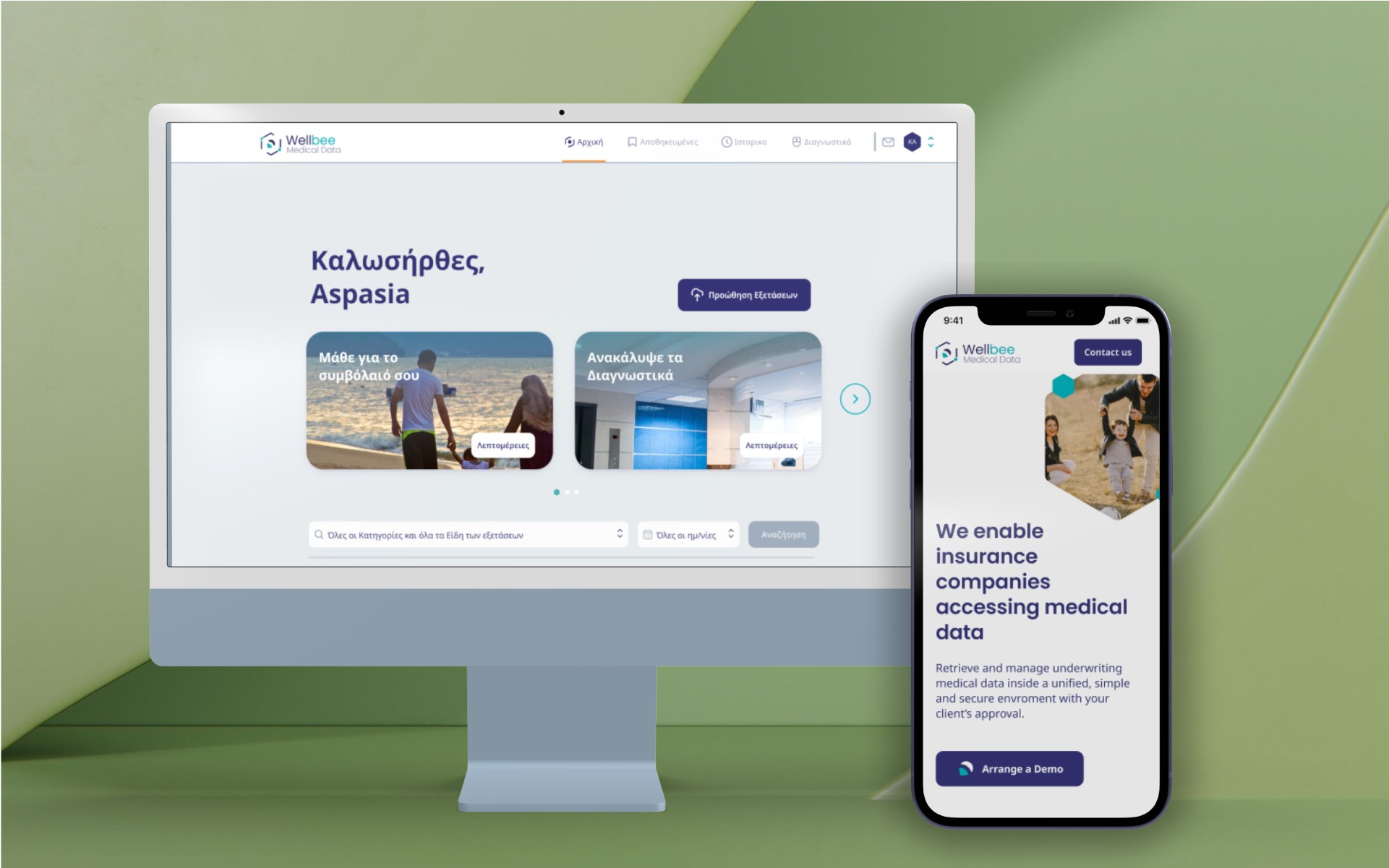
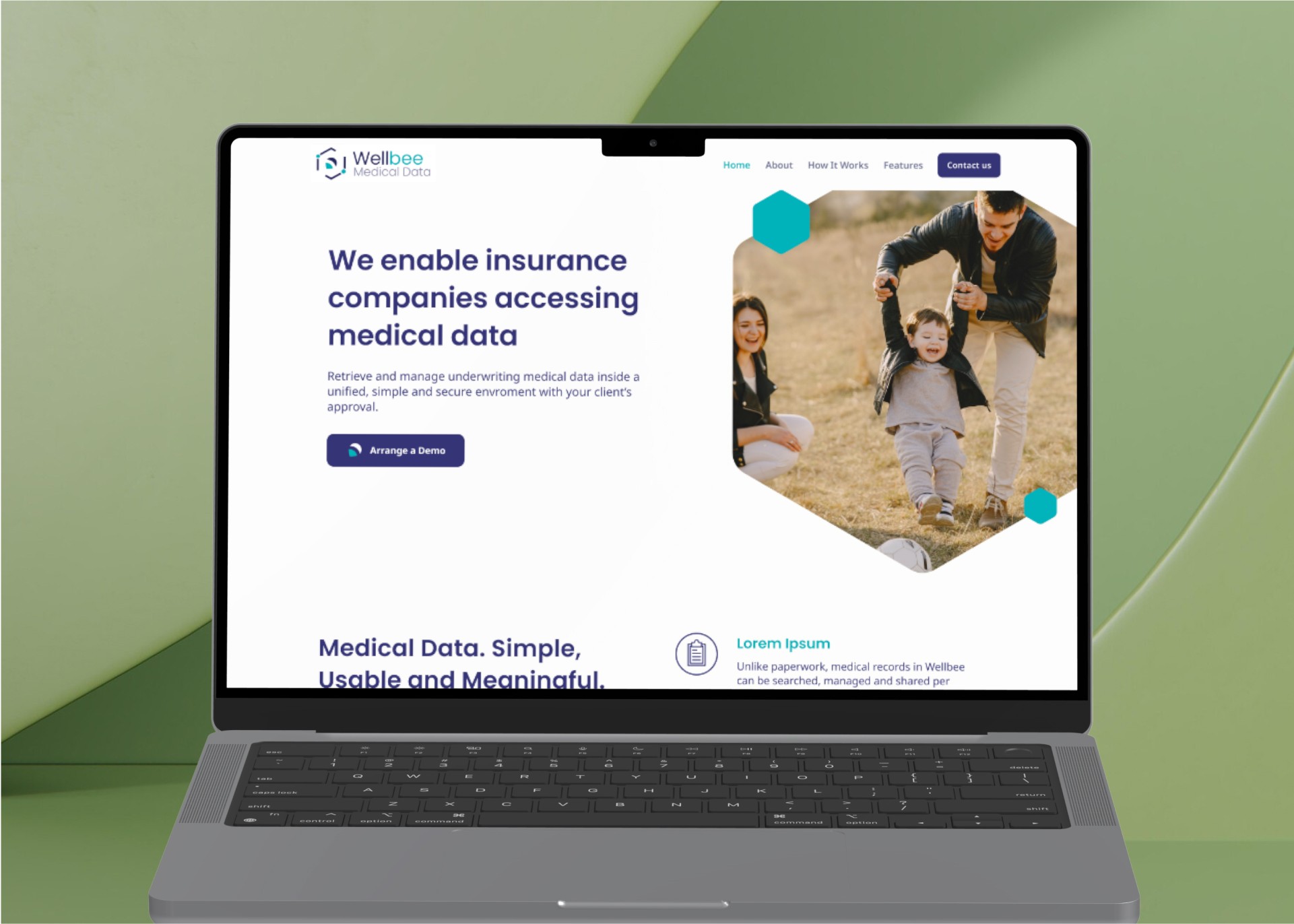
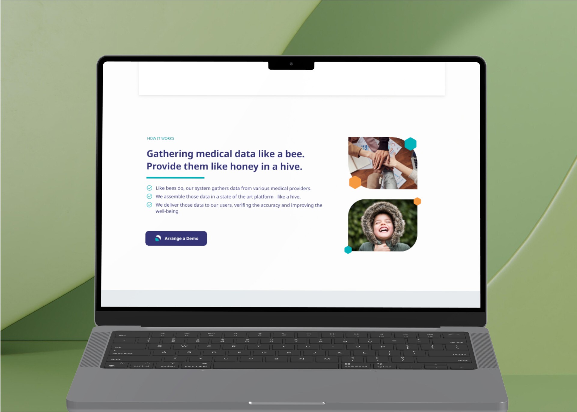
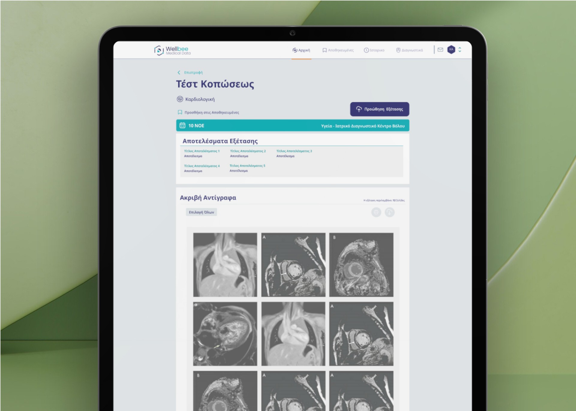
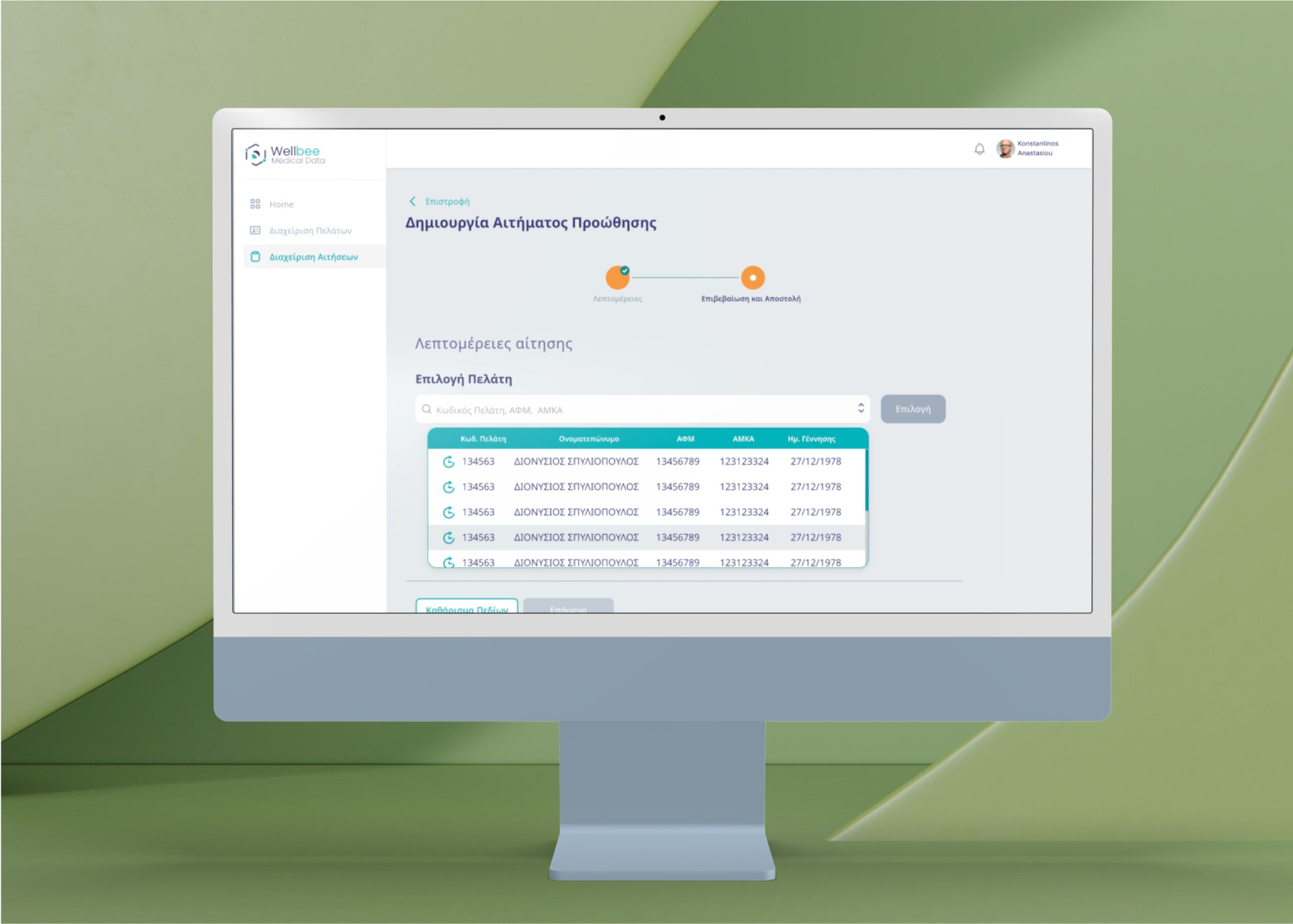
Wellbee is a digital platform designed to give users secure access to their consolidated medical records, pulled from multiple sources. The platform allows users to share medical information with doctors, family, or insurance underwriters for specified periods, meeting needs for transparency and ease in life or health insurance agreements.
Role
UX Desiign, Branding
Design Thinking, UI Design
Client
Wellbee
Year
2021
Services
Product Design
Responsive Web App
Project link
The Problem
Wellbee needed a secure, user-friendly interface to make personal medical data easily accessible, sharable, and protected. Key challenges included:
• Data Privacy and Security: Ensuring user control over sensitive health information, especially when sharing data with third parties.
• Usability for Novice Users: Simplifying complex medical information for general users unfamiliar with data sharing or medical record management.
• Underwriter Needs: Designing an efficient interface for insurance underwriters who require quick, reliable access to assess health risks effectively.
• Trustworthy Branding: Creating a visual identity that conveys safety, stability, and health, essential qualities for user trust in the medical and insurance fields.
The Design Process
UX Research and Discovery
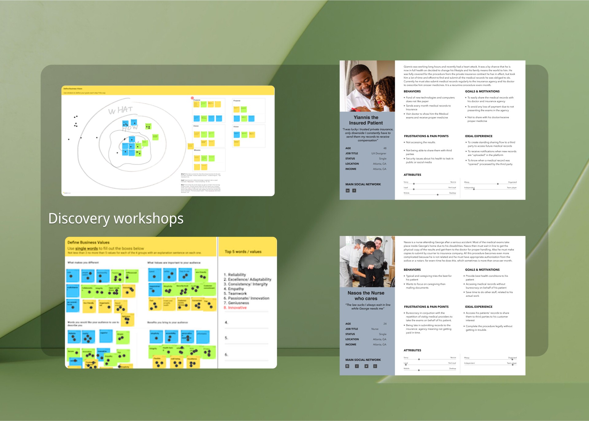
• Conducted in-depth user interviews and workshops to understand the core pain points of various stakeholders, including users, doctors, and insurance underwriters.
• Researched insurance underwriting processes and the specific challenges users face in managing and sharing medical data securely.
• Gathered insights about user needs for privacy and control over data, balanced with a willingness to share for better medical care or favorable insurance terms.
2. Workshops and Stakeholder Collaboration
• Facilitated workshops with stakeholders, including developers, to define security protocols and data handling standards.
• Addressed privacy concerns by transforming complex business requirements (like third-party data sharing) into clear, intuitive user flows, specifically designed for novice users.
• Established a collaborative approach with cross-functional teams to ensure the platform’s technical feasibility and alignment with business goals.
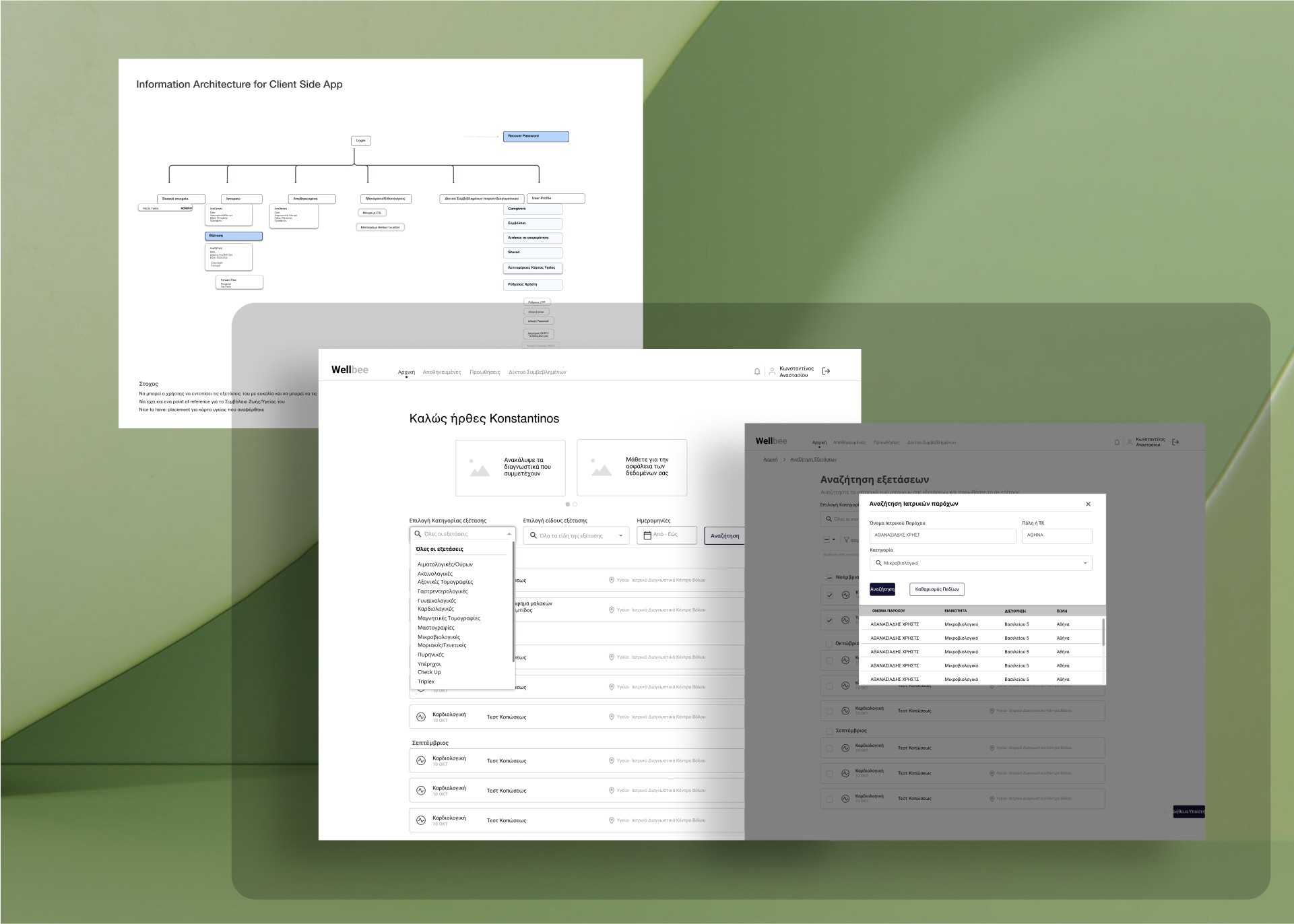
3. Wireframing and Prototyping
• Designed user flows and created low-fidelity wireframes, iterating based on feedback from stakeholders and developers.
• Validated wireframes with cross-functional teams to confirm that proposed solutions could be executed efficiently.
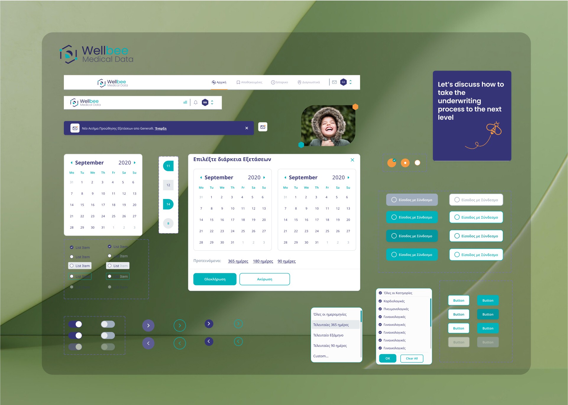
• Used atomic design principles to build a scalable design system that would support future enhancements.
4. Branding and UI Design
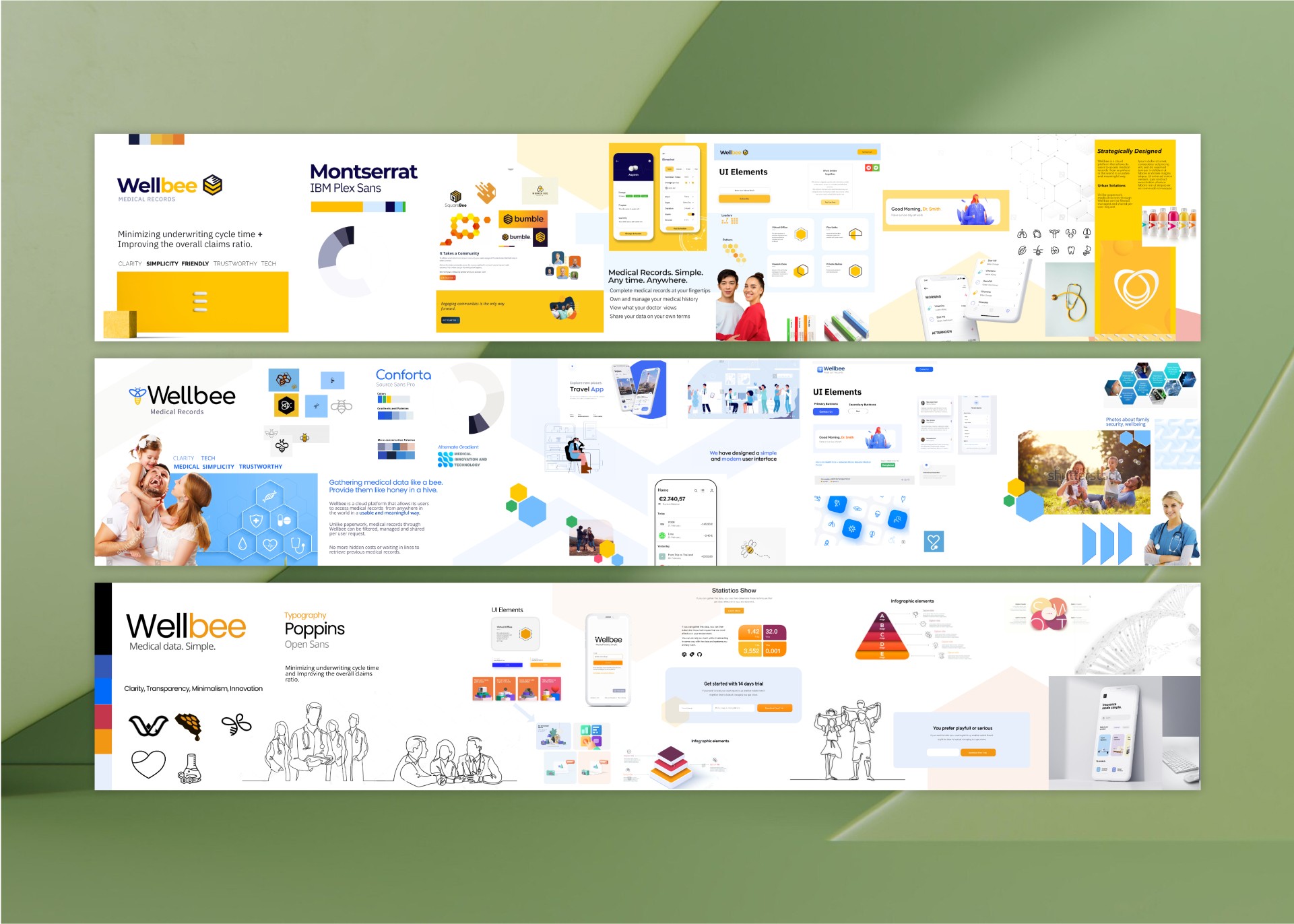
• Developed a brand identity with a calming, health-focused color palette to establish trust and create a sense of stability.
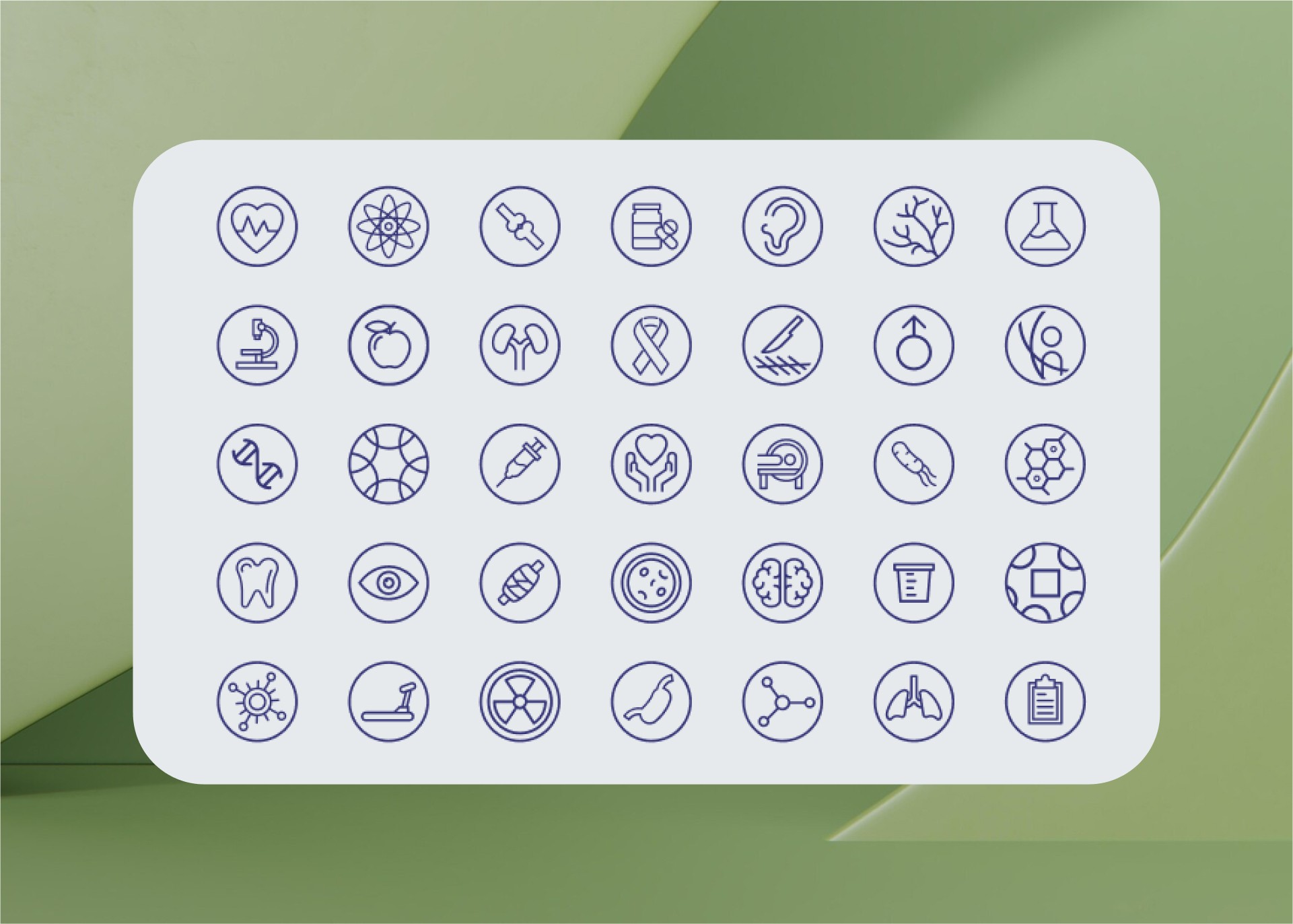
• Designed custom iconography to clearly represent medical records, data-sharing permissions, and various types of medical data (e.g., examinations, diagnoses).
• Created a consistent UI across desktop and mobile platforms, ensuring a seamless user experience.
The Design
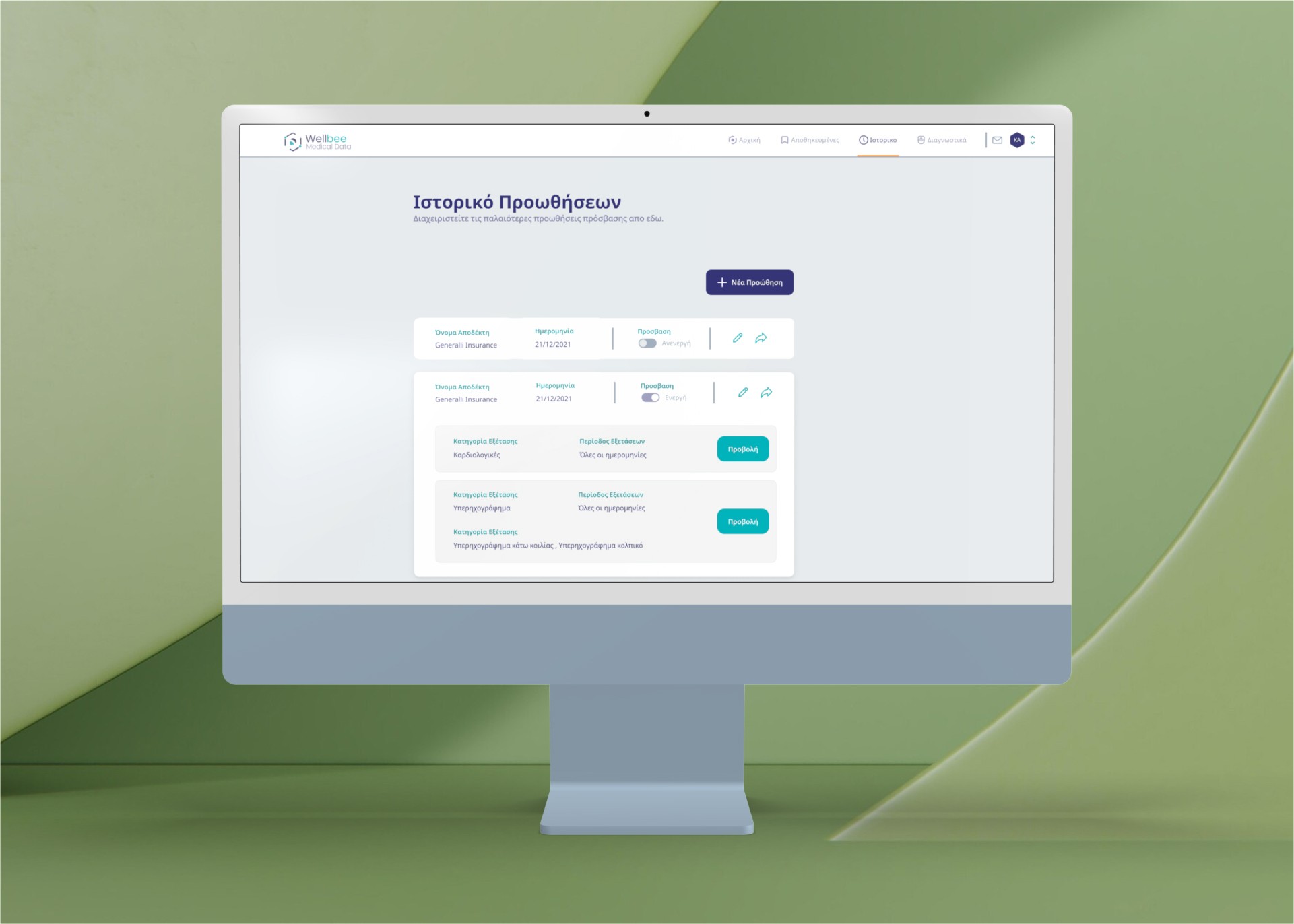
Customizable, Secure User Interface: Designed an intuitive, user-centered interface that allows users to view, manage, and share their medical records with confidence.
• Redesigned Data-Sharing Flow: Created a simplified, secure sharing process for novice users, enabling them to share data with third parties (e.g., doctors, insurance underwriters) with full control over access and permissions.
• Efficient Dashboard for Underwriters: Developed a dashboard tailored to insurance underwriters, with clear, organized displays of medical data for quick risk assessments.
• Consistent and Scalable Design System: Implemented a design system based on atomic design principles to support long-term scalability and maintain consistency across Wellbee’s web and mobile applications.
Design Rationale
Each design choice was backed by user insights and stakeholder feedback:
• Security & Trust: Research confirmed that users value data security and control. The design ensures users retain ownership over their information, with secure sharing protocols and privacy settings integrated into the user flows.
• Underwriter Needs: Interviews with underwriters revealed the need for a streamlined, efficient interface. To address this, the dashboard was organized with a focus on quick access and clarity, allowing underwriters to evaluate medical records without excessive navigation.
• Branding & Visual Design: Based on research, a traditional yet calming aesthetic was chosen. The color palette and typography were selected to convey health, stability, and trustworthiness, reinforcing user confidence in the platform.
UI Design & Branding
• Branding & Visual Identity: The branding aimed to reflect Wellbee’s mission of secure, accessible health data management. The UI was designed to look professional, approachable, and aligned with healthcare values.
• Custom Iconography: Custom icons were created to represent medical conditions, data permissions, and health records, ensuring clarity and a cohesive visual language.
• Design System: Using atomic design principles, a scalable and adaptable design system was built to support Wellbee’s current needs and future growth.
The outcome
The Wellbee Medical Records Web App design is currently being developed, but the user-focused, secure, and scalable interface has already received positive feedback from stakeholders. The design aligns with Wellbee’s mission to provide a trustworthy platform for managing and sharing medical records, setting a strong foundation for future product enhancements and scaling.
Client Feedback
I met Konstantinos back at the 2019 Thessaloniki International Fair. Rarely to possibly never you meet someone and say you would assign him a job immediately. That's exactly what happened.
We chatted and shared our vision and immediately I realized I need him to take on eHOSP's rebranding and the UI/UX design. After our first meetings, the whole team was super excited to work with him. Upon completion, the results were outstanding and impressed every shareholder!
To sum up, I am more than happy and blessed to work with such an amazing and open-minded designer that loves his job. More than professional results!
Well done Konstantine!
Wellbee CEO // Entrepreneur // Strategy consultant