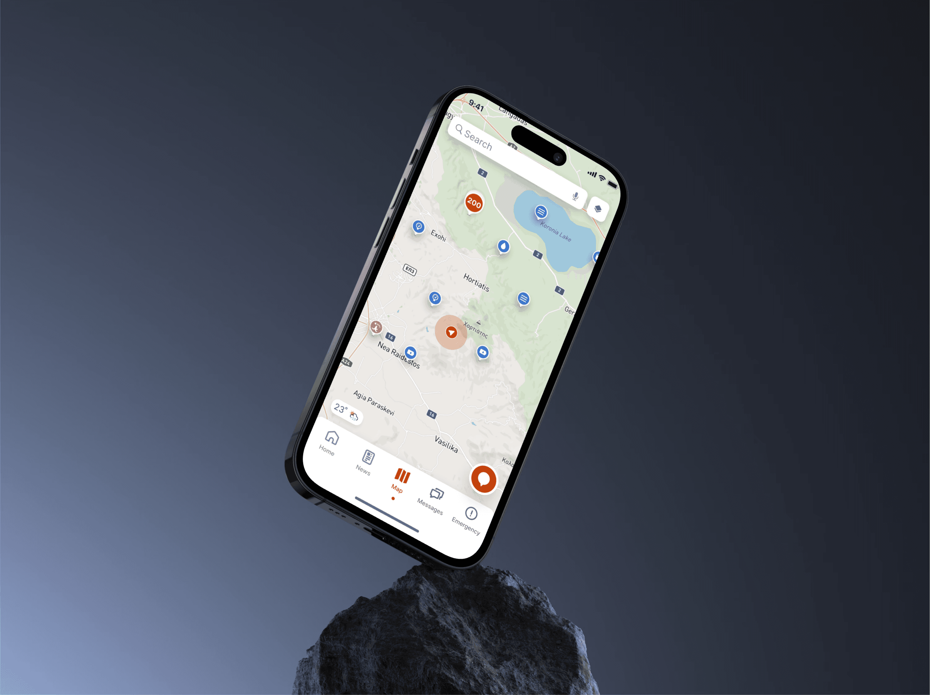
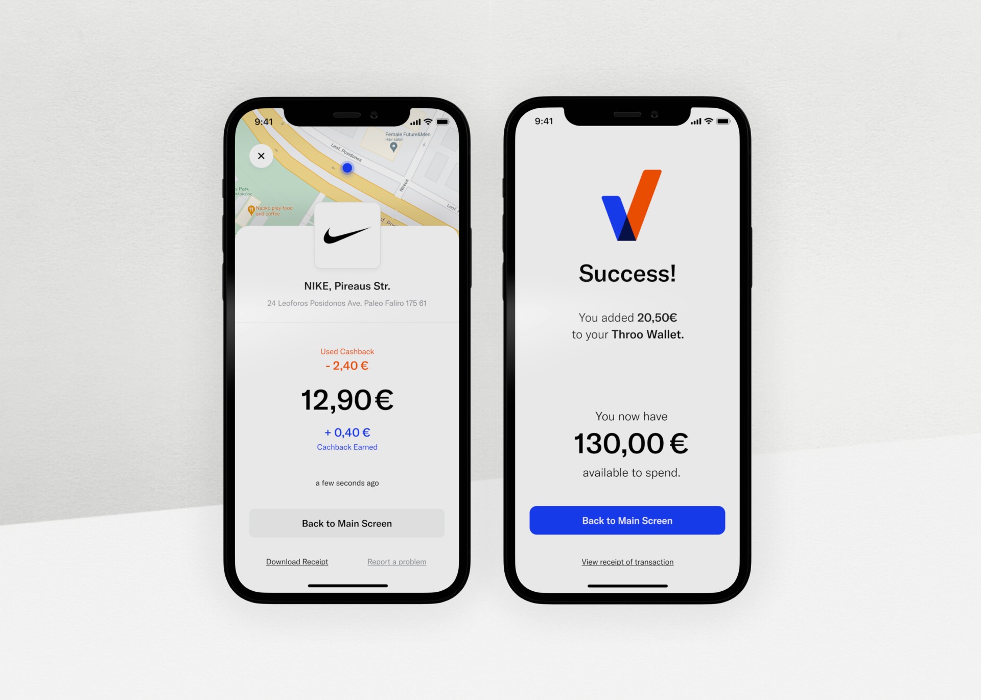
Throo is a mobile payment solution designed to revolutionize digital transactions by offering a seamless, efficient, and cost-effective alternative to traditional payment systems. By leveraging QR-based payments, Throo reduces transaction costs, simplifies processes, and provides immediate cash flow to merchants. Its digital wallet, integrated loyalty programs, and advanced KYC measures create a user-friendly experience that benefits both consumers and businesses.
But the path to creating Throo wasn’t linear. It was a journey of discovery, iteration, and refinement, shaped by real users and guided by a visionary team. From countless design iterations to user insights driving transformative changes, Throo emerged as a powerful, efficient solution.
Its success story was ultimately validated by its acquisition by Euronet, marking a new era for digital payments.
Role
Product UX/UI Designer
Client
Throo
Year
2021
Services
UX Design
UI Design
Agency
Mentions
Branding: HOLY
Initial Concept: A. Marousis




The Problem
The inception of Throo was driven by a need to address critical issues in the payments ecosystem:
1. High Transaction Costs: Traditional systems burden merchants with fees ranging from 1% to 3%, making them especially challenging for small and medium-sized businesses .
2. Delayed Fund Transfers: Merchants often experience significant delays in receiving their payments, sometimes waiting several days, which hampers cash flow and operational efficiency .
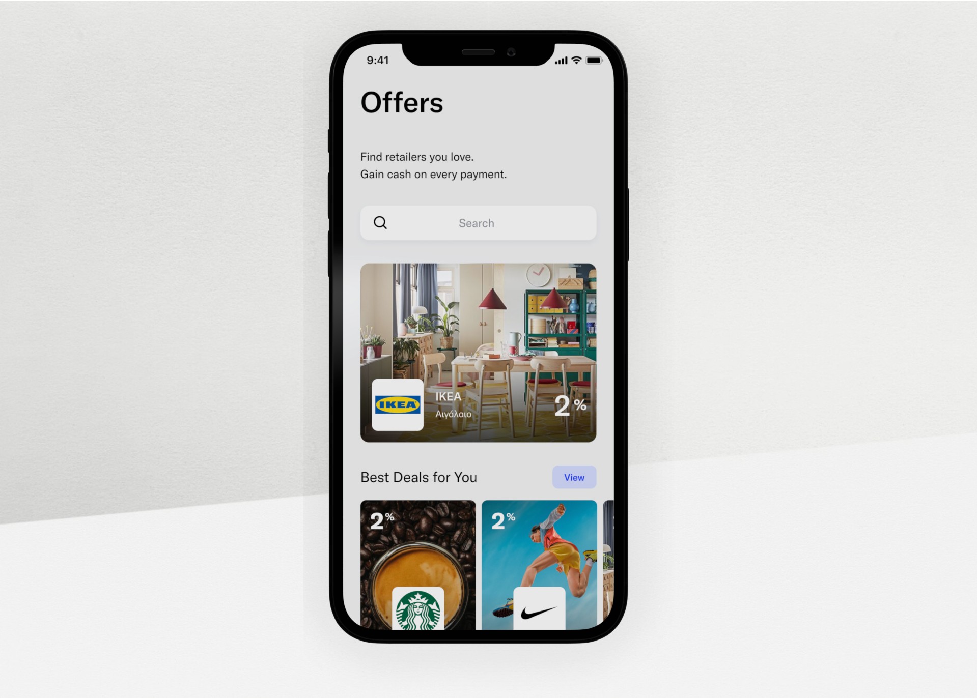
3. Lack of Access to Loyalty Programs: Smaller merchants are left out of loyalty schemes that larger retailers enjoy, limiting their ability to engage and retain customers .
4. Consumer Frustrations: Traditional systems are plagued with user friction, including cumbersome onboarding processes and limited incentives. Consumers demand faster, more intuitive payment experiences that integrate rewards .
Throo set out to rewrite this narrative by focusing on a simple, affordable, and rewarding payment experience that anyone could adopt.


The Sollution
Designing Throo wasn’t just about building a payment app—it was about solving real problems and creating a system that felt effortless and rewarding for both merchants and consumers. It was a process of iteration, testing, and refinement, balancing the art of design with the science of usability. Here’s how we approached it.
When you’re creating for two distinct audiences, it’s not just about solving their immediate needs—it’s about finding ways to connect their experiences seamlessly. For **merchants**, the focus was on simplicity and power: enabling QR payments without the complexity of traditional POS systems while giving them actionable insights into customer behavior.
For **consumers**, it was all about clarity and rewards. We knew they wanted an app that made payments frictionless and gave something back in return. This meant creating intuitive payment flows and making features like cashback easy to access and understand. The challenge was ensuring these two perspectives worked together in perfect harmony.
1. User Research and Personas
The team conducted extensive user research to identify key audiences, such as small merchants, mega retailers, and consumers spanning diverse demographics. Proto-personas were developed to represent user needs, motivations, and pain points. For example:
• “Manolis,” a 52-year-old retailer, needed seamless integration with his ERP system to streamline accounting processes.
• “Dani,” a 24-year-old designer, valued visually appealing and easy-to-use apps .
Through interviews, workshops, and brainstorming sessions, Throo’s team created personas that embodied the platform’s diverse user base. These personas weren’t just placeholders—they became guiding stars, steering every decision toward solving real problems.
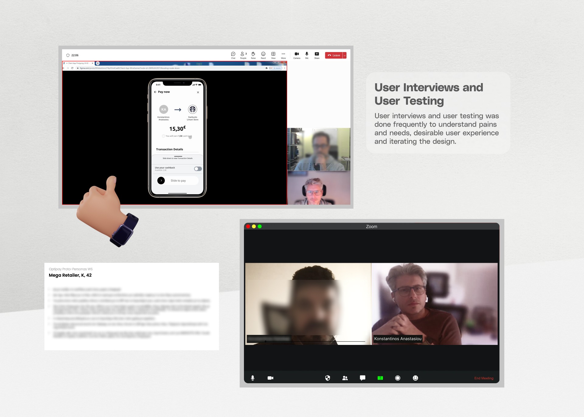
2. User Testing and Feedback
Nothing was perfect on the first try. Early prototypes revealed where friction existed. Consumers found the onboarding process too long, and merchants needed faster access to key actions like refunds. Instead of pushing forward with our assumptions, we paused and listened. Every piece of feedback helped us refine and improve.
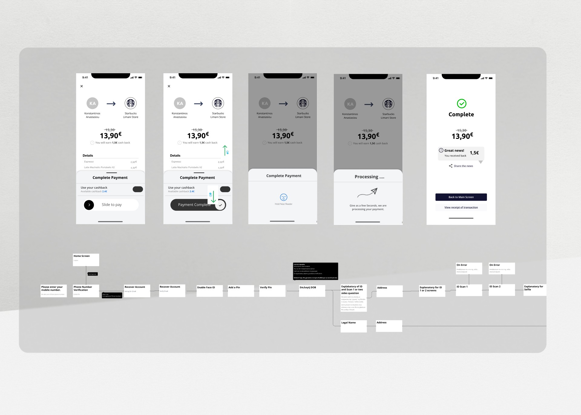
A detailed user testing plan evaluated key functionalities, including onboarding, cash top-ups, QR payments, and account settings. By adopting a “think aloud” methodology, I gathered real-time insights into user behavior and frustrations. This feedback informed design refinements, such as simplifying payment flows and optimizing navigation .
This feedback from user testing sessions became the lifeblood of change. Every change, big or small, was a step closer to creating a product that resonated with its users. Improving and bringing changes to the final results. for example the experience users added - topped up - their wallets was simply not working. The users couldn't understand the slider and they needed a simple keypad. Design was changed accordingly to reflect that.




The Design
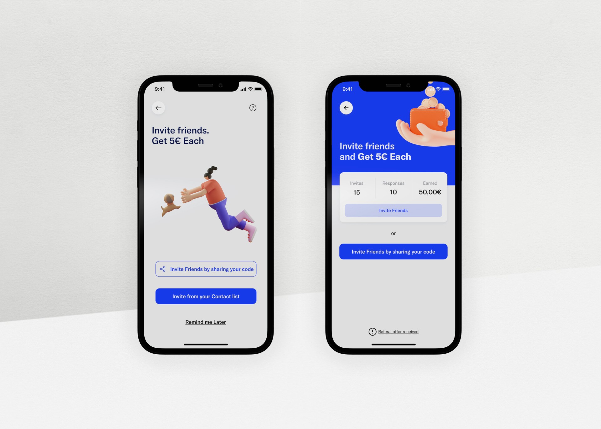
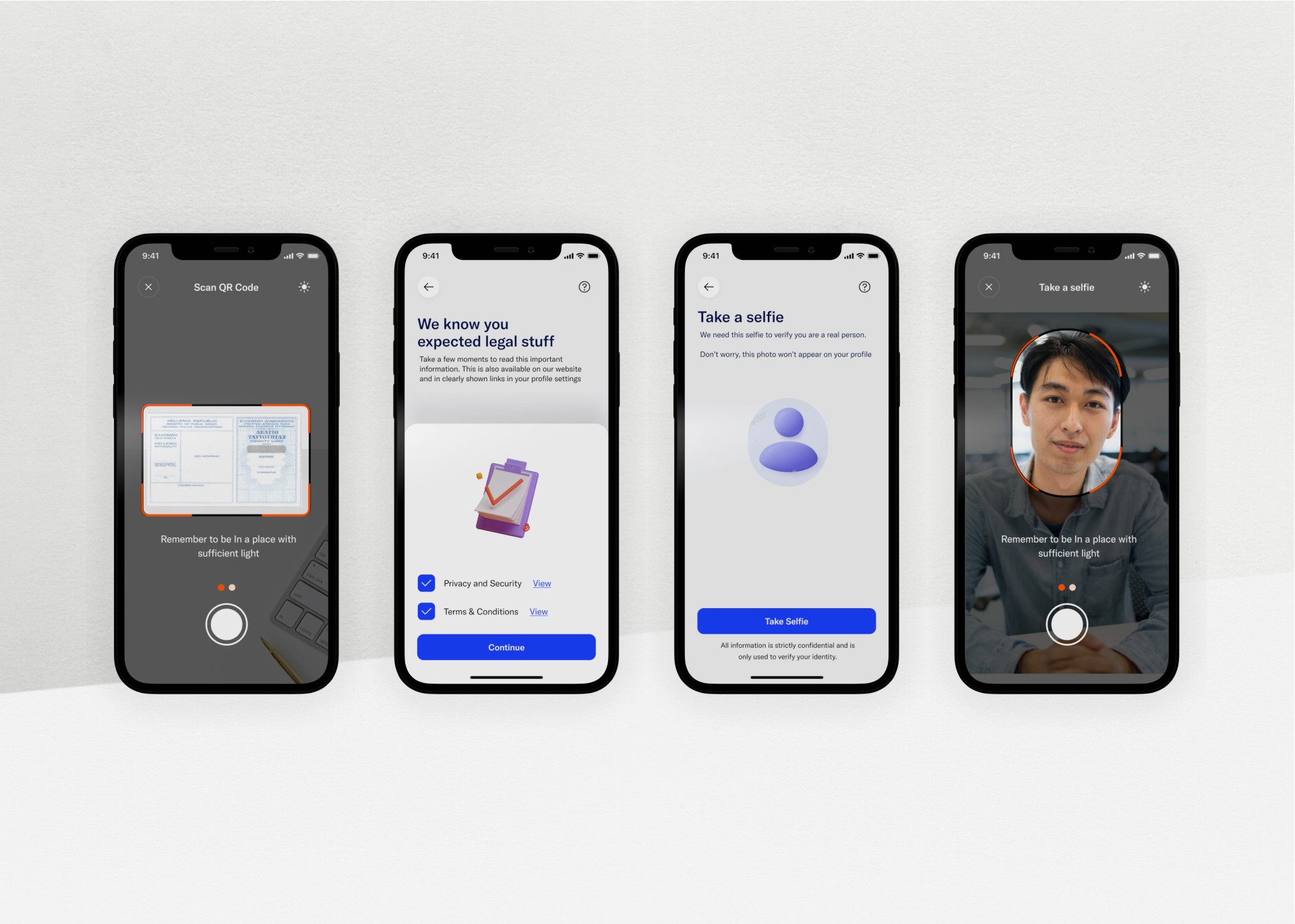
Behind the scenes, everything was powered by a design system that ensured consistency across all touchpoints. Whether users were scanning a QR code on their phone or merchants were viewing analytics on their dashboard, the experience felt cohesive.
The branding, inspired by vibrant guidelines from **Holy**, played a key role. It gave Throo a fresh and approachable identity, one that conveyed trust and simplicity without overwhelming users. Bold typography, clean layouts, and just the right splash of color made every interaction feel polished and modern.






The Design
The creation of Throo wasn’t just about building an app—it was about crafting an entire ecosystem. Throo became a trusted ally for merchants, driving their business growth, and a favorite for consumers, celebrated for its simplicity and rewarding experiences. By balancing an intense focus on the process with delivering an exceptional product, we created a solution that didn’t just work—it delighted.
What truly set Throo apart was its foundation: relentless listening, thoughtful iteration, and a steadfast commitment to putting users first. This wasn’t just another payment app—it was a transformative platform bridging the needs of merchants and consumers alike. Merchants found a tool to streamline operations and unlock growth, while consumers enjoyed a seamless, secure, and rewarding journey.
The real magic of Throo wasn’t in any one feature but in the way every decision reflected user insights and real-world feedback. It showcased the power of design thinking, proving that when innovation and empathy intersect, payments can become effortless and even delightful.
Client Feedback
Konstantinos is a standout Product UX Designer who understands how to deliver the best solutions for his partners.
I came to know Konstantinos from his work on a couple of projects and I trusted him with the Product UX Design of my fintech startup.
We worked closely together as he designed our MVP based on business goals and user needs. Konstantinos’ biggest strength, which impressed the team, was his deep understanding of terms, usability issues, and user flows narrowed down for the financial services industry.
He interviewed users who tested prototypes and frequently came back with suggestions and improvements, either as part of the MVP or as next-step improvements.
Konstantinos’ passion, commitment, and attention to detail as a Product UX/UI Designer, along with his understanding of financial services guarantee a successful UX design for any fintech project.
Sotiris Syrmakezis
25+ years in Digital Financial Services.
Throo Founder


