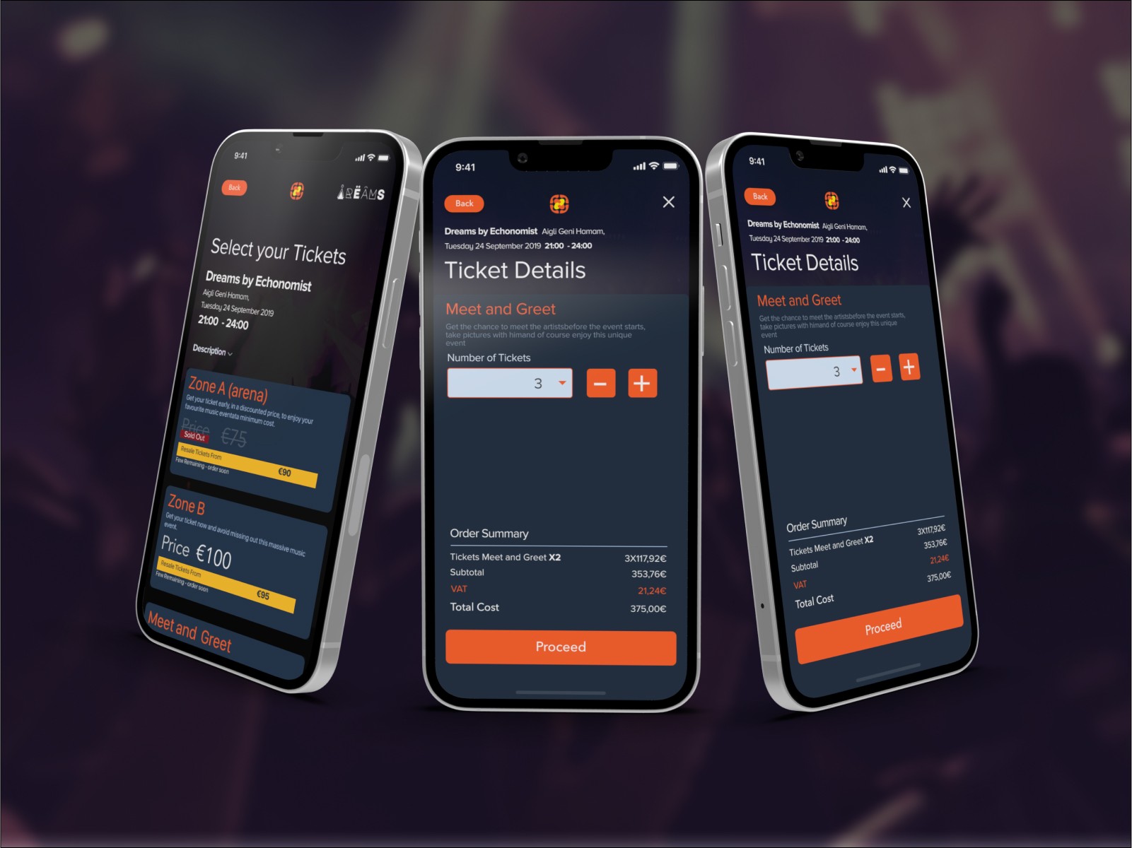
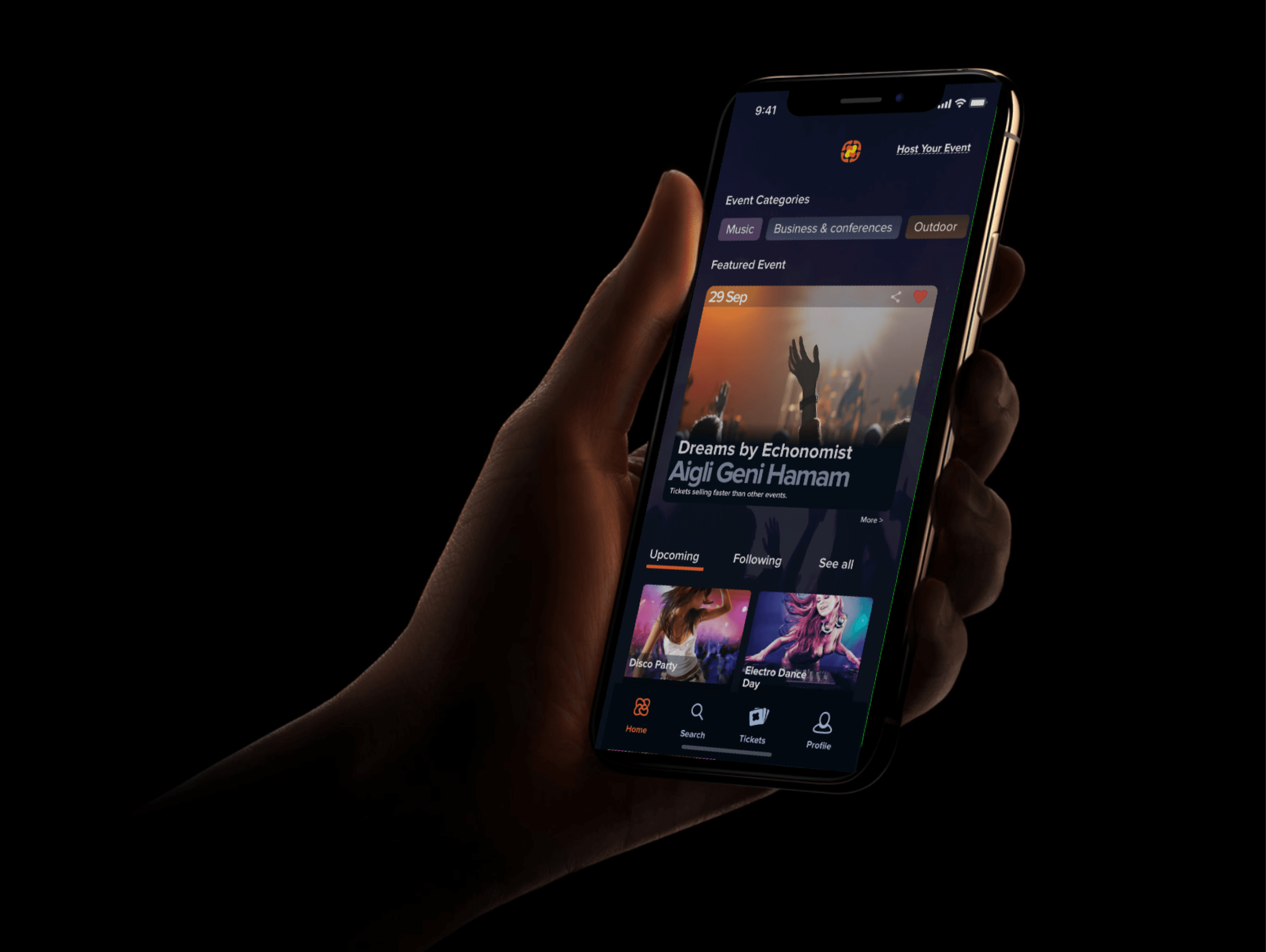
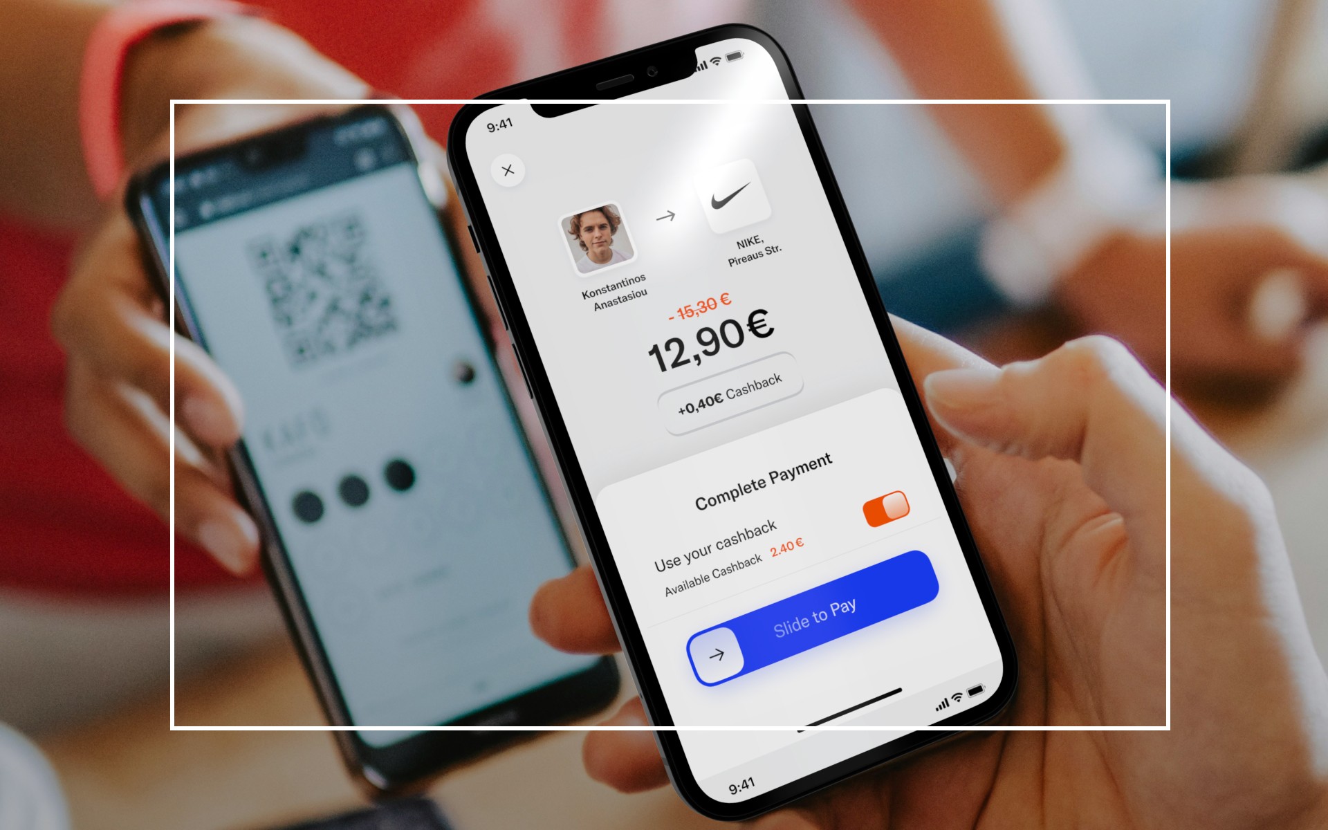
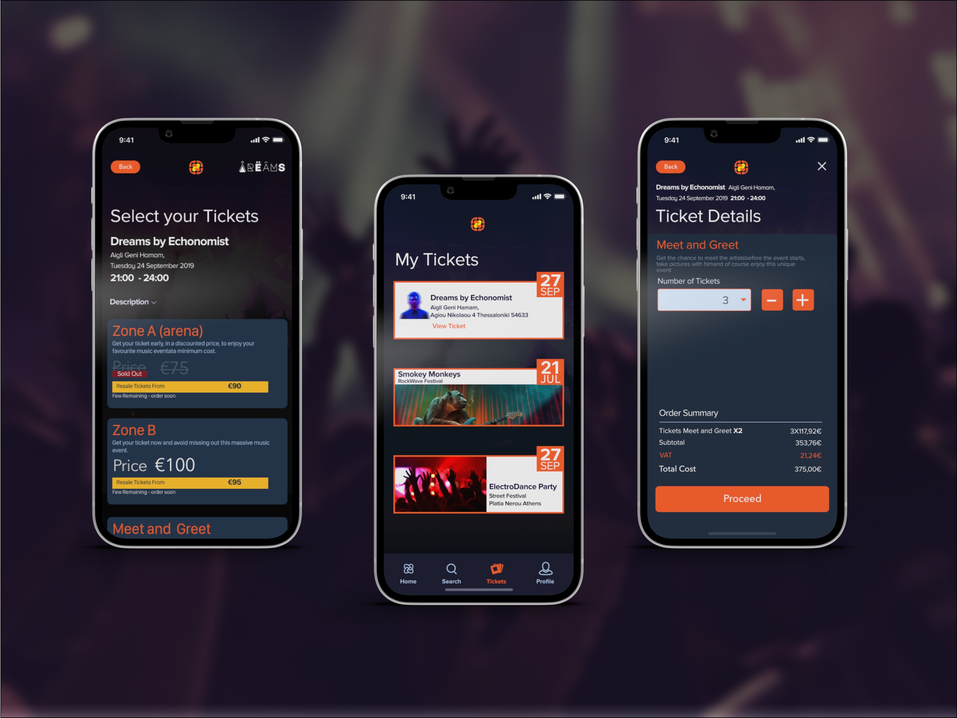
ComeTogether empowers event organizers with full control over the entire ticket lifecycle. It uses blockchain to combat scalping within a sleek, user-friendly interface. In addition, users can easily resell their tickets through an in-app marketplace, with event organizers earning transaction fees from these sales. All transactions are securely processed through the blockchain protocol.
ComeTogether empowers event organizers with full control over the entire ticket lifecycle. It uses blockchain to combat scalping within a sleek, user-friendly interface. In addition, users can easily resell their tickets through an in-app marketplace, with event organizers earning transaction fees from these sales. All transactions are securely processed through the blockchain protocol.
ComeTogether empowers event organizers with full control over the entire ticket lifecycle. It uses blockchain to combat scalping within a sleek, user-friendly interface. In addition, users can easily resell their tickets through an in-app marketplace, with event organizers earning transaction fees from these sales. All transactions are securely processed through the blockchain protocol.




The Problem
ComeTogether’s concept is brilliant—using blockchain to combat ticket scalping is a game-changer! We all agreed that the product needed to stand out with a strong user experience (UX) to simplify the ticketing process. A well-crafted UX can truly differentiate a product from established market leaders.
“How do you create a great experience when designing a ticket-buying application?”
“How can you fight ticket scalping with blockchain while still delivering a usable and meaningful experience to users?”
In addition, users should be able to resell their tickets easily and find the best price across multiple listings. Event organizers should also benefit by receiving transaction fees from resold tickets. All of this must be executed in a clear, intuitive way, leveraging the transparency and security of blockchain technology.


The UX Process
Discovery
Our UX research encompassed the following key tasks:
Identifying competitors — reviewing solutions and user flows
Conducting user interviews and identifying main audience segments
Segmenting needs and developing proto-personas
Understanding the ticket lifecycle
Gaining familiarity with the blockchain ecosystem
We focused on the needs of four main user segments who could potentially interact with the app:
Providers
Event Attendees
Artists
Creators
After extensive research and multiple user interviews, I organized a workshop with stakeholders to align the team on our users' main needs, frustrations, and behaviors.
We found that users needed to feel safe and trust the system, despite concerns about blockchain versus traditional ticketing systems. They also wanted to find matching events quickly and easily. Event organizers needed to connect with suitable event providers and venues, and wished to complete venue booking within the app.
These insights shaped the development of our proto-personas.
Affinity Mapping
Affinity mapping revealed that the most critical moment in the user journey is when the client pays for the ticket. To address this, we aimed to create an experience that feels like being part of a community event happening during the ticket purchase.
We identified several different types of events:
Music events
Blockchain events
Sporting events
Community events
Cultural events (art, dance, museum, specific exhibitions)
Business events
We concluded that each event type should have distinct aesthetics to reflect the user's mental state.
For example, our data showed that for music events, the app should be particularly appealing to Gen Y and Millennials as primary audiences. Based on existing branding guidelines, I designed corresponding iconography for mobile use.
Information Architecture & User Flows
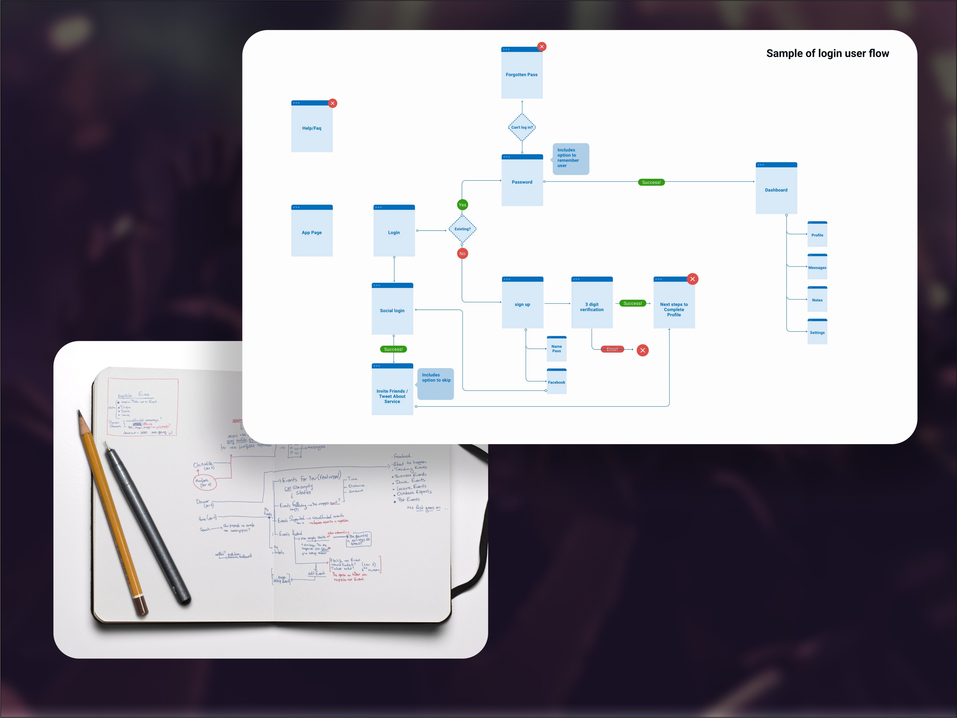
Before moving to wireframes, we developed user flows. These were designed without graphical elements to help the team focus on the actual flow, avoiding visual distractions.
Information architecture is crucial for helping the app scale as it evolves beyond the MVP stage.


The UI Design Process
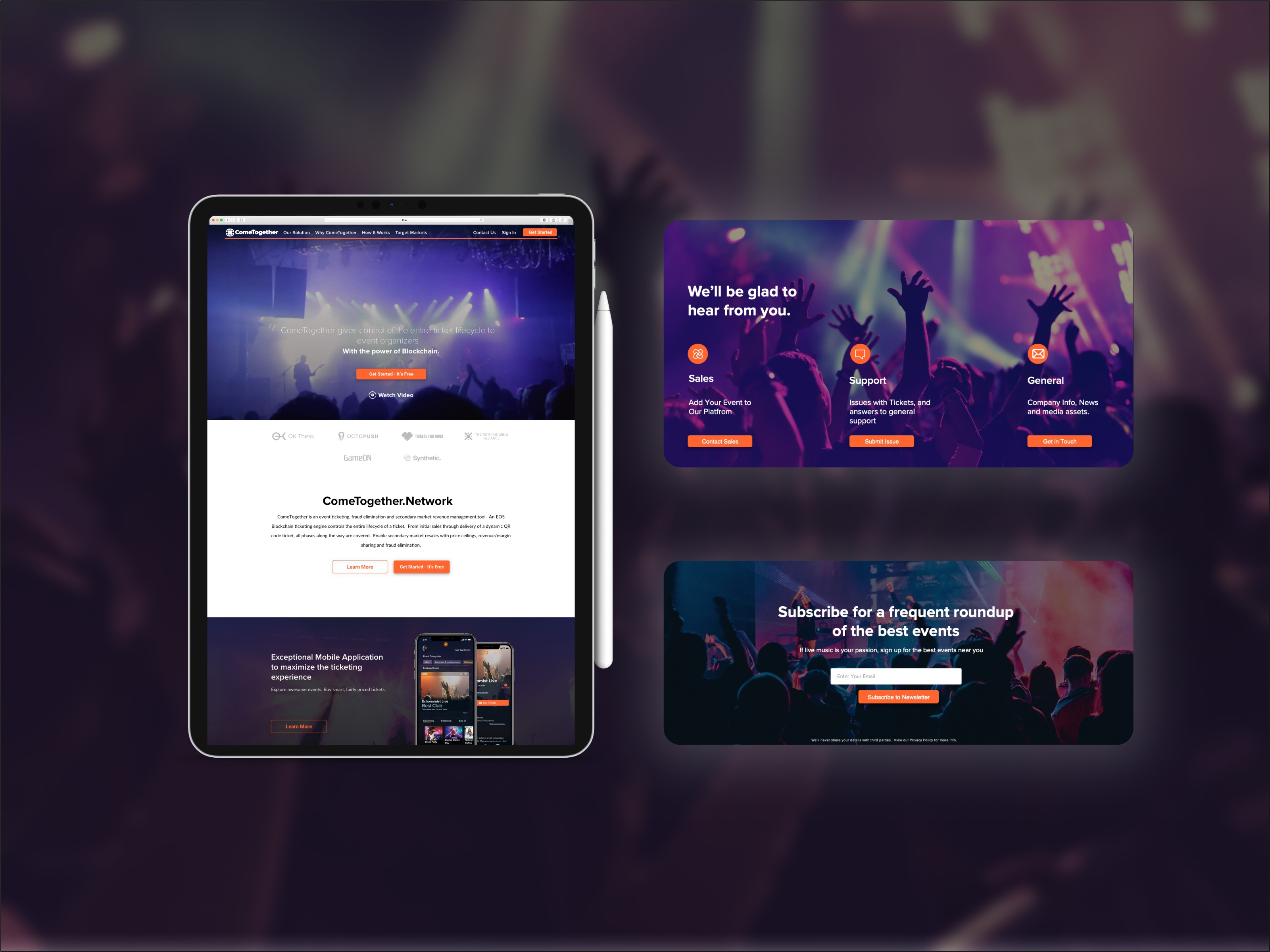
The platform should offer a sense of differentiation while remaining simple and intuitive for ticket sales. We also recognized that each persona required a unique environment.
"From a user perspective, the ticket buying process is an integral part of the overall event experience."
The team aimed to convey a feeling of belonging, festivity, and community, appealing to Millennials. Using the existing branding guidelines, I designed corresponding iconography tailored for mobile use.




The Impact
ComeTogether's evident achievements can be seen in successfully selling out a festival with a 7,500 audience capacity. This was done by ameliorating conversion tracking of our campaigns and making the user experience better. The significant impact of my design input was pivotal in forging a smooth, immersive ticket purchasing procedure which held vital significance for user fulfillment and adoption of our platform. Implementing user feedback allowed us to refine the design to provide an effortless, delightful experience, fortifying ComeTogether's position as a distinctive choice in the market. From the viewpoint of the user, the process of purchasing the ticket is a crucial part of the total event experience.
Client Feedback
I had the pleasure to work with Konstantinos during the design of our first ComeTogether UX. He is a very talented and experienced UX designer and an excellent professional! He is always up to date with the state of the art when it comes to UX, has empathy for the users, along with great aesthetics. Thank you Kosta, looking forward to our next project!
Lazaros Penteridis Co-Founder/CEO at ComeTogether


