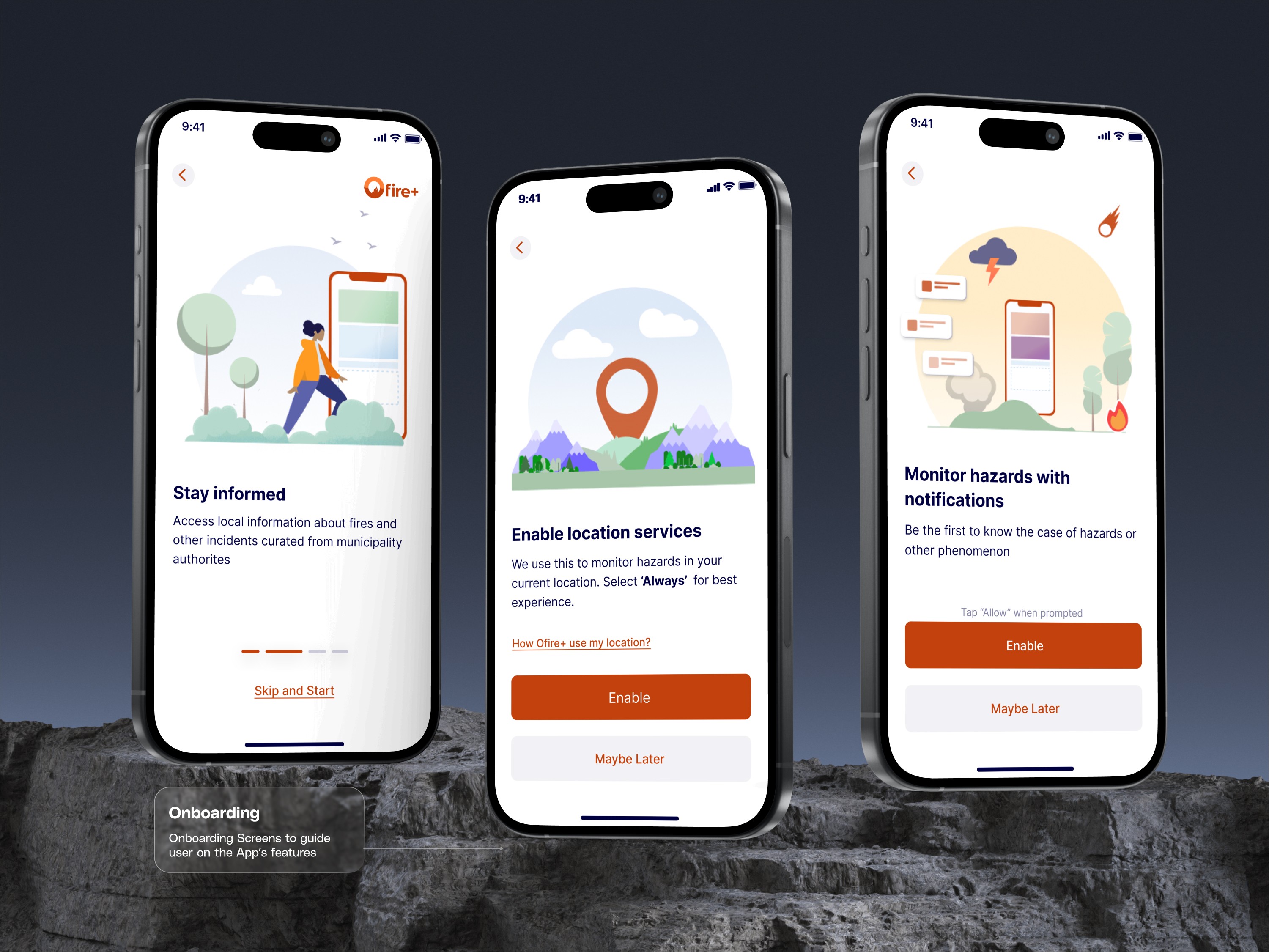
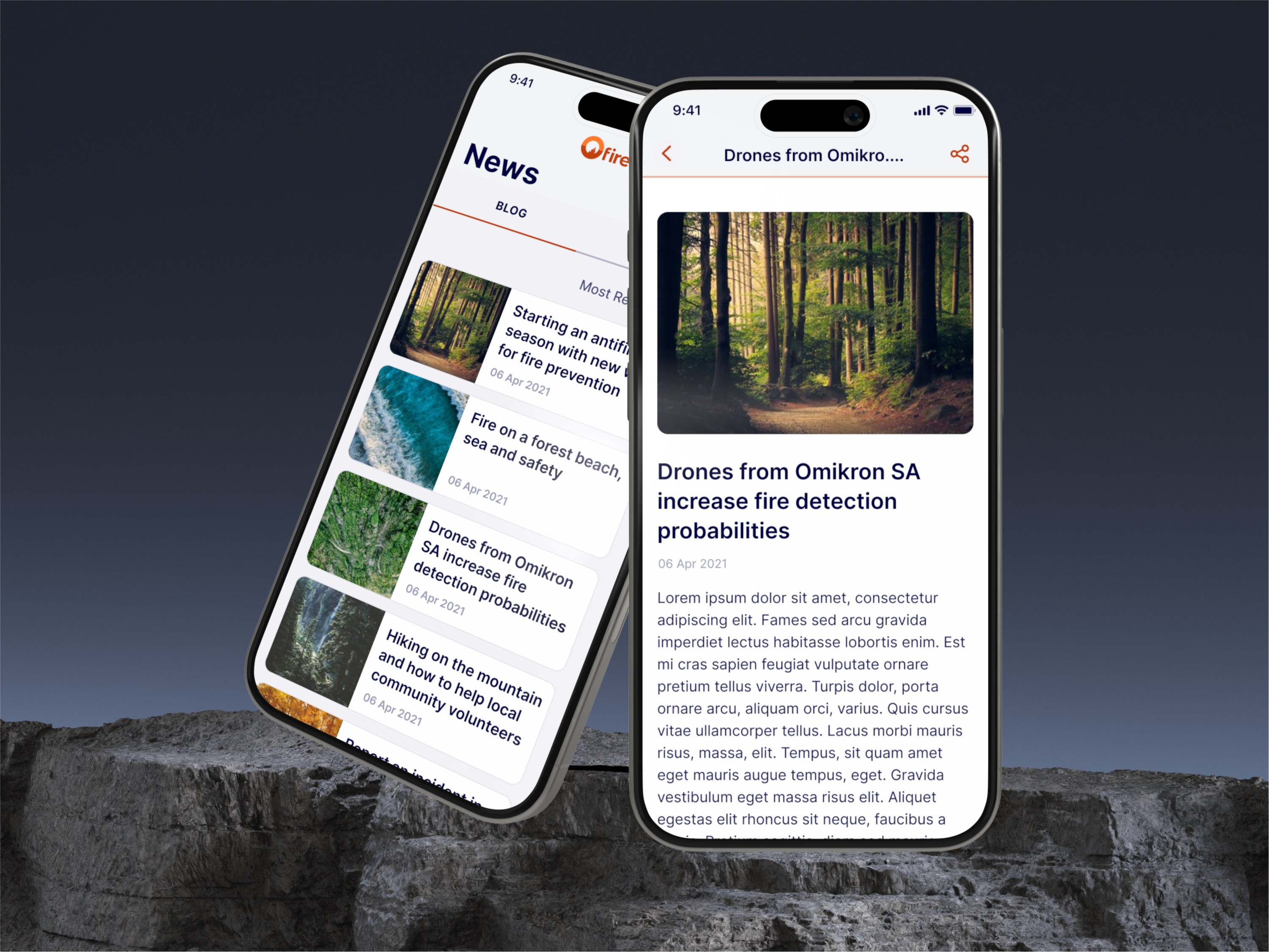
Ofireplus enables authorities to prevent or manage hazards wildfires, coordinate field volunteers, or inform the general public about them in a meaningful and accessible way.
Ofireplus enables authorities to prevent or manage hazards wildfires, coordinate field volunteers, or inform the general public about them in a meaningful and accessible way.
Ofireplus enables authorities to prevent or manage hazards wildfires, coordinate field volunteers, or inform the general public about them in a meaningful and accessible way.




The Problem
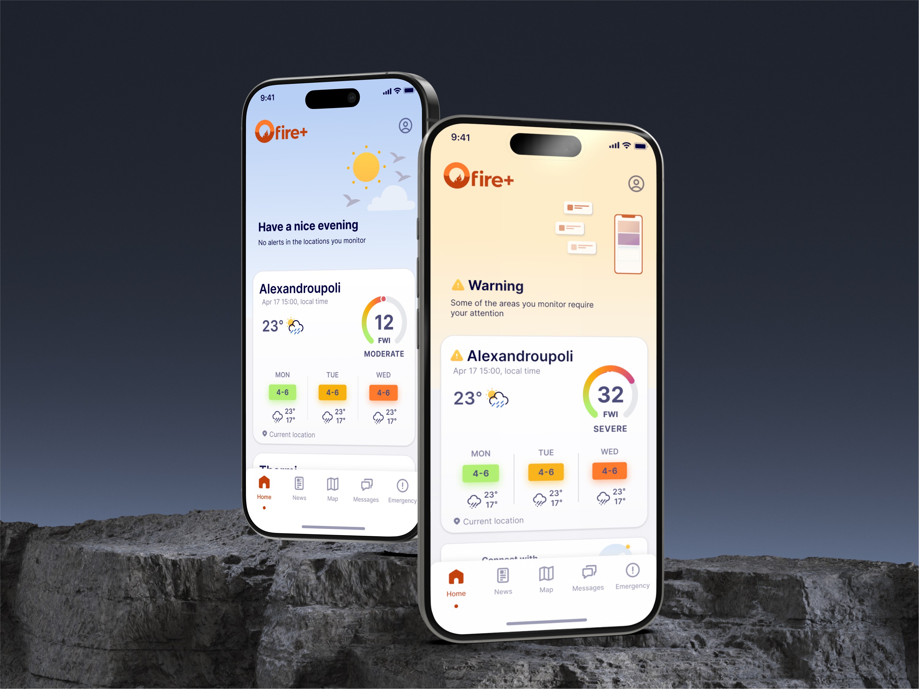
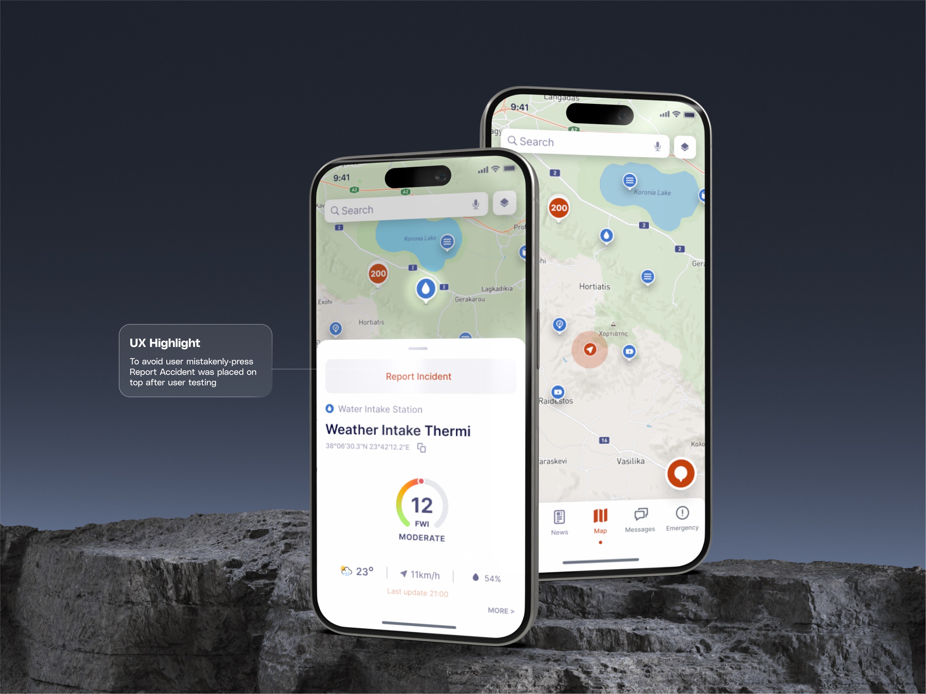
Ofire+ enables authorities to prevent and manage wildfire hazards, coordinate field volunteers, and inform the public effectively. However, despite the platform’s success in its core functions, it became clear that usability issues were hindering key performance indicators (KPIs) such as user engagement, incident reporting accuracy, and adoption rates among local authorities.
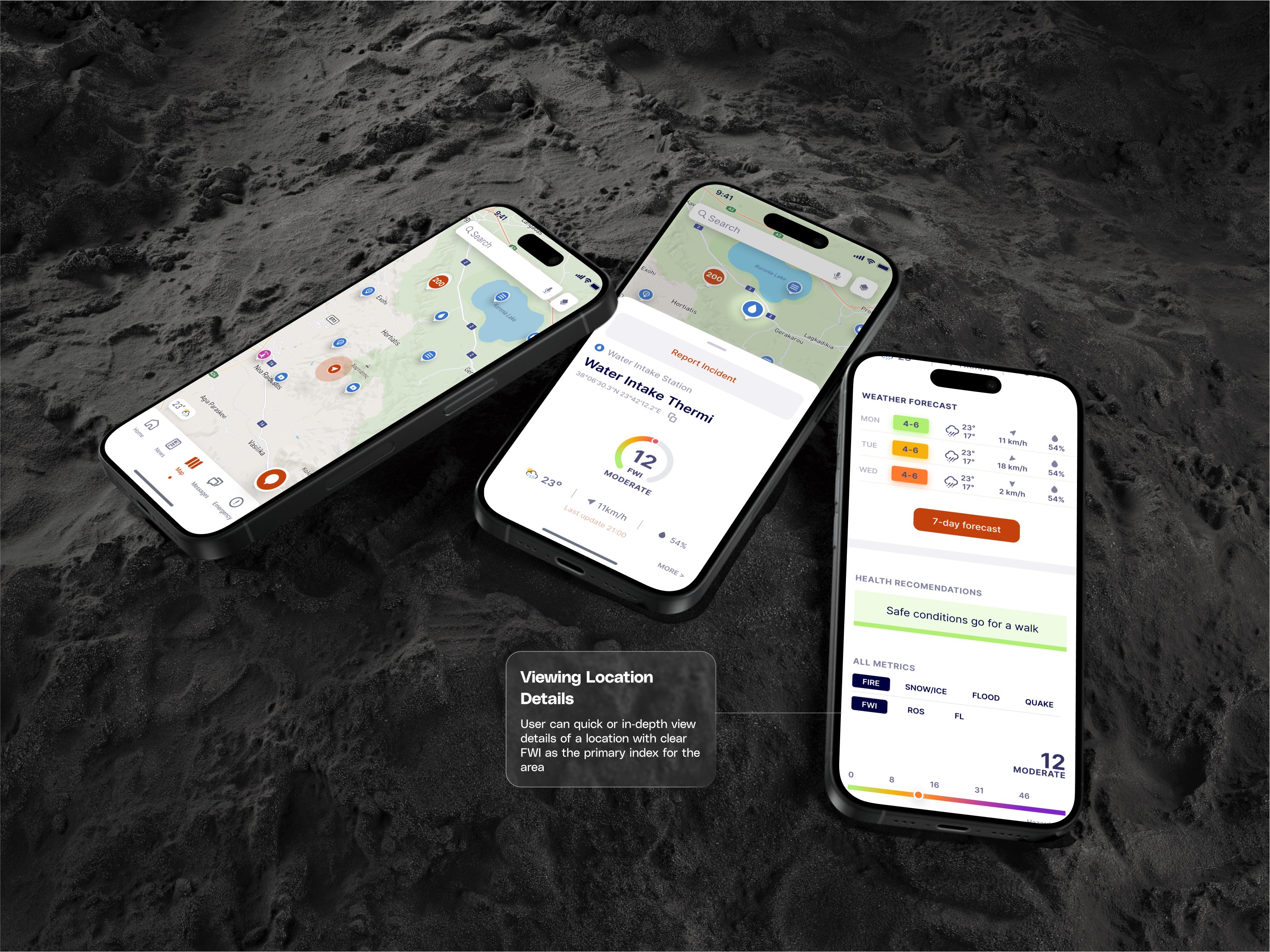
To address these challenges, a redesign was necessary to enhance the user experience, making critical features like map interactions and in-app reporting more intuitive and accessible. Improving these aspects was crucial not only for boosting platform performance but also for achieving important KPIs and securing the additional funding needed for further scaling and development.


Discovery and Research
The project kickoff involved multiple workshops with the product team. These sessions aimed to understand the product's vision, business logic, and previously researched pain points. We also elaborated on existing research and assumptions the product team had already made.
Cognitive Walkthrough
When our collaboration began, the product already had an MVP launched. I conducted a thorough UX review (cognitive walkthrough) of the existing solution, noting everything that could be useful later. I also performed a heuristic evaluation, though with less detail due to the impending redesign. Telemetry and user feedback were taken into consideration for the design We cross-checked our findings against the business's needs and the product's vision.
Competition Benchmark
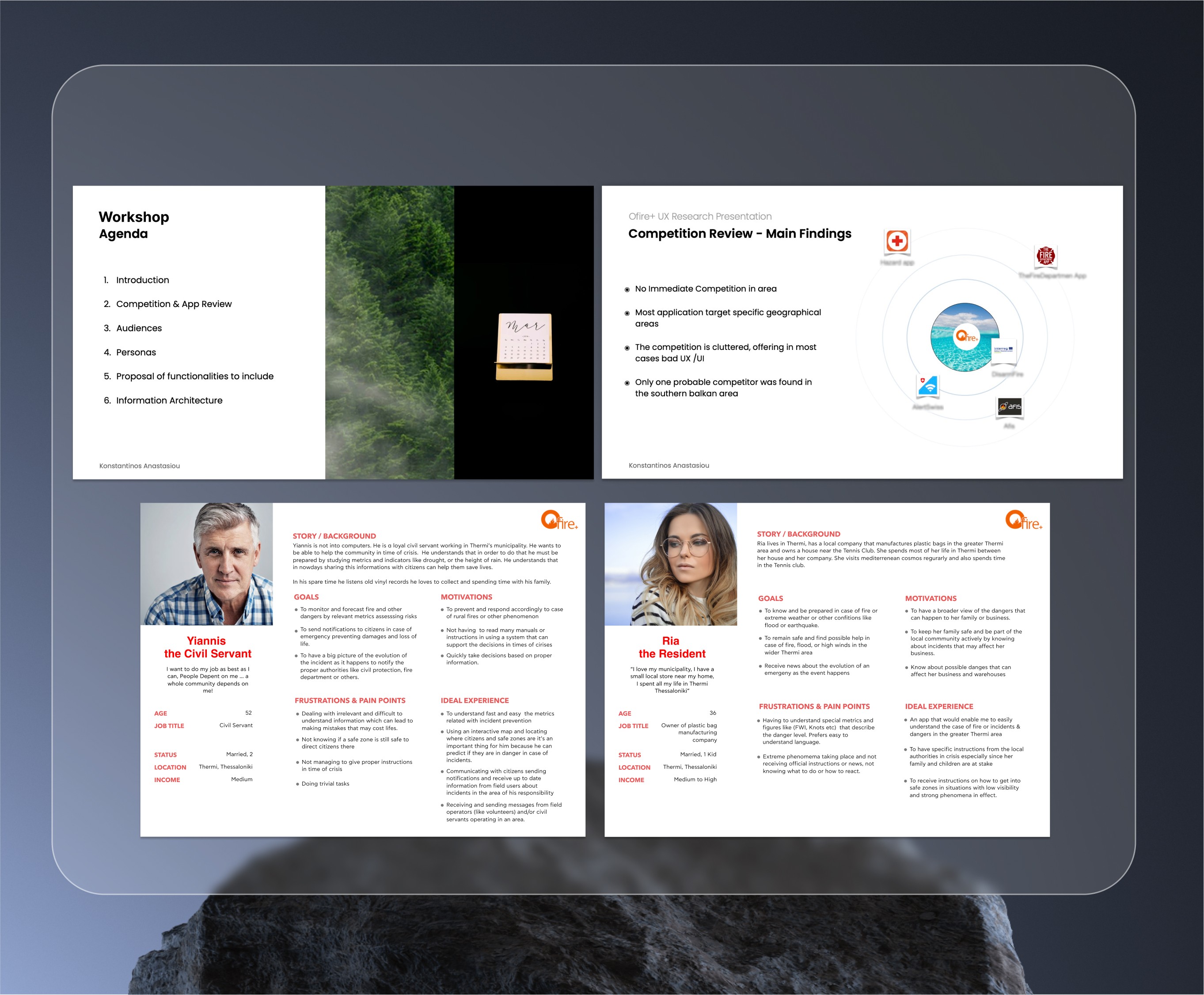
I researched competitive hazard prevention apps from various regions, using these insights to inform our design proposal. While most apps performed well on a cognitive level, they often struggled with information overload. Aesthetically, many apps fell short, resulting in usability issues, with only a few exceptions. This analysis helped us identify gaps and opportunities for improvement in our own solution.
User Interviews and Personas
To ensure our design addressed real-world needs, we interviewed key user groups, including municipality employees, local authorities, and firefighters. We also prioritized feedback from field volunteers, who play a critical role during crises and emergencies. These interviews, guided by semi-structured questionnaires, allowed us to define audience segments and their unique requirements clearly.
The insights we gathered directly influenced our design decisions, leading to a robust Information Architecture and user flows tailored to user needs and pain points. We presented these findings to the product team in collaborative workshops, which aligned the team’s focus and ensured that our efforts were centered around delivering a solution that truly met user expectations.
UX Wireframing
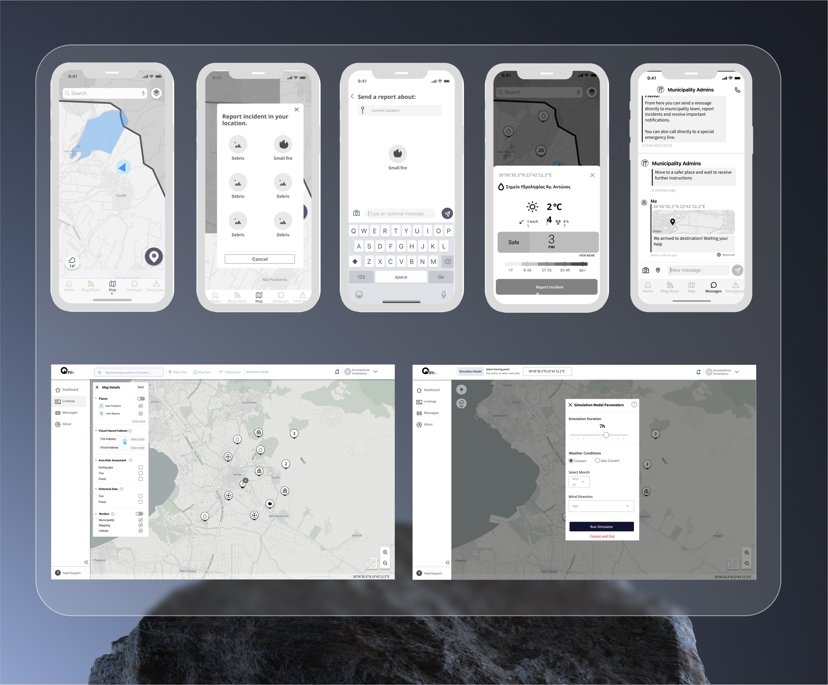
I used wireframes to help the team visualize the proposed solution and involved developers early on. This approach made it easier to implement changes without incurring additional costs, fostering better collaboration and ensuring the team stayed aligned throughout the project.
Discovery and Research
The project kickoff involved multiple workshops with the product team. These sessions aimed to understand the product's vision, business logic, and previously researched pain points. We also elaborated on existing research and assumptions the product team had already made.
Cognitive Walkthrough
When our collaboration began, the product already had an MVP launched. I conducted a thorough UX review (cognitive walkthrough) of the existing solution, noting everything that could be useful later. I also performed a heuristic evaluation, though with less detail due to the impending redesign. Telemetry and user feedback were taken into consideration for the design We cross-checked our findings against the business's needs and the product's vision.

Competition Benchmark
I researched competitive hazard prevention apps from various regions, using these insights to inform our design proposal. While most apps performed well on a cognitive level, they often struggled with information overload. Aesthetically, many apps fell short, resulting in usability issues, with only a few exceptions. This analysis helped us identify gaps and opportunities for improvement in our own solution.
User Interviews and Personas
To ensure our design addressed real-world needs, we interviewed key user groups, including municipality employees, local authorities, and firefighters. We also prioritized feedback from field volunteers, who play a critical role during crises and emergencies. These interviews, guided by semi-structured questionnaires, allowed us to define audience segments and their unique requirements clearly.
The insights we gathered directly influenced our design decisions, leading to a robust Information Architecture and user flows tailored to user needs and pain points. We presented these findings to the product team in collaborative workshops, which aligned the team’s focus and ensured that our efforts were centered around delivering a solution that truly met user expectations.
UX Wireframing
I used wireframes to help the team visualize the proposed solution and involved developers early on. This approach made it easier to implement changes without incurring additional costs, fostering better collaboration and ensuring the team stayed aligned throughout the project.
Discovery and Research
The project kickoff involved multiple workshops with the product team. These sessions aimed to understand the product's vision, business logic, and previously researched pain points. We also elaborated on existing research and assumptions the product team had already made.
Cognitive Walkthrough
When our collaboration began, the product already had an MVP launched. I conducted a thorough UX review (cognitive walkthrough) of the existing solution, noting everything that could be useful later. I also performed a heuristic evaluation, though with less detail due to the impending redesign. Telemetry and user feedback were taken into consideration for the design We cross-checked our findings against the business's needs and the product's vision.

Competition Benchmark
I researched competitive hazard prevention apps from various regions, using these insights to inform our design proposal. While most apps performed well on a cognitive level, they often struggled with information overload. Aesthetically, many apps fell short, resulting in usability issues, with only a few exceptions. This analysis helped us identify gaps and opportunities for improvement in our own solution.
User Interviews and Personas
To ensure our design addressed real-world needs, we interviewed key user groups, including municipality employees, local authorities, and firefighters. We also prioritized feedback from field volunteers, who play a critical role during crises and emergencies. These interviews, guided by semi-structured questionnaires, allowed us to define audience segments and their unique requirements clearly.
The insights we gathered directly influenced our design decisions, leading to a robust Information Architecture and user flows tailored to user needs and pain points. We presented these findings to the product team in collaborative workshops, which aligned the team’s focus and ensured that our efforts were centered around delivering a solution that truly met user expectations.
UX Wireframing
I used wireframes to help the team visualize the proposed solution and involved developers early on. This approach made it easier to implement changes without incurring additional costs, fostering better collaboration and ensuring the team stayed aligned throughout the project.






The Design
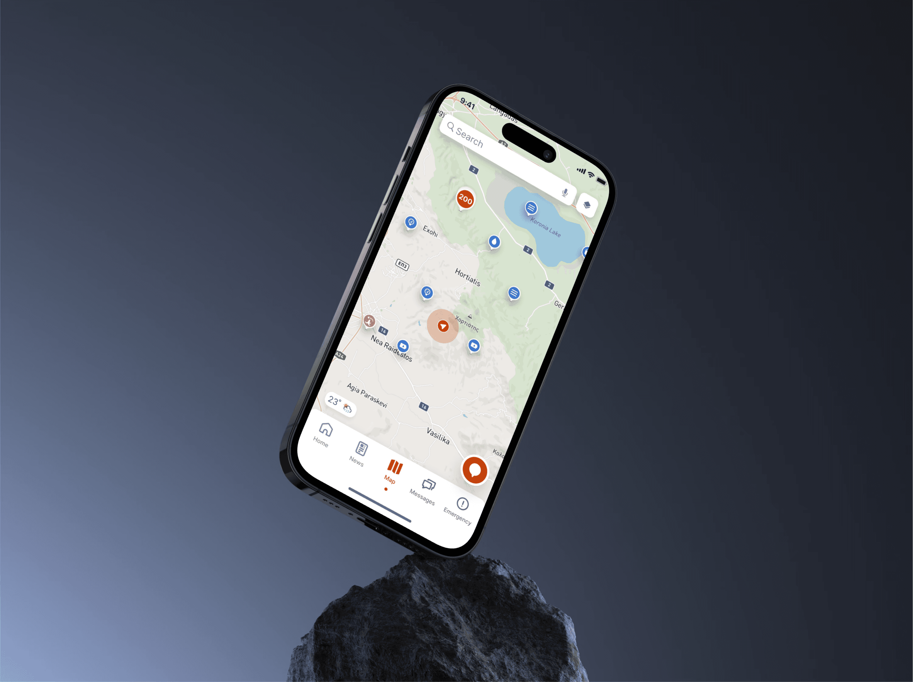
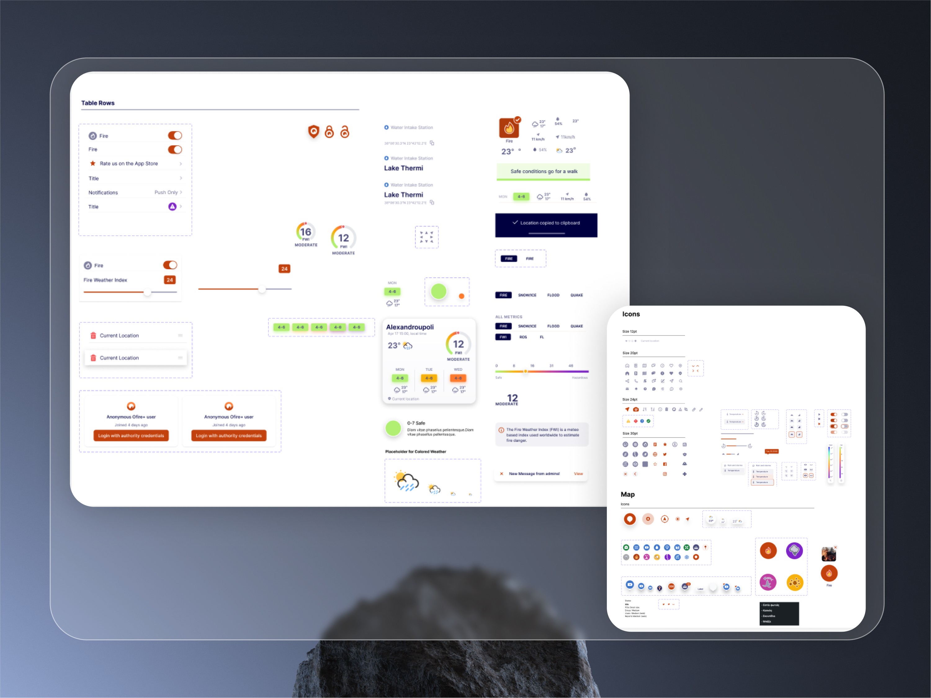
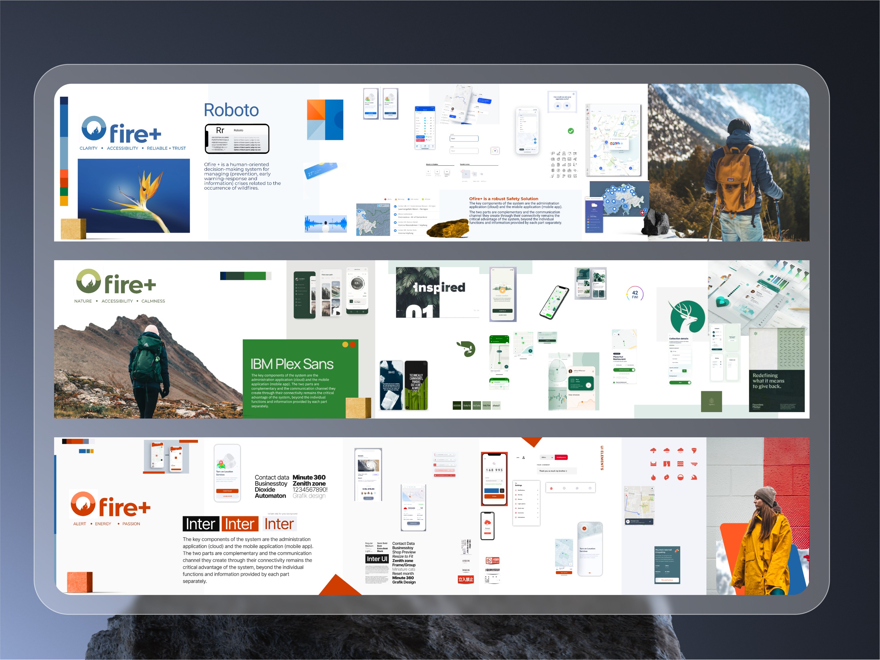
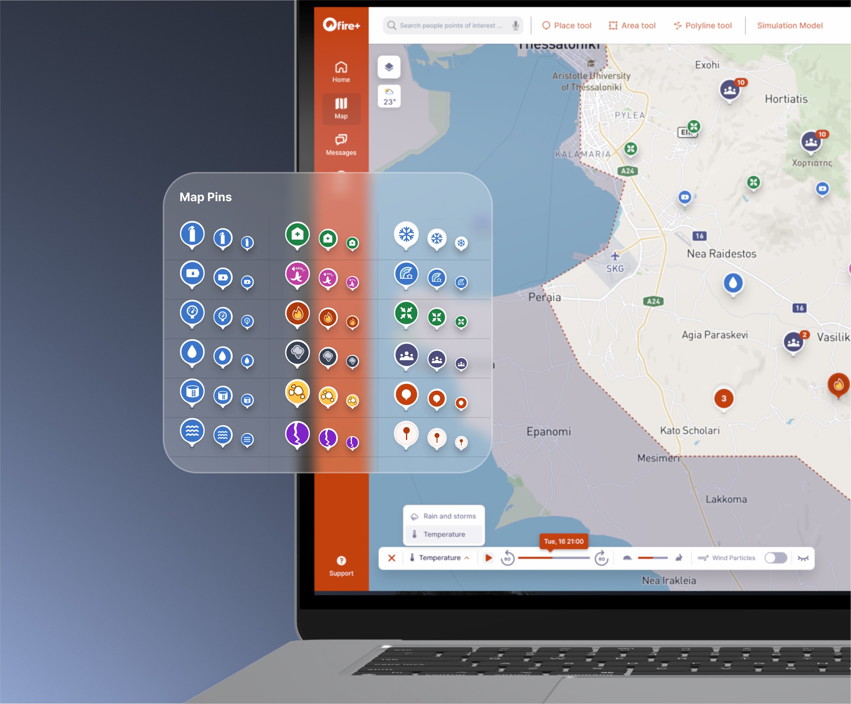
The primary goal of the design concept was to create agnostic components that would facilitate micro-frontend development for the various organizations using the platform. Another key aspect was developing proposals and options for map colors, cartographic details, and visual metaphors. This required dedicated user testing to ensure the map’s UI delivered information in a fast, clear, and consistent manner.
The map’s UI design underwent user testing to ensure that information was presented quickly, clearly, and consistently.
In addition to these challenges, other major considerations included:
• Ensuring accessibility while maintaining an appealing design
• Preserving a consistent design language across all use cases
• Minimizing color use to support potential future white-labeling of the product
Accessibility and Inclusive Design
Accessibility was a critical factor influencing every part of the design. The application needed to be usable by everyone, which meant focusing on appropriate microcopy, font choices, and contrast levels to meet accessibility standards.
Desktop Admin Web App
What gets measured gets managed
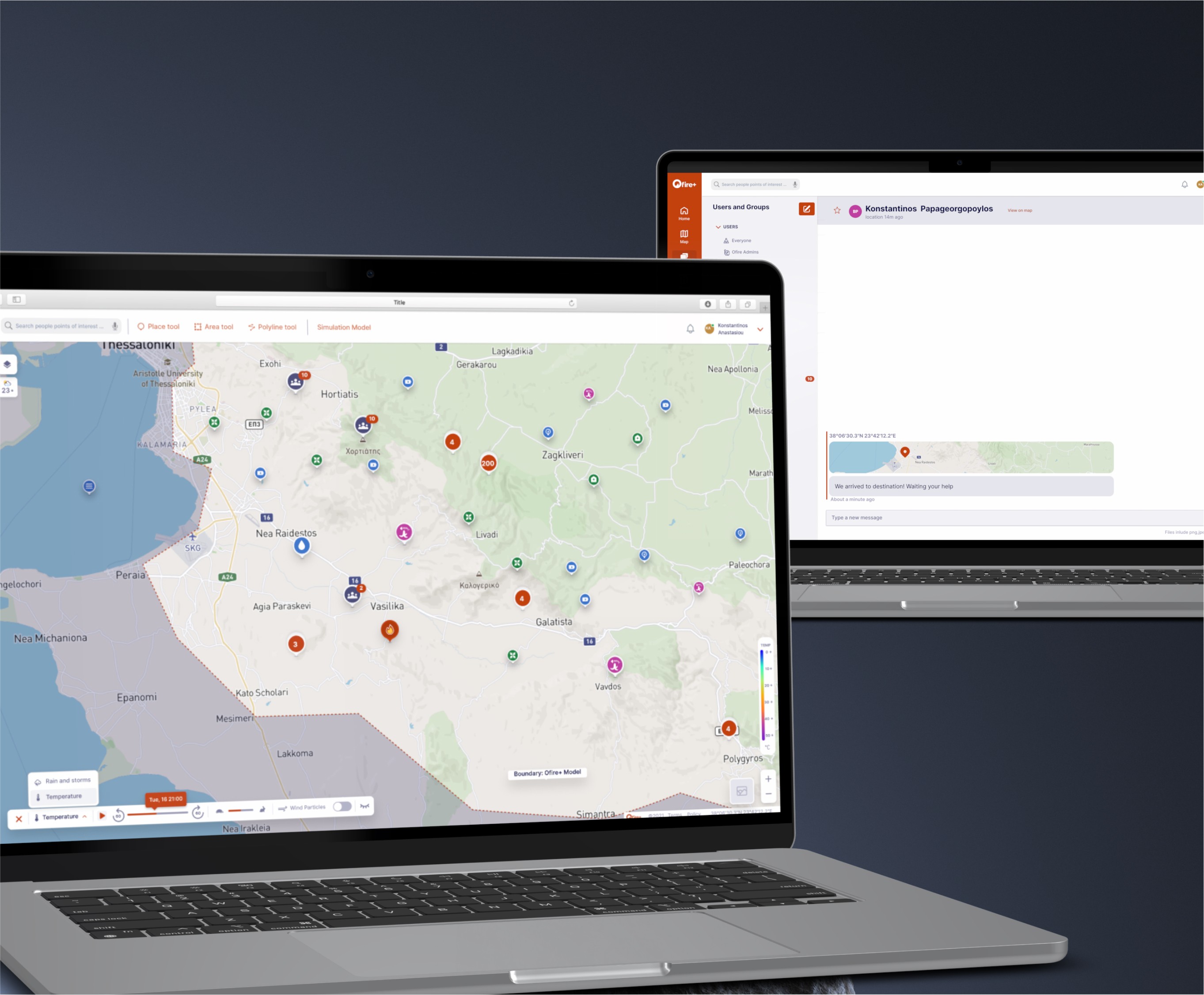
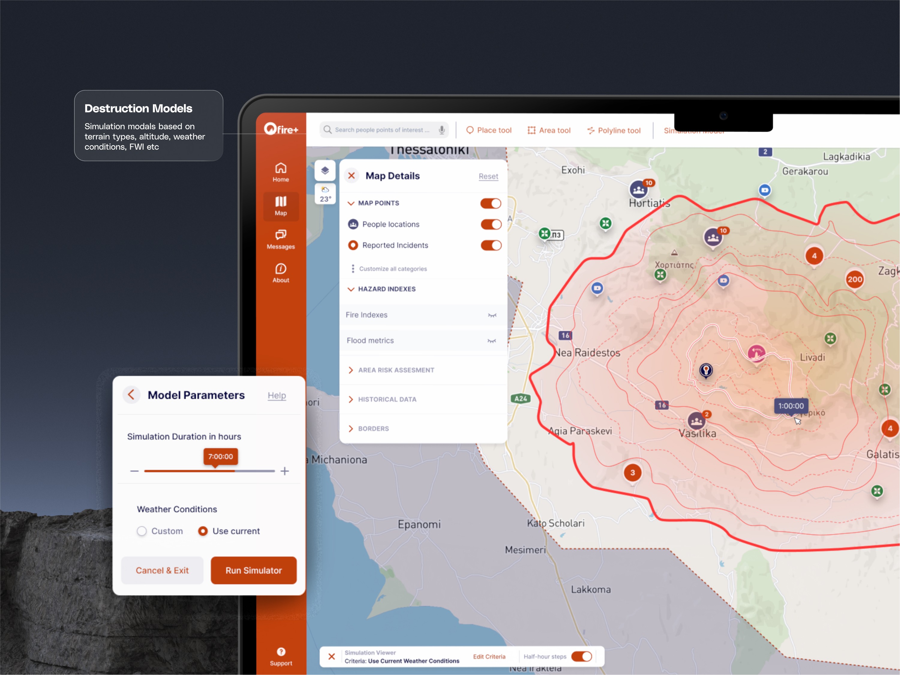
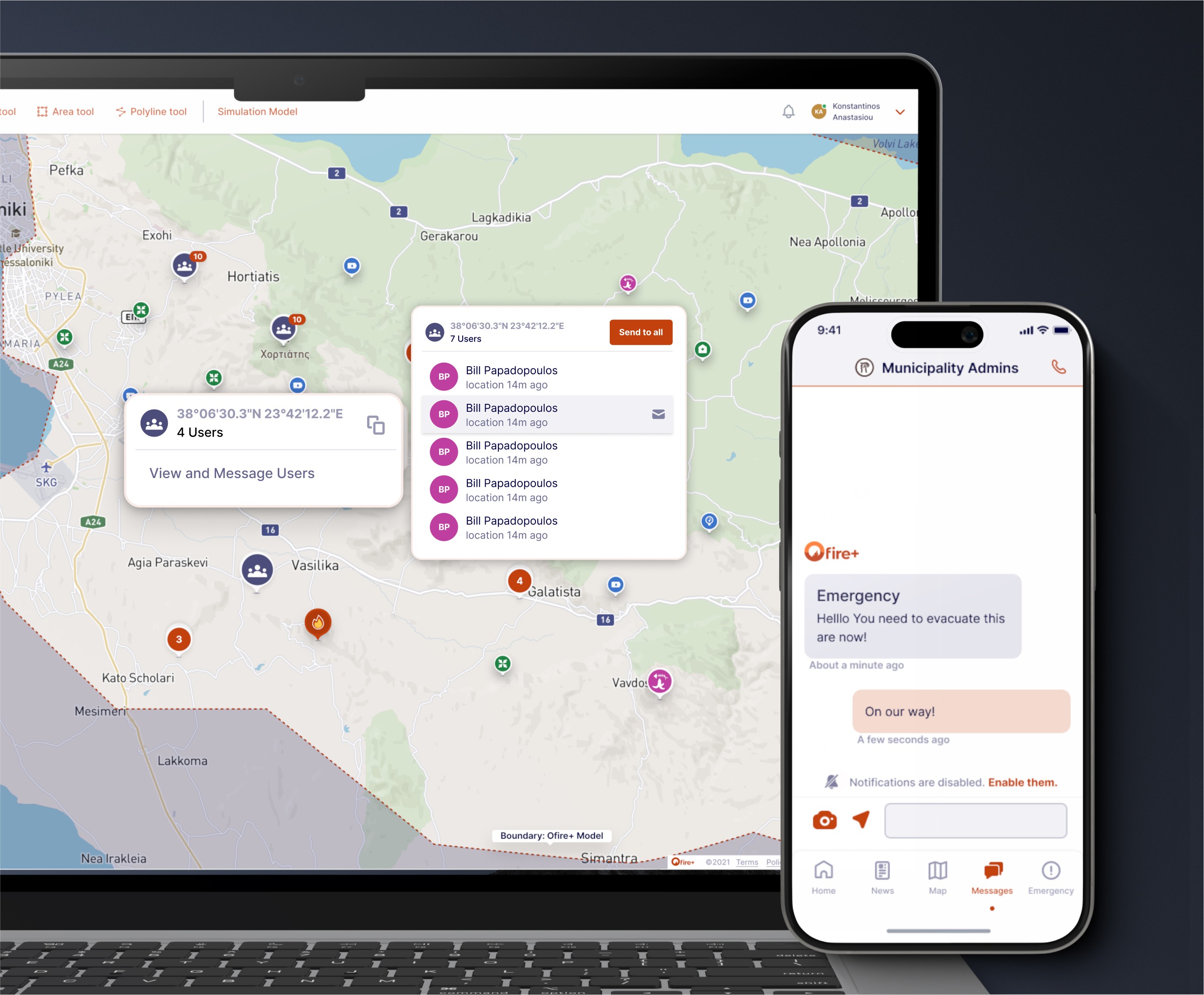
The Admin app, installed at municipal headquarters, was designed for personnel to manage advanced capabilities. Through the platform, administrators could use mathematical models to calculate risks and visualize data in a clear, meaningful way. The app also facilitated communication with field volunteers, who could report incidents or hazards directly to the “War Room.”






The Impact
The product has made a significant impact in preventing fires across Greece and is now being scaled for implementation by numerous other authorities. By empowering these organizations to protect forests and Natura-designated areas, the platform is playing a vital role in safeguarding natural environments.
Stakeholders, public employees, and partners were highly impressed by the quality of the design work, particularly the simplicity and efficiency of the UX in managing complex tasks. The seamless user experience not only enhanced operational efficiency but also strengthened trust and engagement with the platform.
Client Feedback
We selected to work with Konstantinos for the development of the UX/UI design of an innovative wild fire prevention & safety App for a client of our company, Groovyenie PC. From the project on boarding, the solutions he provided to the client's project, the personas isolation to the wireframing and UX/UII, plus the unique and smart features he suggested for the App, which were later added to the App, lead us to deliver a really unique & most beautiful result to our client. During the whole process of the project, he teamed up with smooth and outer professional way with the client's programming team & project manager, leaving a feeling of consistency and reliability. For our next project, he would be the person to work with without further hesitation
Christos Katramados CEO & CoFounder at GroovyGenie.com
