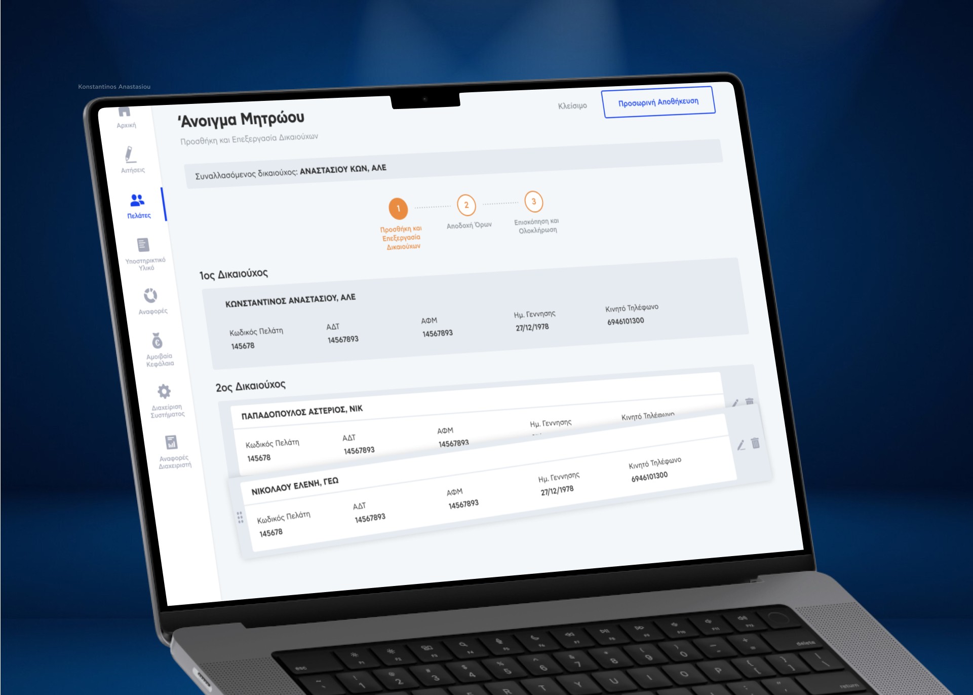
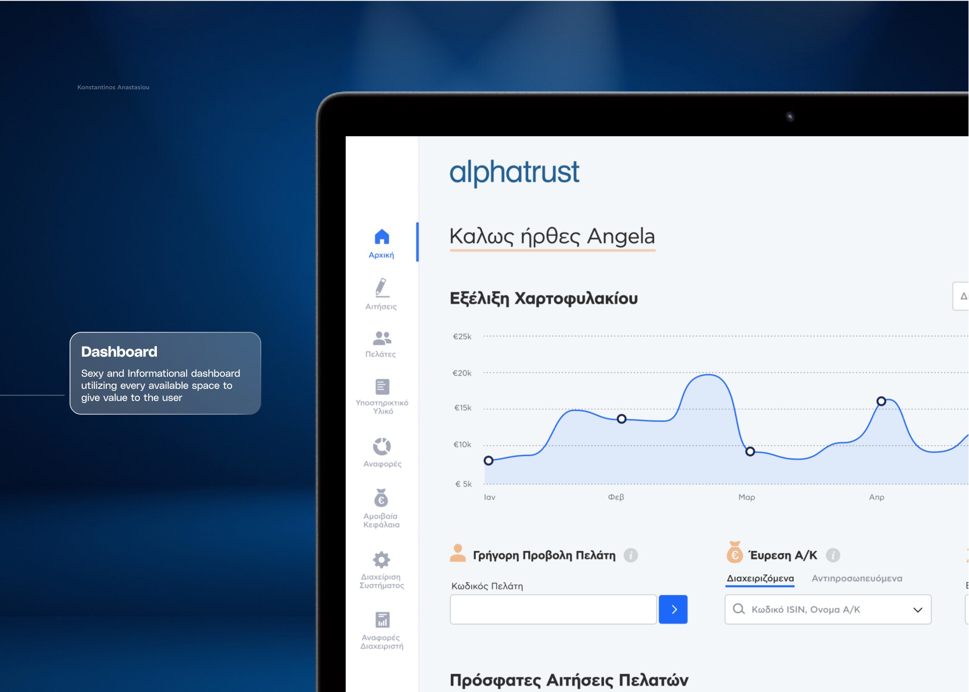
The AlphaTrust platform was developed to simplify mutual fund management for a wide range of users, from board members to new agents. With my background in financial digital products, I brought expertise to this project, helping to shape a platform that combines functionality, security, and accessibility. AlphaTrust now includes comprehensive dashboards, fund registration workflows, and user access management, all designed to address the unique needs of the financial sector.
The AlphaTrust platform was developed to simplify mutual fund management for a wide range of users, from board members to new agents. With my background in financial digital products, I brought expertise to this project, helping to shape a platform that combines functionality, security, and accessibility. AlphaTrust now includes comprehensive dashboards, fund registration workflows, and user access management, all designed to address the unique needs of the financial sector.
The AlphaTrust platform was developed to simplify mutual fund management for a wide range of users, from board members to new agents. With my background in financial digital products, I brought expertise to this project, helping to shape a platform that combines functionality, security, and accessibility. AlphaTrust now includes comprehensive dashboards, fund registration workflows, and user access management, all designed to address the unique needs of the financial sector.
Role
Lead Product UX Design
Client
alphatrust
Year
2019
Services
UX Discovery
UX Design
Agency
Mentions
ATCOM
Development


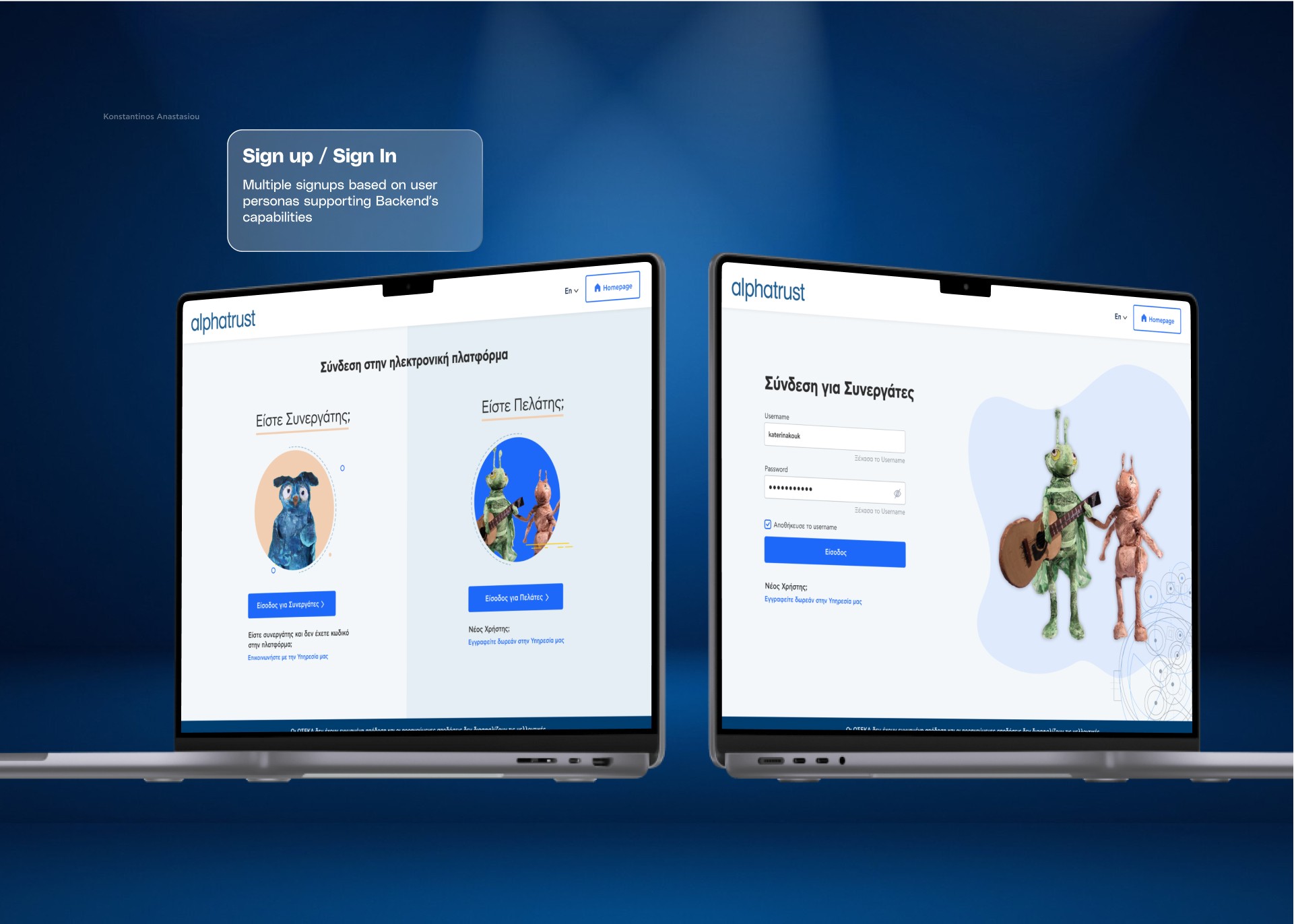


The Problem
Alphatrust needed a platform that could cater to a broad spectrum of users with varying expertise. Some were seasoned finance professionals, while others were new to digital tools. I faced the challenge of balancing different stakeholders’ needs, many of whom had distinct objectives. My goal was to create a product that met each user’s needs while addressing the business’s goals. This required clear communication and a collaborative process to ensure alignment across departments.
Key challenges included:
Diverse User Requirements: Different levels of expertise among users called for a design that was both functional and approachable.
Stakeholder Coordination: Varied objectives from multiple departments required alignment to achieve a unified product vision.


The Sollution Process
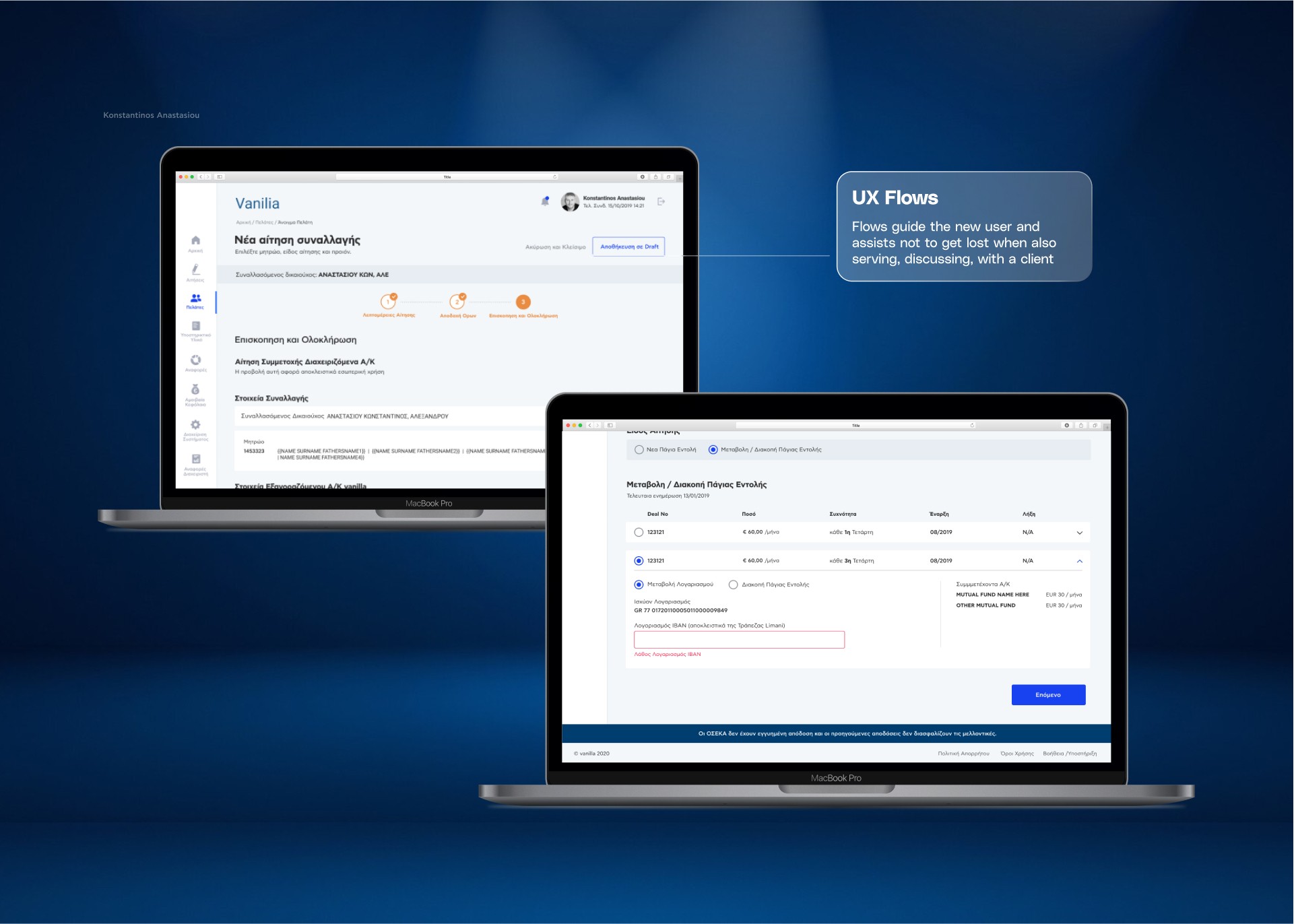
To tackle this project, I began by establishing a high-level information architecture, mapping out primary and secondary flows to create a well-organized structure that could expand with future features.
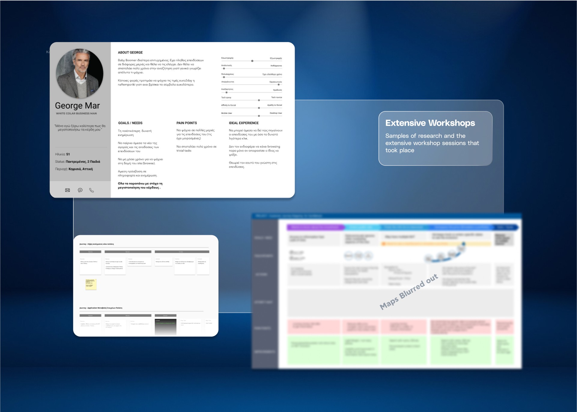
Workshops were essential to the process. I led sessions with stakeholders from sales, compliance, and development, capturing each team’s unique requirements and challenges. These workshops weren’t just for gathering input—they were collaborative problem-solving sessions. I frequently presented early wireframes to ensure alignment, allowing stakeholders to see their feedback translated directly into the design.
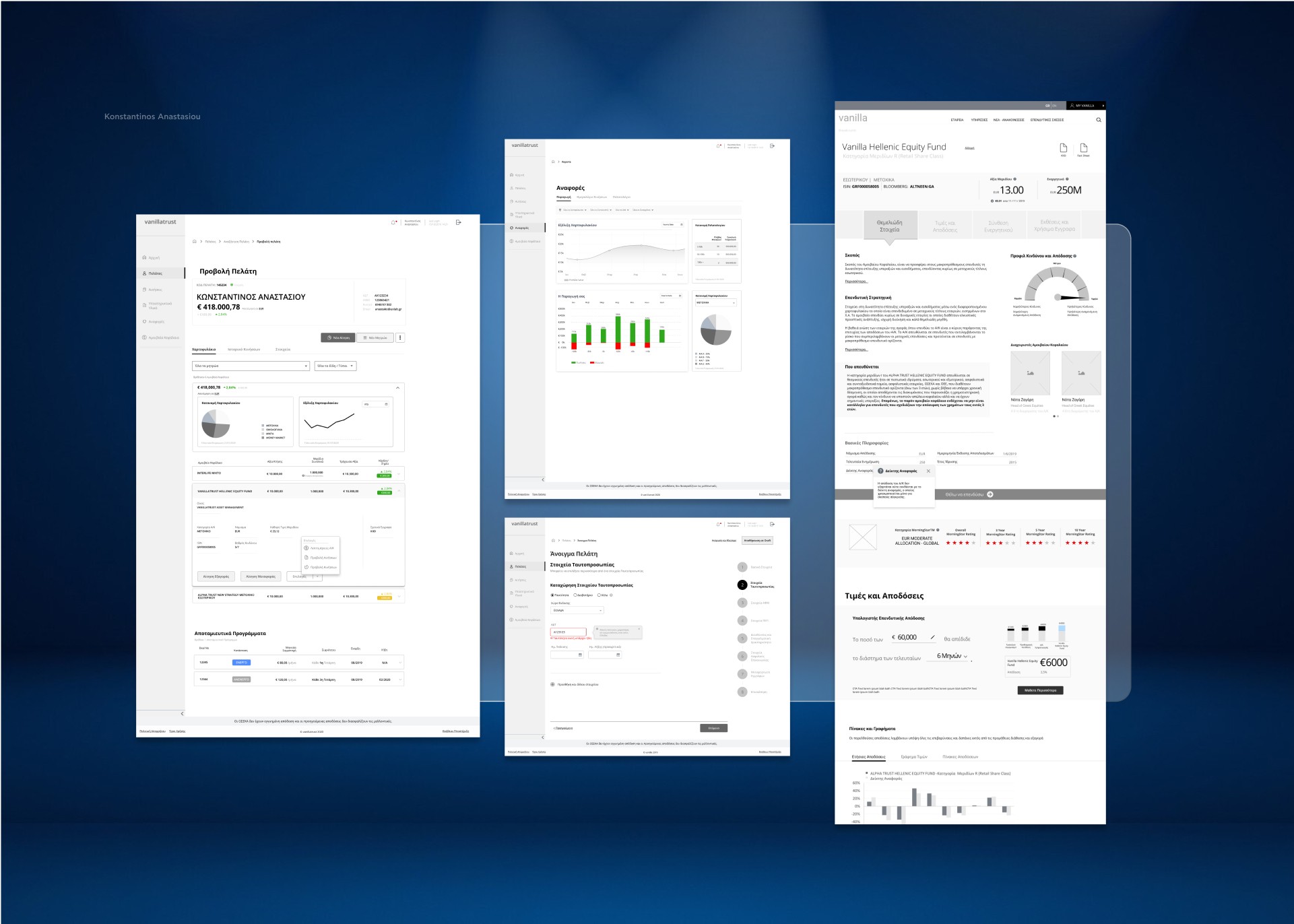
Each screen and flow underwent multiple rounds of testing with real users during the wireframe stage. By observing how users interacted with the flows, I could identify areas for improvement, making adjustments to better align the design with user needs. This iterative testing helped us refine each component, ensuring the platform was intuitive and efficient for all user types before moving into UI development.
With finalized wireframes, I shifted focus to coordinating with the UI and development teams. Although I didn’t handle the final UI design, I provided oversight to ensure that each element matched the intended functionality. In subsequent projects with AlphaTrust, I took on UI design tasks, ensuring that all elements adhered to existing guidelines while enhancing user experience.






Design Rationale
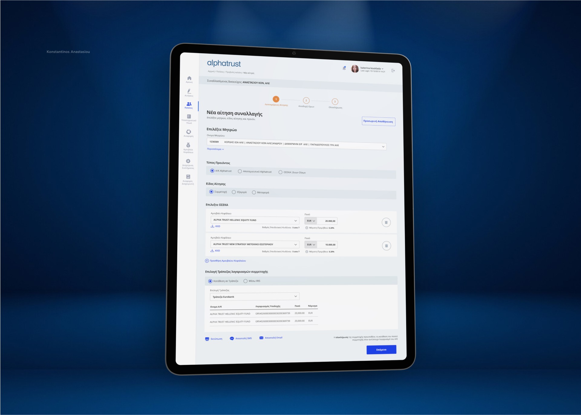
The design approach for AlphaTrust centered around creating a platform that felt supportive rather than overwhelming. Given the nature of mutual fund management, the platform had to be functional in high-stakes situations where agents might be discussing funds directly with clients.
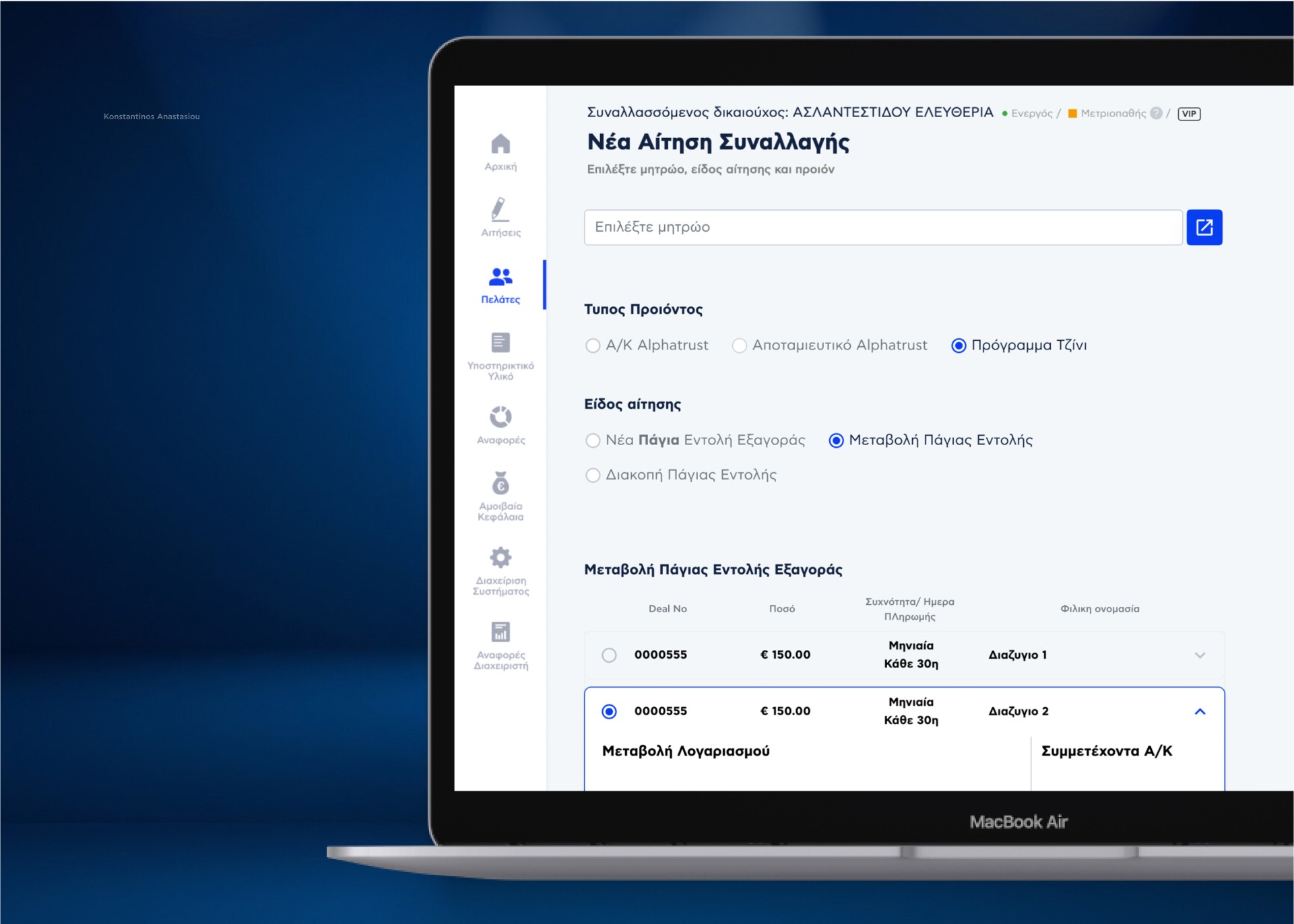
With this in mind, we focused on a minimalist, clean design that allowed key information to stand out without distraction. Fonts were chosen for their clarity, and elements were spaced generously to ensure accessibility and readability across all devices. During the design, I emphasized modularity so that elements could adjust to fit each user’s needs. For instance, some users would require quick access to portfolio summaries, while others might need more detailed, layered information. The modular design allowed us to serve both without cluttering the experience for any one user group.
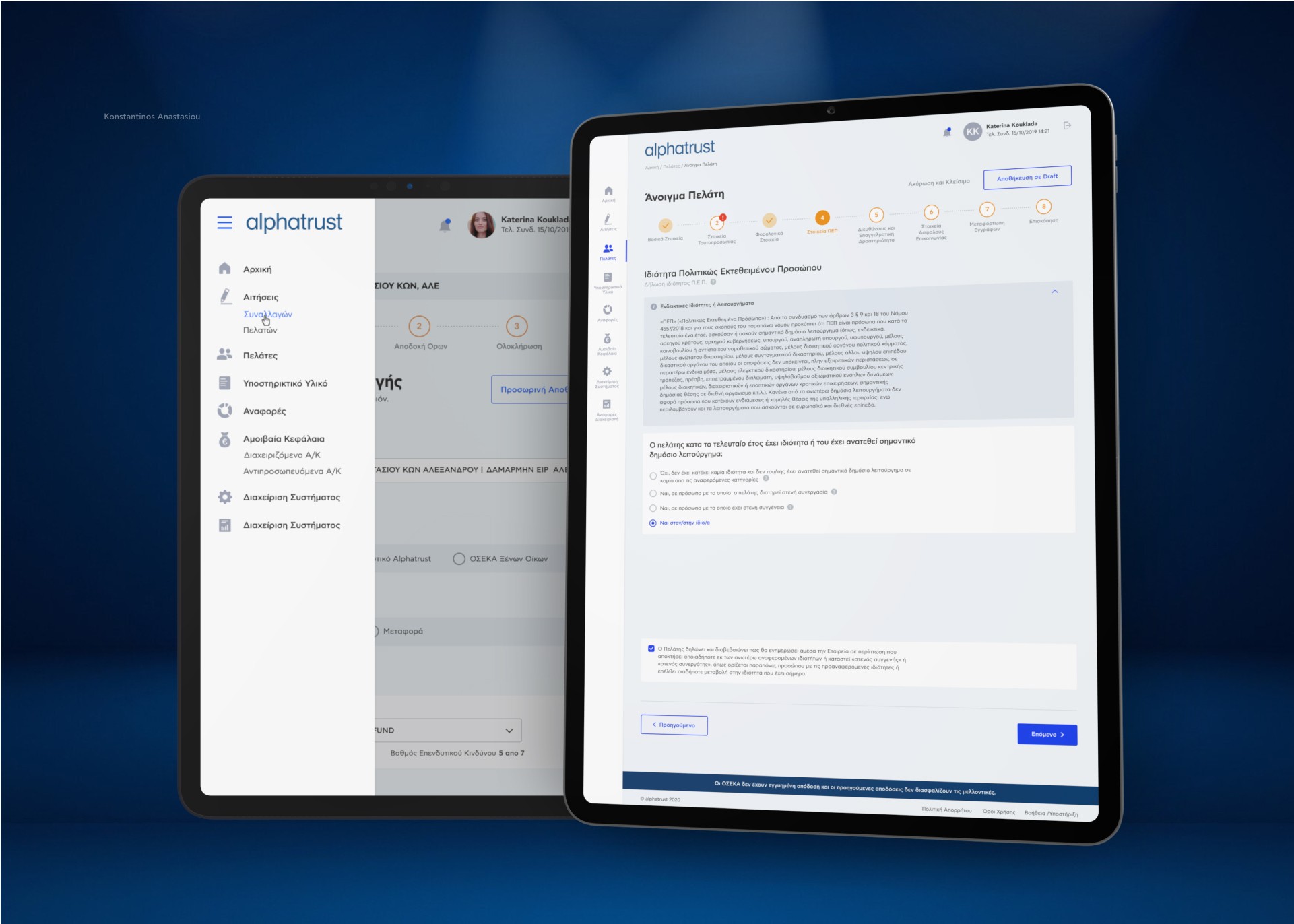
Additionally, through conversations with stakeholders, we discovered that many users lacked extensive technical expertise. As a result, the platform’s design had to be intuitive and approachable, with straightforward navigation and carefully placed prompts to guide users through complex processes.






The Design
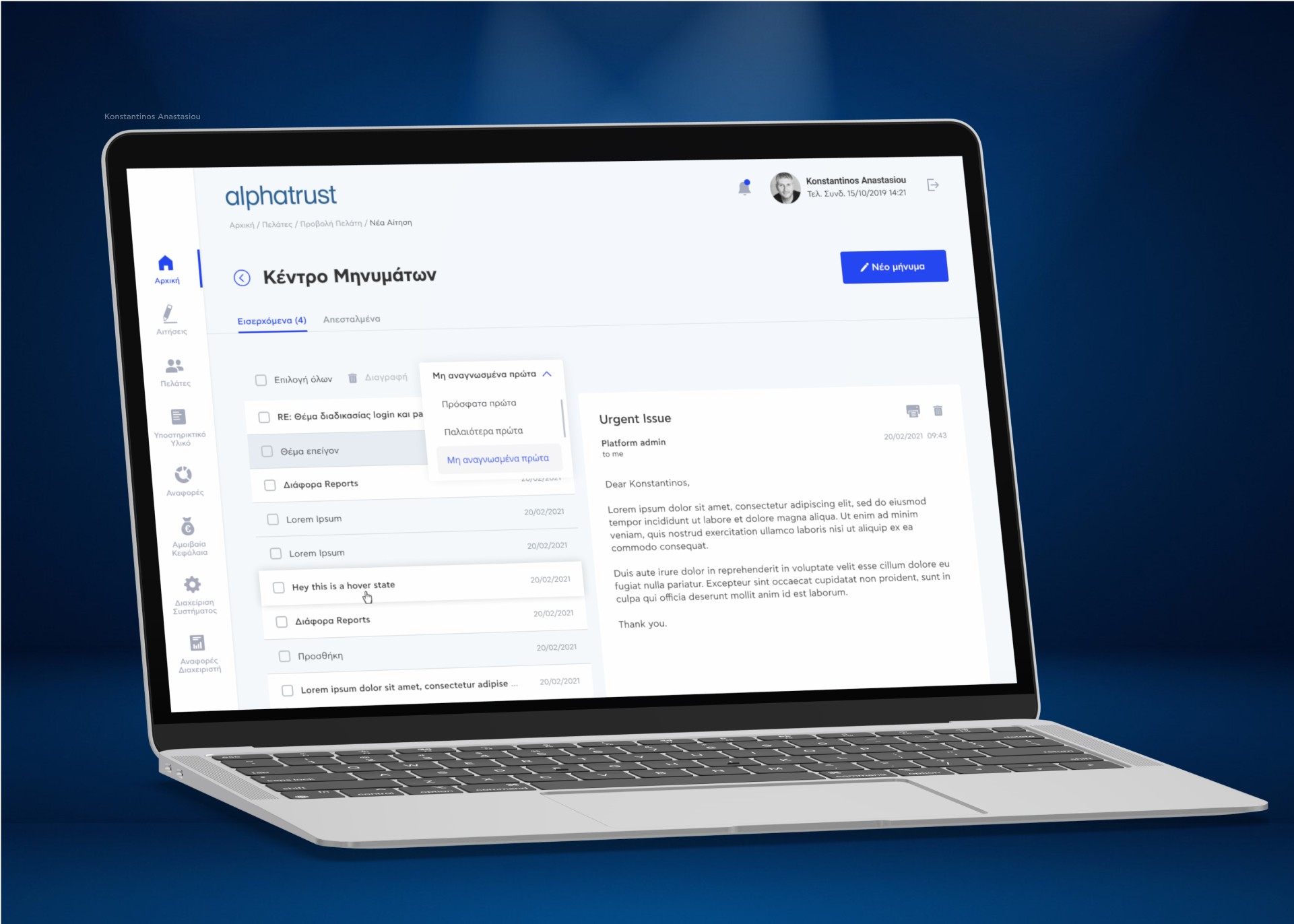
The AlphaTrust platform has led to significant improvements across the organization. By streamlining complex processes, I helped reduce onboarding time for new agents and made daily tasks easier for experienced financial professionals.
One of the most rewarding aspects of this project was the way it improved interdepartmental communication. The workshops didn’t just inform the design—they helped bridge gaps between teams. As a result, departments that rarely interacted began collaborating more effectively, leading to faster, better-informed decisions.
The platform’s user-friendly design also had a direct impact on client satisfaction. Agents found that they could present data more clearly, fostering trust and enabling more productive conversations. This clarity and ease of use contributed to higher client retention and had a measurable positive impact on AlphaTrust’s revenue.
In short, AlphaTrust isn’t just a tool—it’s a platform that has strengthened relationships across the organization and with clients, helping the company grow and adapt in an increasingly digital world.
