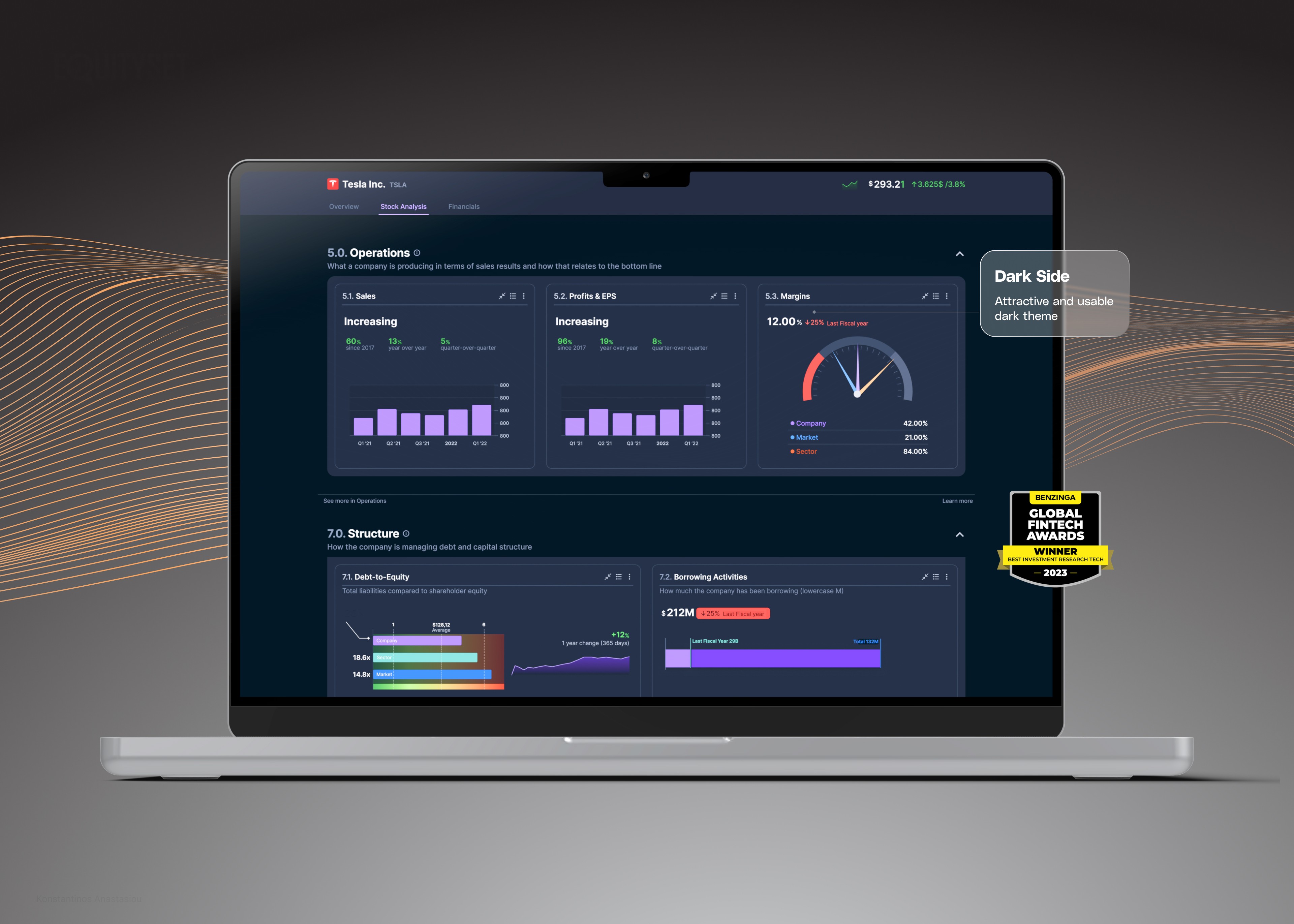
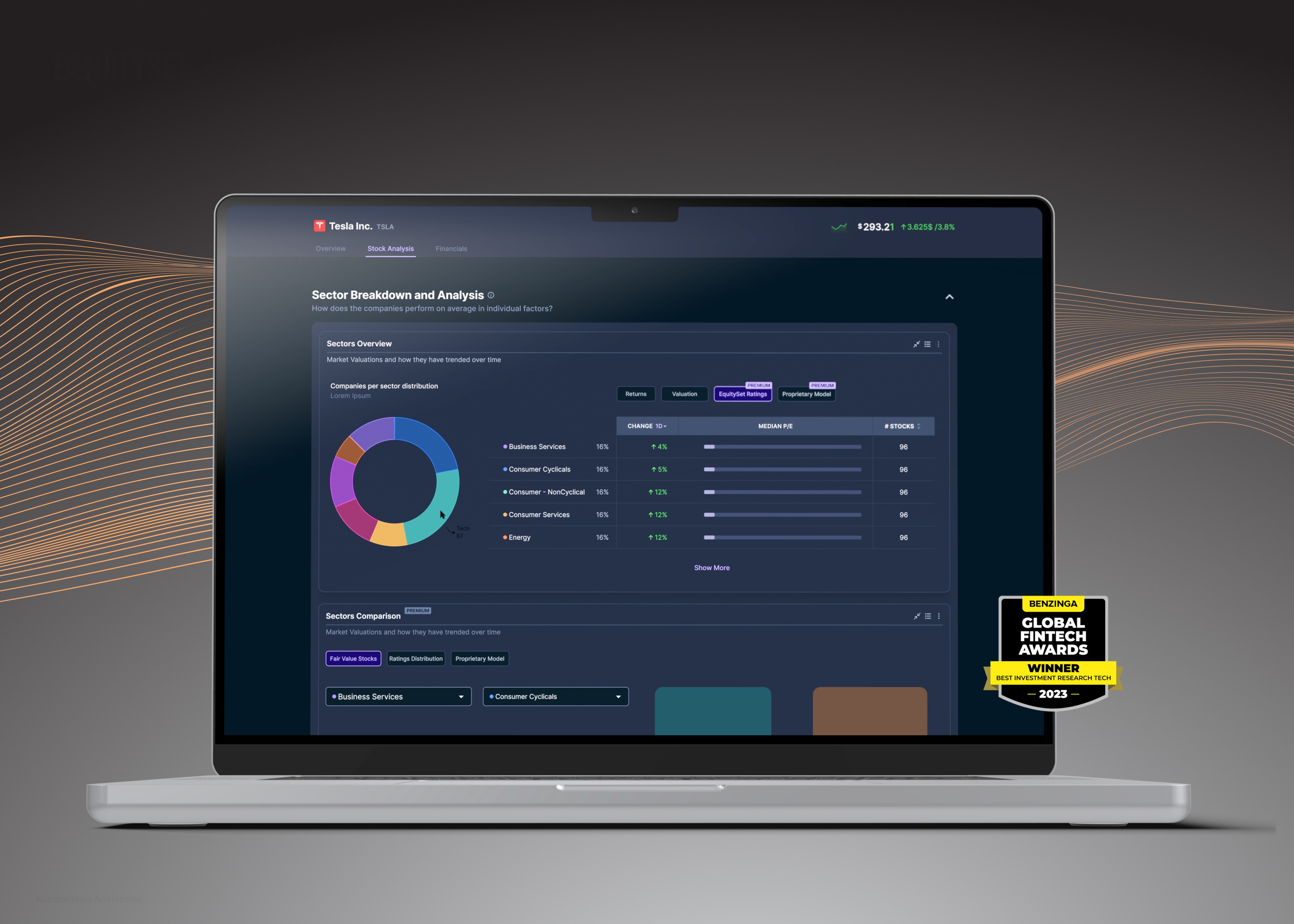
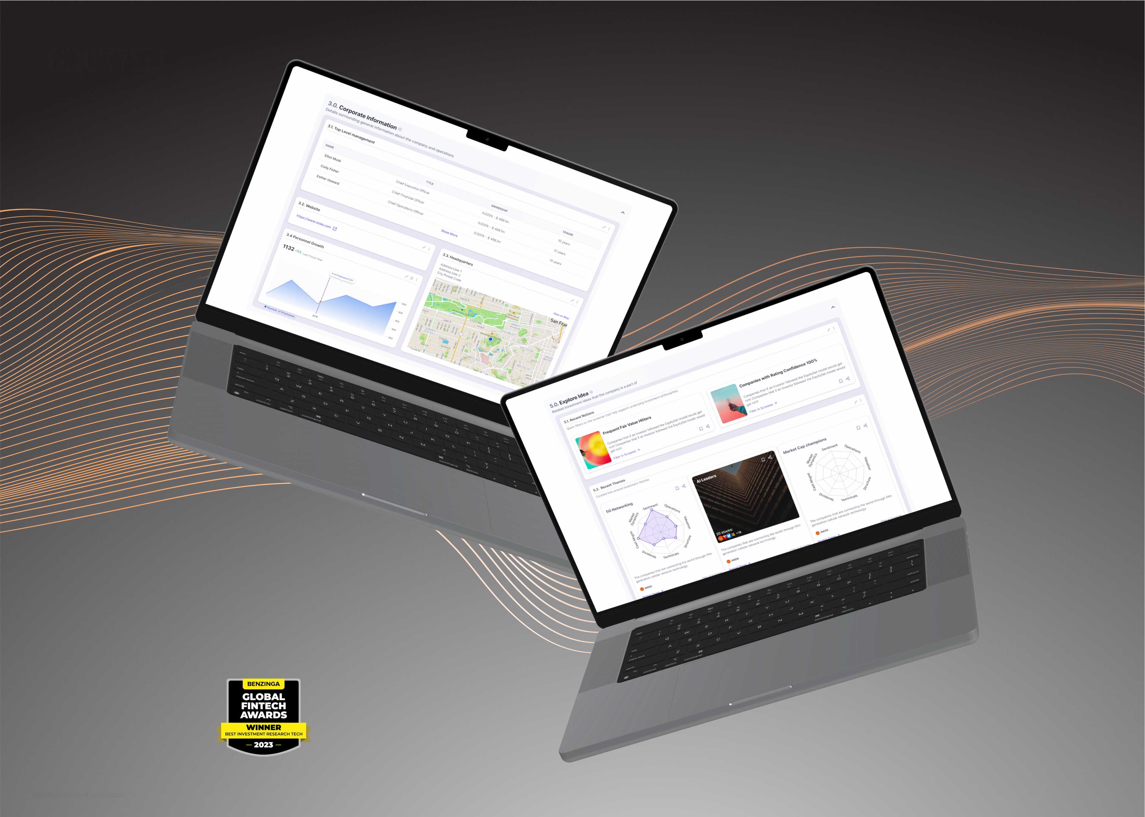
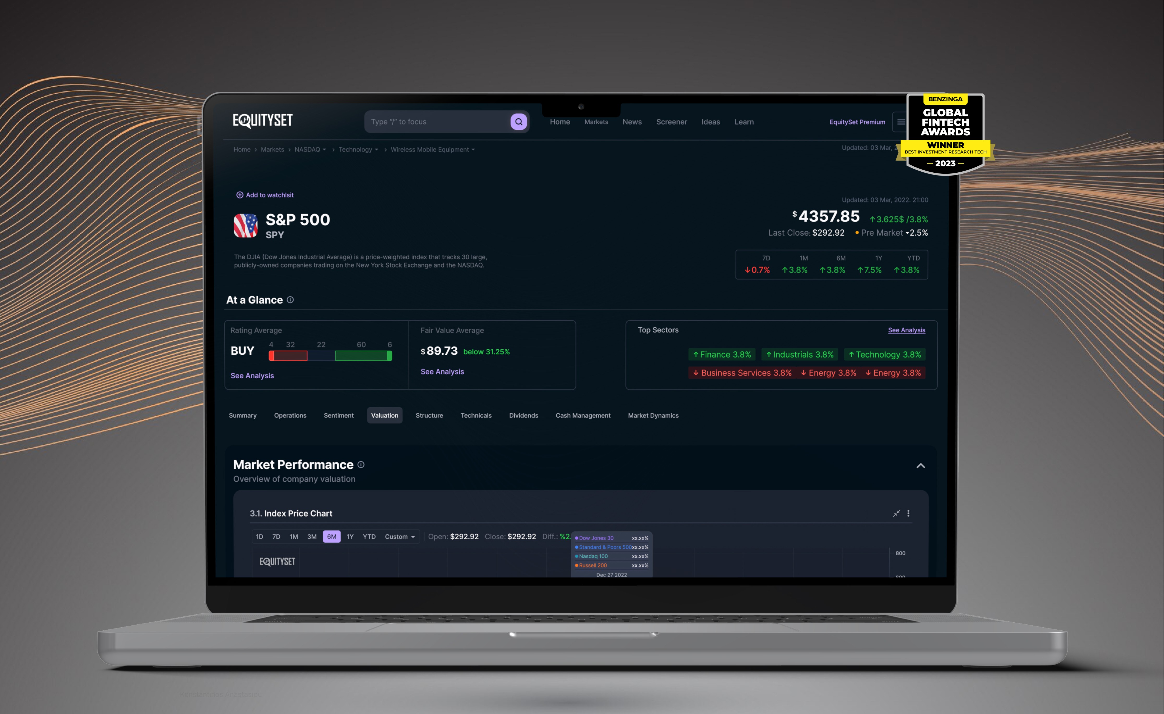
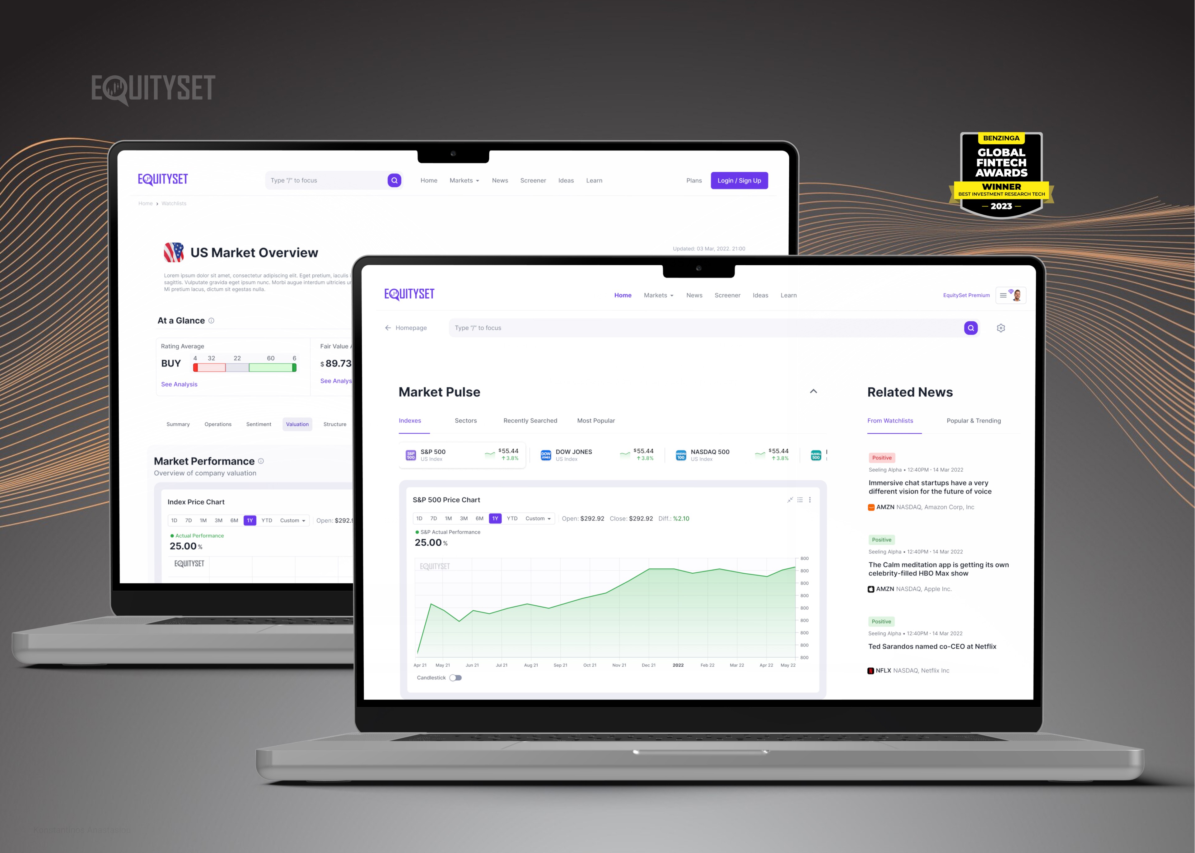
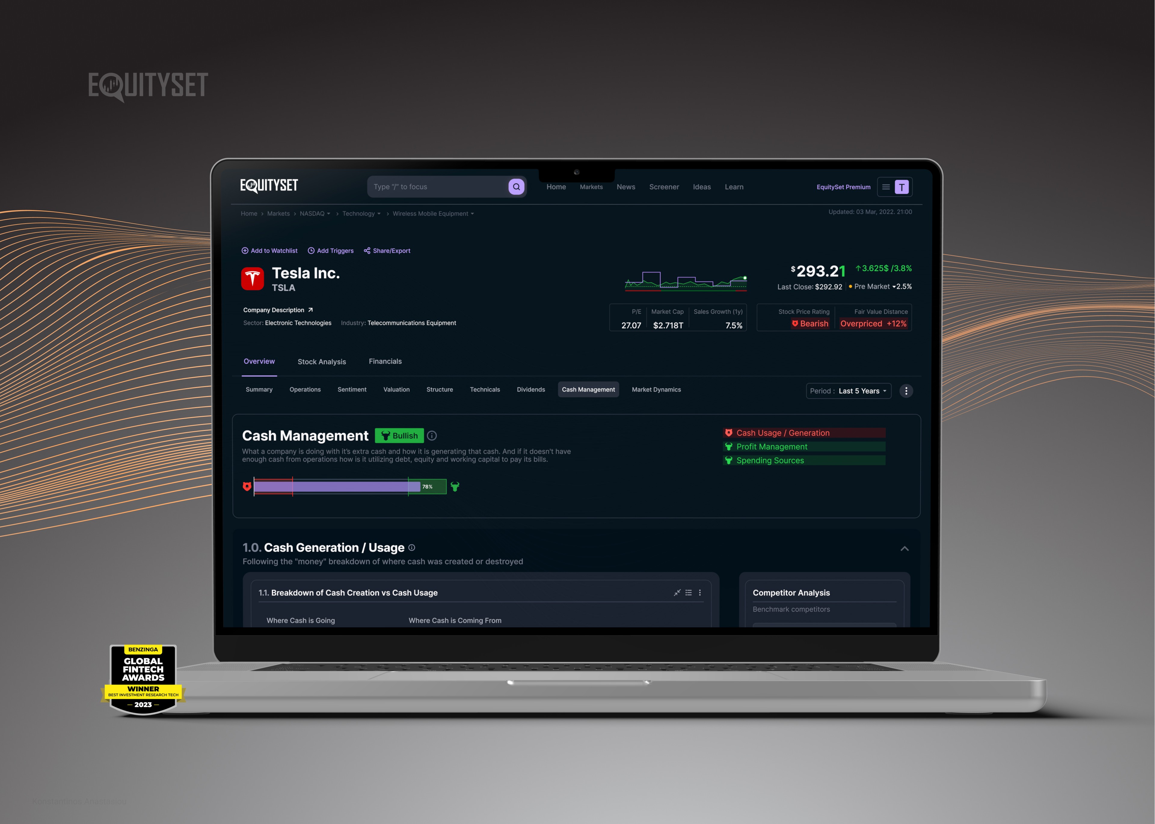
EquitySet is a platform designed to provide detailed stock research and analytics. The objective of this redesign was to enhance the platform's effectiveness, usability, and incorporate EquitySet's unique stock evaluation model. The ultimate goal was to introduce premium tiers and subscription options for users.
The outcome surpassed expectations since not only the business objectives were satisfied but also the platform was awarded with Benzinga Global Fintech 2023 prestigious award.
Role
Product UX/UI Designer
Growth Designer
Client
EquitySet
Year
2022
Services
UX / UI
Data Visualization Design




Understanding the User and Defining the Problem
Research Before Design
The first crucial step involved conducting one-on-one user interviews and consulting industry experts using structured questionnaires. This approach provided deep insights into the specific needs, motivations, and challenges of stock investors and researchers. These interviews highlighted the complexity of the data users must navigate and interpret, revealing a clear need for an intuitive and efficient way to handle and understand intricate data sets.
Stakeholder Workshops
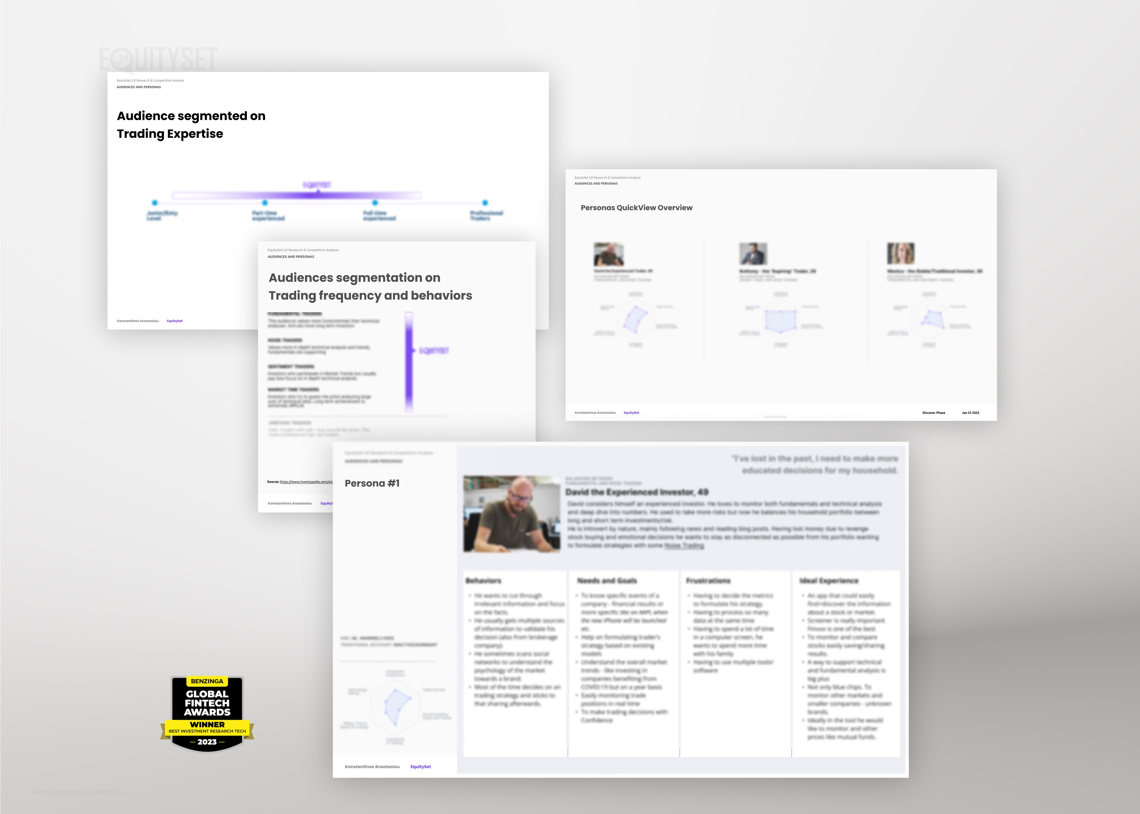
In addition, we conducted multiple workshops with stakeholders to ensure alignment and manage expectations. While I can’t share the actual deliverables due to confidentiality, these sessions were instrumental in gaining a deep understanding of EquitySet’s model. Grasping the nuances of the financial sector and the specifics of the platform—including the original go-to-market strategy and feedback from investor presentations—was essential. This collaborative approach led to a comprehensive understanding of user personas, which guided our design decisions.
Telemetry Analysis
Conducting an in-depth analysis of our existing telemetry was also crucial. While Google Analytics has limitations in providing detailed qualitative insights, it offered valuable indications of user flows on the EquitySet site. We identified key areas where users experienced difficulties. Notably, users frequently navigated back and sought alternative routes, suggesting issues with our navigation flow, call-to-action buttons, or other interface elements that required optimization.
Competitor Analysis
We performed an in-depth competitor analysis to understand how similar platforms address these challenges, uncovering industry best practices and identifying market gaps. This analysis, combined with my nearly 20 years of experience in the finance and banking sector, formed the cornerstone of our approach. By merging external market insights with deep industry expertise, we developed strategies that meet and exceed user expectations, effectively setting our platform apart in a competitive landscape.
Refining the Strategy
This process allowed us to delve deeper into users’ actual needs while highlighting competitors’ strengths and weaknesses. Understanding where competitors excel and where they fall short enabled us to refine our go-to-market strategy and achieve a superior product-market fit. For example, recognizing that competitors often lack customizable data visualization tools, we prioritized developing an intuitive dashboard that caters to individual user preferences.


The Solution
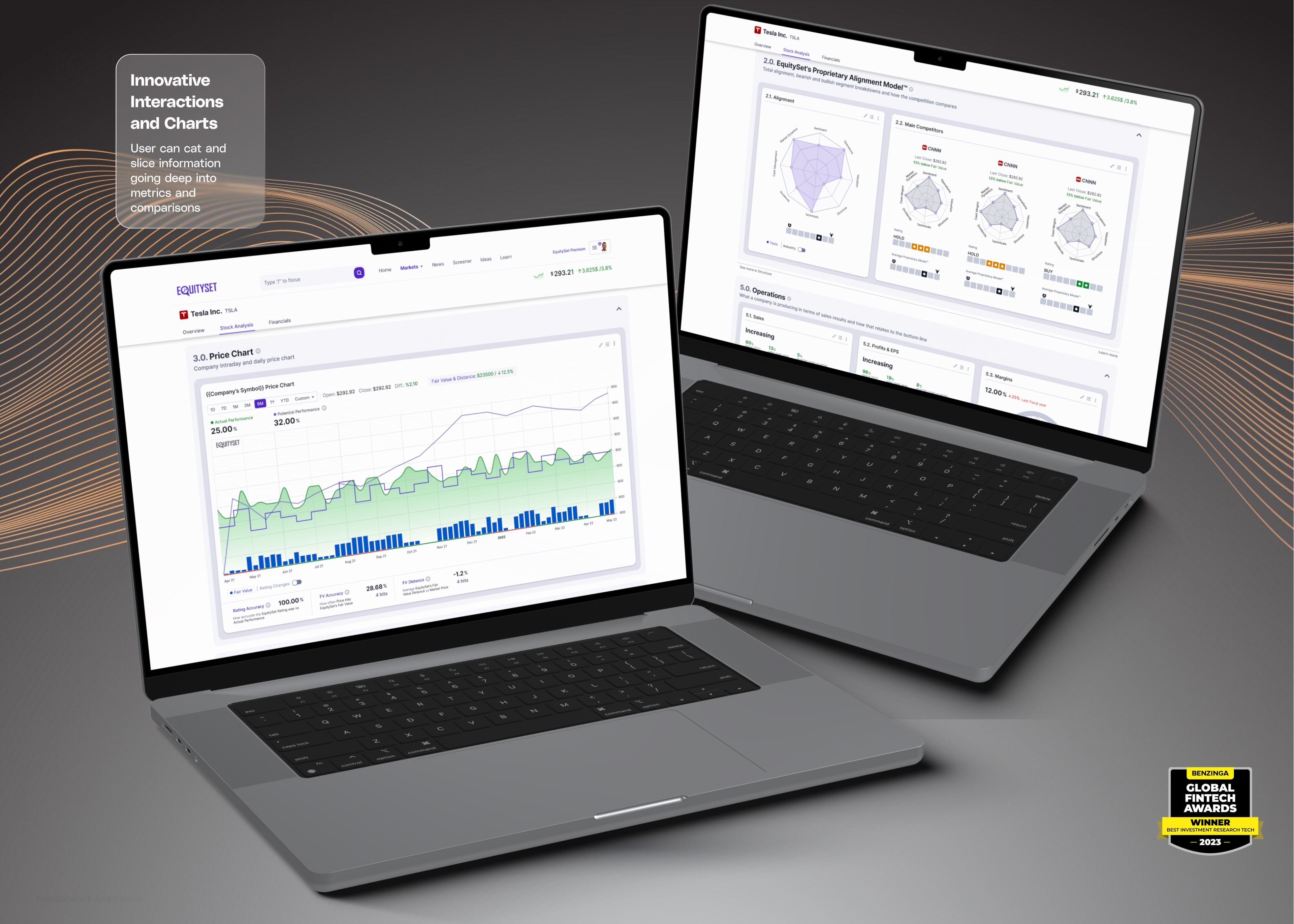
iven the complexity of the data, I knew it was crucial to incorporate effective data visualization into the design. Early on, I collaborated closely with the development team to define micro-interactions within charts and tables. This involved deciding how hover states would display tooltips with additional data, how users could click and drag to zoom into specific timeframes, and how filtering options would instantly update the visualizations. These micro-interactions were essential for making complex data more accessible and interactive.
I meticulously mapped out user flows for key functionalities, such as the stock page, market page, competitor comparison, and the EquitySet model analysis. By crafting detailed personas based on our user research, I ensured that each user flow catered to the needs and behaviors of our target users. For instance, an experienced investor persona might prioritize advanced analytics and customization options, while a novice user might need simplified views and educational tooltips.
The information architecture (IA) went through multiple iterations, balancing the depth of information with ease of navigation. I organized workshops and brainstorming sessions to refine the IA, ensuring users could intuitively find the information they needed without feeling overwhelmed. I created wireframes and shared them with users during usability testing sessions, gathering feedback that was instrumental in refining the designs. This iterative process helped me identify pain points and areas for improvement early on.
I maintained stakeholder engagement throughout the design process. At each stage, I presented the wireframes and prototypes to stakeholders, incorporating their feedback to align the design with business objectives and technical constraints. This collaborative approach ensured the final product met both user needs and company goals.
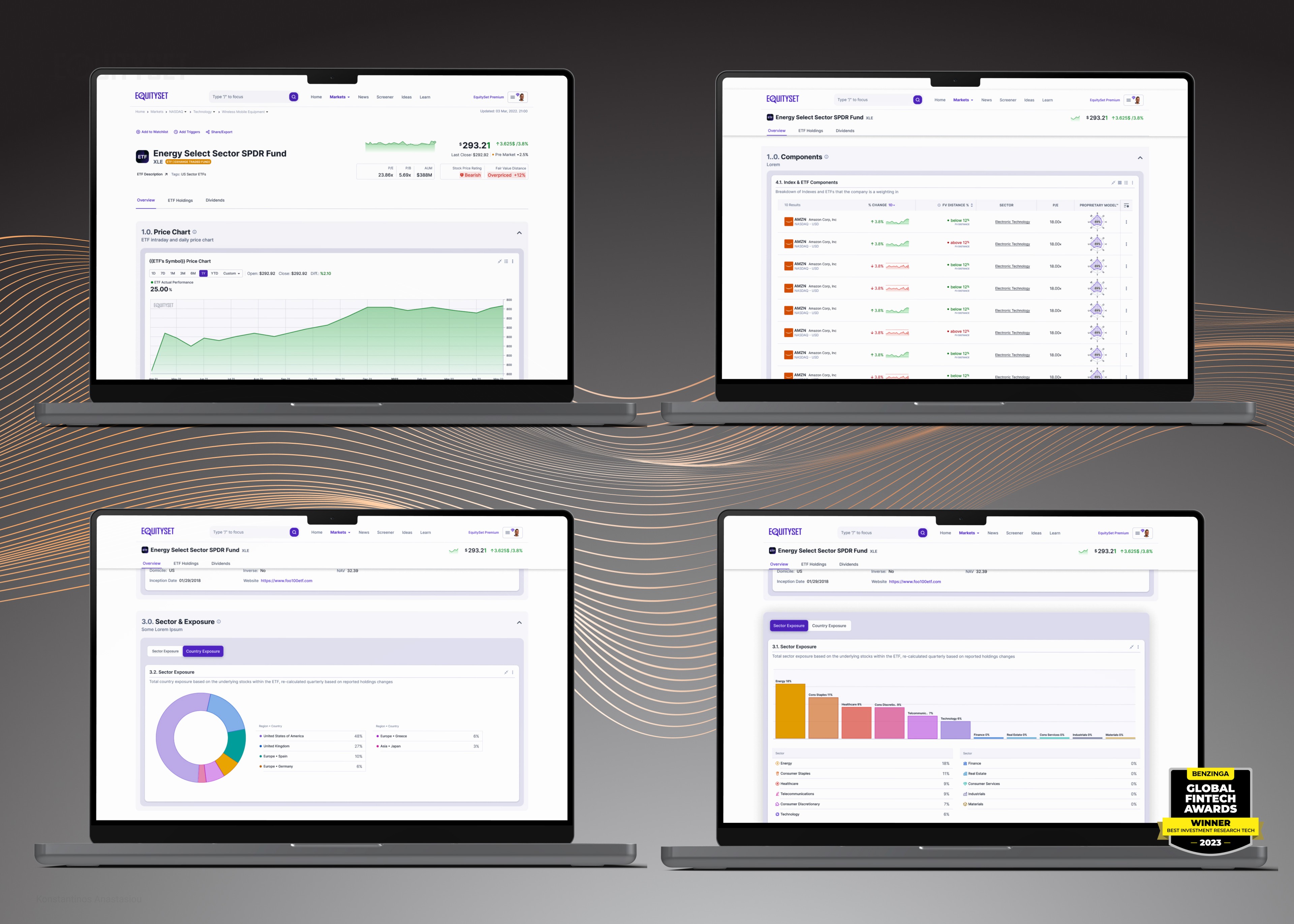
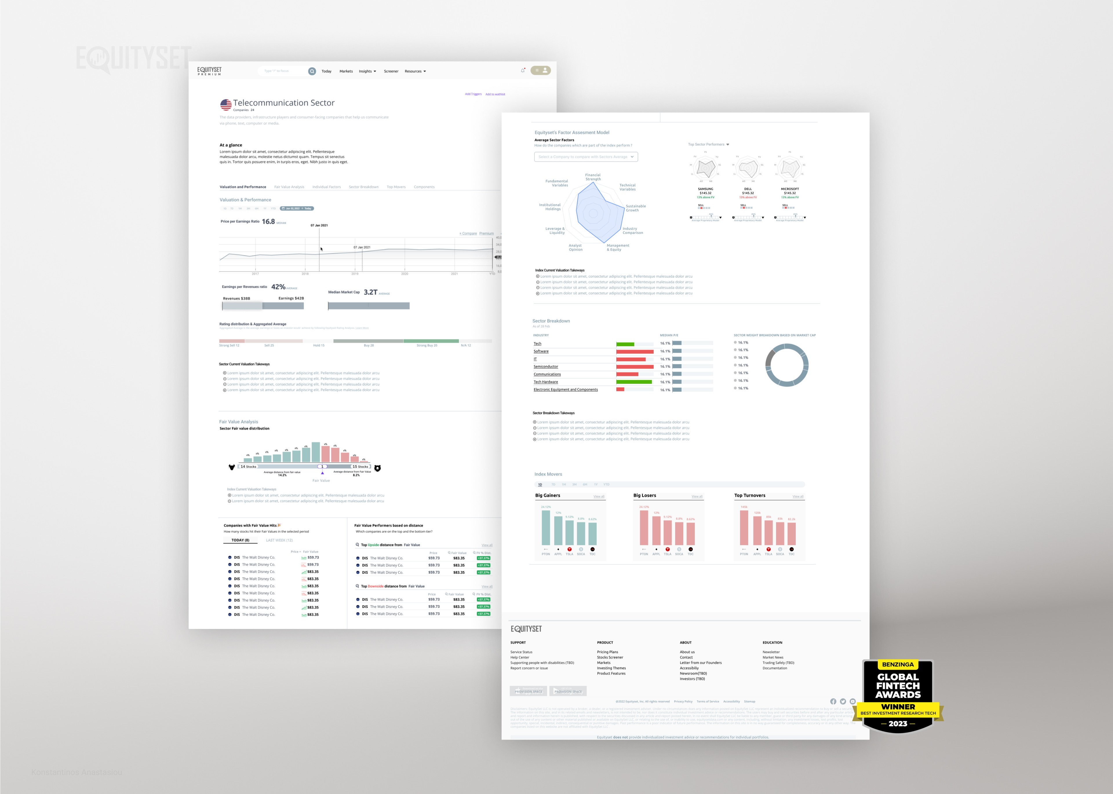
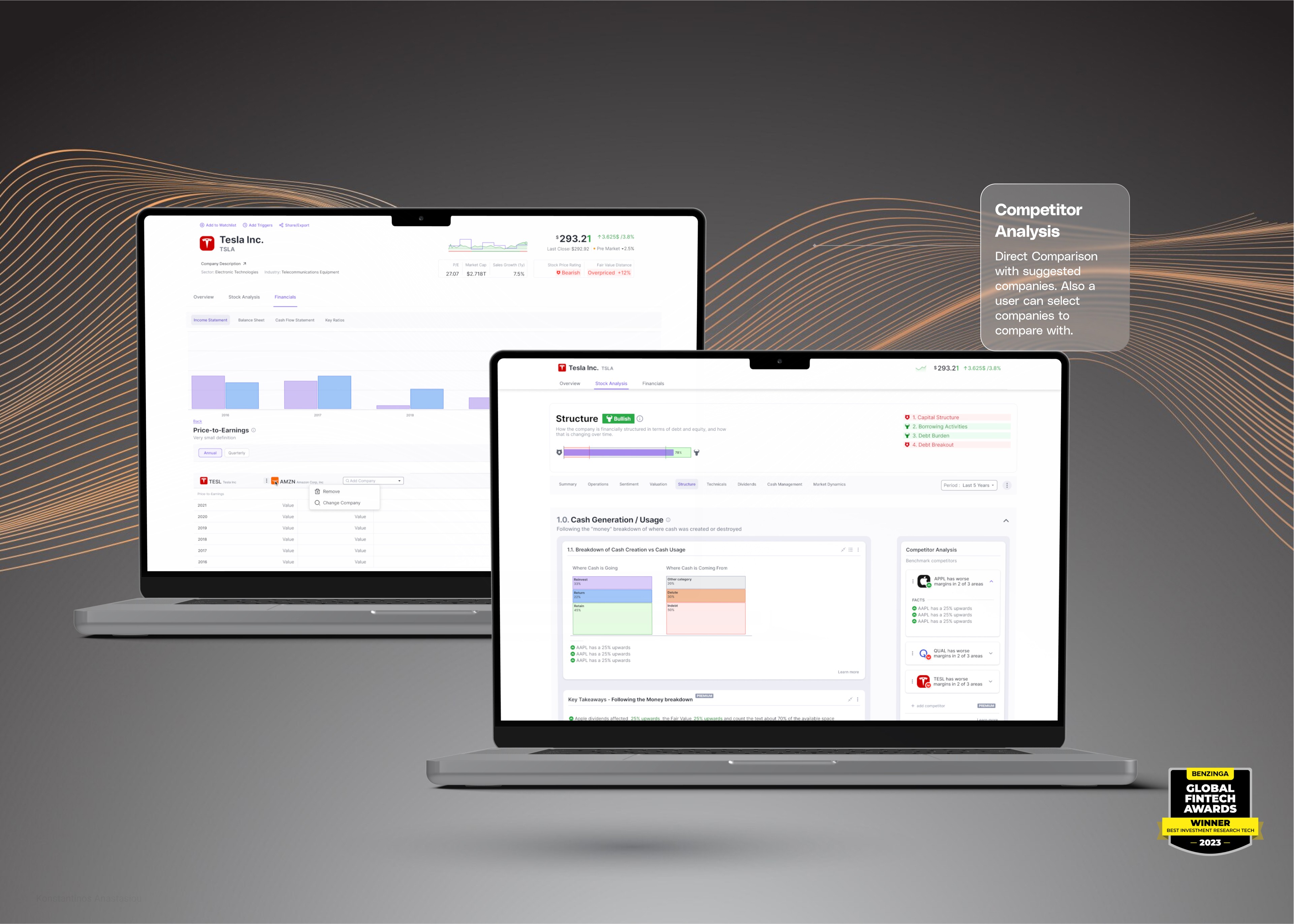
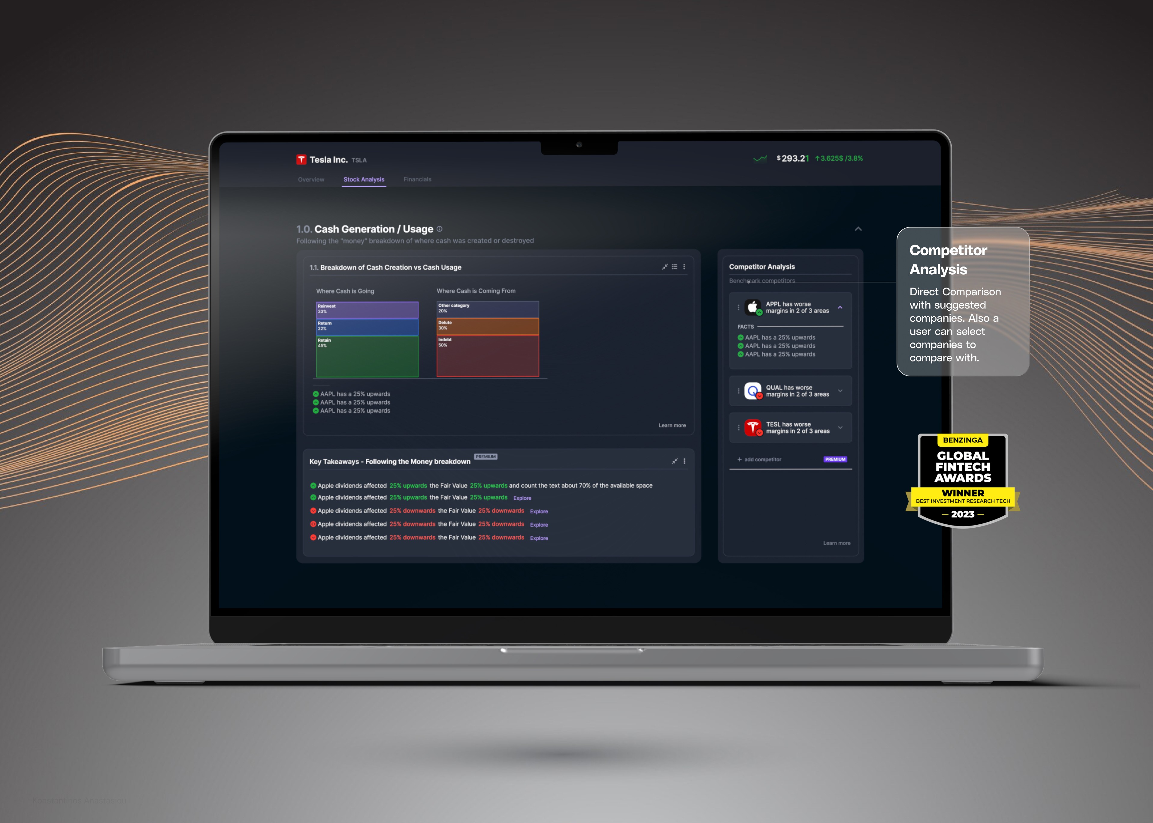
For critical pages like the stock page, market page, competitor comparison, and the EquitySet model analysis, I added more detailed interactions and visual elements. The stock page featured interactive charts with real-time data updates and the ability to compare historical performance over customizable periods. The market page provided a dashboard overview with drill-down capabilities into specific sectors or indices. The competitor comparison allowed users to select multiple companies and view side-by-side metrics, leveraging dynamic tables and charts for clarity.
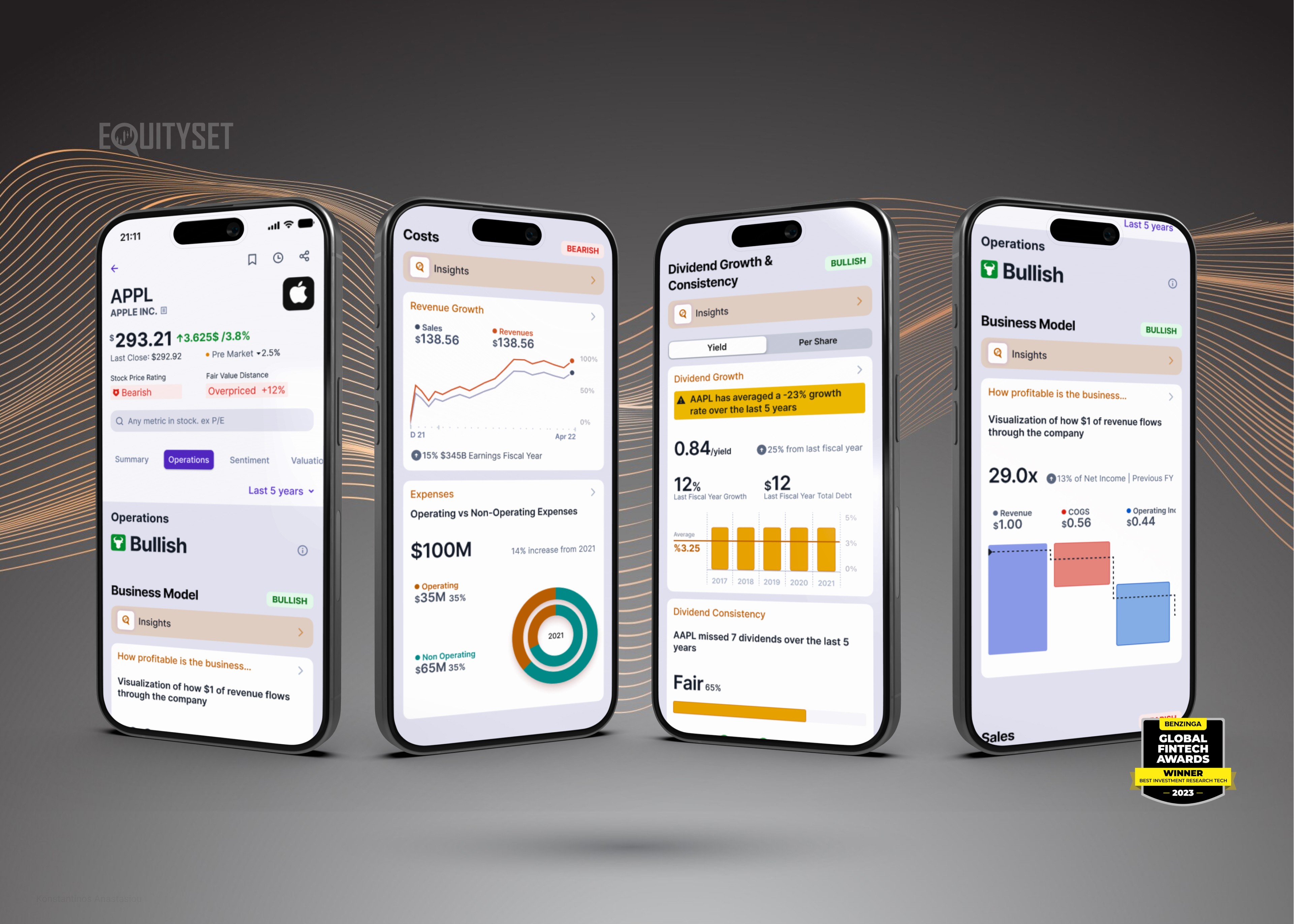
Given the complexity of the EquitySet model, I focused on simplifying its presentation without sacrificing depth. I used visual cues, such as color coding and iconography, to highlight key insights. Micro-interactions were implemented to reveal additional layers of data upon user engagement, allowing for a clean interface that could expand based on user interest.
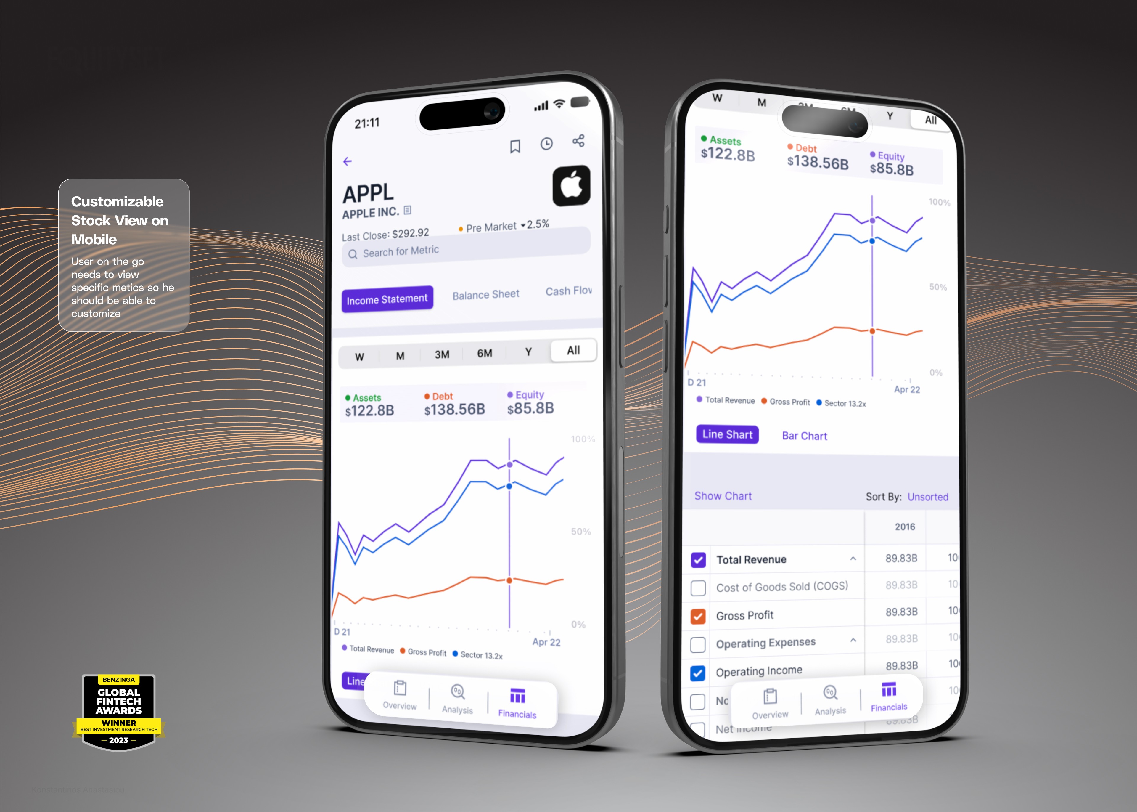
A modular design approach was used to ensure responsiveness across different devices. Components were designed to be adaptable to various screen sizes, providing a consistent user experience on desktops, tablets, and mobile devices. The color scheme was carefully crafted to be pleasing to the eye and adaptable to both light and dark themes, catering to user preferences and enhancing accessibility.
Throughout the entire process, I incorporated feedback from stakeholders at each stage. Regular meetings and updates kept everyone aligned, and adjustments were made based on their insights and the technical feasibility assessed by the development team. This ongoing dialogue was crucial for the successful integration of the design with the underlying technology.
By combining user-centered design principles with close collaboration among developers, users, and stakeholders, I created a platform that effectively visualizes complex data through intuitive interactions and thoughtful design. The result is a user experience that not only meets but exceeds expectations, making sophisticated financial analysis accessible to a broader audience.
The Solution
iven the complexity of the data, I knew it was crucial to incorporate effective data visualization into the design. Early on, I collaborated closely with the development team to define micro-interactions within charts and tables. This involved deciding how hover states would display tooltips with additional data, how users could click and drag to zoom into specific timeframes, and how filtering options would instantly update the visualizations. These micro-interactions were essential for making complex data more accessible and interactive.
I meticulously mapped out user flows for key functionalities, such as the stock page, market page, competitor comparison, and the EquitySet model analysis. By crafting detailed personas based on our user research, I ensured that each user flow catered to the needs and behaviors of our target users. For instance, an experienced investor persona might prioritize advanced analytics and customization options, while a novice user might need simplified views and educational tooltips.
The information architecture (IA) went through multiple iterations, balancing the depth of information with ease of navigation. I organized workshops and brainstorming sessions to refine the IA, ensuring users could intuitively find the information they needed without feeling overwhelmed. I created wireframes and shared them with users during usability testing sessions, gathering feedback that was instrumental in refining the designs. This iterative process helped me identify pain points and areas for improvement early on.

I maintained stakeholder engagement throughout the design process. At each stage, I presented the wireframes and prototypes to stakeholders, incorporating their feedback to align the design with business objectives and technical constraints. This collaborative approach ensured the final product met both user needs and company goals.
For critical pages like the stock page, market page, competitor comparison, and the EquitySet model analysis, I added more detailed interactions and visual elements. The stock page featured interactive charts with real-time data updates and the ability to compare historical performance over customizable periods. The market page provided a dashboard overview with drill-down capabilities into specific sectors or indices. The competitor comparison allowed users to select multiple companies and view side-by-side metrics, leveraging dynamic tables and charts for clarity.
Given the complexity of the EquitySet model, I focused on simplifying its presentation without sacrificing depth. I used visual cues, such as color coding and iconography, to highlight key insights. Micro-interactions were implemented to reveal additional layers of data upon user engagement, allowing for a clean interface that could expand based on user interest.

A modular design approach was used to ensure responsiveness across different devices. Components were designed to be adaptable to various screen sizes, providing a consistent user experience on desktops, tablets, and mobile devices. The color scheme was carefully crafted to be pleasing to the eye and adaptable to both light and dark themes, catering to user preferences and enhancing accessibility.
Throughout the entire process, I incorporated feedback from stakeholders at each stage. Regular meetings and updates kept everyone aligned, and adjustments were made based on their insights and the technical feasibility assessed by the development team. This ongoing dialogue was crucial for the successful integration of the design with the underlying technology.
By combining user-centered design principles with close collaboration among developers, users, and stakeholders, I created a platform that effectively visualizes complex data through intuitive interactions and thoughtful design. The result is a user experience that not only meets but exceeds expectations, making sophisticated financial analysis accessible to a broader audience.
The Solution
iven the complexity of the data, I knew it was crucial to incorporate effective data visualization into the design. Early on, I collaborated closely with the development team to define micro-interactions within charts and tables. This involved deciding how hover states would display tooltips with additional data, how users could click and drag to zoom into specific timeframes, and how filtering options would instantly update the visualizations. These micro-interactions were essential for making complex data more accessible and interactive.
I meticulously mapped out user flows for key functionalities, such as the stock page, market page, competitor comparison, and the EquitySet model analysis. By crafting detailed personas based on our user research, I ensured that each user flow catered to the needs and behaviors of our target users. For instance, an experienced investor persona might prioritize advanced analytics and customization options, while a novice user might need simplified views and educational tooltips.
The information architecture (IA) went through multiple iterations, balancing the depth of information with ease of navigation. I organized workshops and brainstorming sessions to refine the IA, ensuring users could intuitively find the information they needed without feeling overwhelmed. I created wireframes and shared them with users during usability testing sessions, gathering feedback that was instrumental in refining the designs. This iterative process helped me identify pain points and areas for improvement early on.

I maintained stakeholder engagement throughout the design process. At each stage, I presented the wireframes and prototypes to stakeholders, incorporating their feedback to align the design with business objectives and technical constraints. This collaborative approach ensured the final product met both user needs and company goals.
For critical pages like the stock page, market page, competitor comparison, and the EquitySet model analysis, I added more detailed interactions and visual elements. The stock page featured interactive charts with real-time data updates and the ability to compare historical performance over customizable periods. The market page provided a dashboard overview with drill-down capabilities into specific sectors or indices. The competitor comparison allowed users to select multiple companies and view side-by-side metrics, leveraging dynamic tables and charts for clarity.
Given the complexity of the EquitySet model, I focused on simplifying its presentation without sacrificing depth. I used visual cues, such as color coding and iconography, to highlight key insights. Micro-interactions were implemented to reveal additional layers of data upon user engagement, allowing for a clean interface that could expand based on user interest.

A modular design approach was used to ensure responsiveness across different devices. Components were designed to be adaptable to various screen sizes, providing a consistent user experience on desktops, tablets, and mobile devices. The color scheme was carefully crafted to be pleasing to the eye and adaptable to both light and dark themes, catering to user preferences and enhancing accessibility.
Throughout the entire process, I incorporated feedback from stakeholders at each stage. Regular meetings and updates kept everyone aligned, and adjustments were made based on their insights and the technical feasibility assessed by the development team. This ongoing dialogue was crucial for the successful integration of the design with the underlying technology.
By combining user-centered design principles with close collaboration among developers, users, and stakeholders, I created a platform that effectively visualizes complex data through intuitive interactions and thoughtful design. The result is a user experience that not only meets but exceeds expectations, making sophisticated financial analysis accessible to a broader audience.






The Design
To create a user interface that not only meets current needs but also positions EquitySet for future success, I strategically planned and executed the UI design process with a focus on long-term scalability and alignment with business objectives. Recognizing the importance of efficiency and seamless collaboration with the development team, I chose to utilize Tailwind CSS. This strategic decision accelerated the design process and facilitated easier implementation for developers, thanks to Tailwind’s utility-first framework that promotes consistency and maintainability in the codebase.
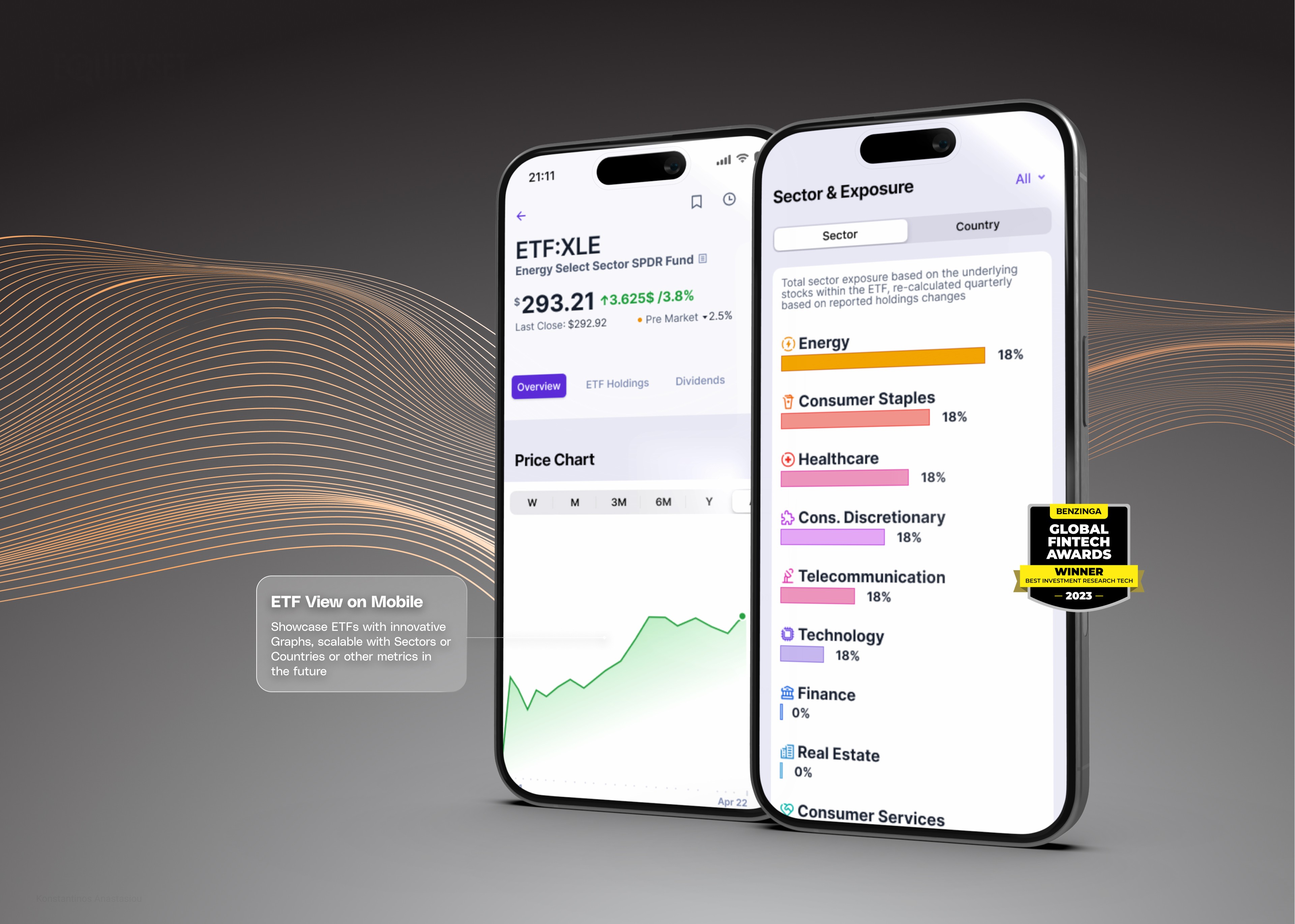
I spearheaded the creation of a fully modular and expandable design system, strategically designed to adapt to various resolutions and devices. Anticipating EquitySet’s plans to launch a mobile app, I ensured that the design system was compatible with NativeWind, allowing for smooth integration with React Native for mobile development. This forward-thinking approach guarantees a unified design language across web and mobile platforms, enhancing brand consistency and providing users with a cohesive experience regardless of the device.
In refining the visual identity, I strategically adjusted the original purple color scheme to a more sophisticated hue, conveying professionalism while maintaining brand recognition. This decision was based on market research and an understanding of our target audience’s preferences. The logo remained unchanged to preserve existing brand equity, but the updated color palette refreshed the brand’s image and better aligned with our strategic positioning in the market.
Beyond the core UI components, I extended my strategic design approach to include the creation of multiple banners, social media assets, landing pages, as well as knowledge bases and dictionaries. By delivering these assets, I ensured that all customer touchpoints were consistent with the overall visual language and brand messaging. This comprehensive suite of materials supports marketing efforts and enhances user education and engagement, contributing to a stronger market presence.
Throughout the UI design process, I leveraged advanced UI design tools and methodologies with a strategic focus on scalability, accessibility, and developer usability. By adopting a modular design approach, I positioned EquitySet for future growth, allowing for easy updates and the addition of new features without overhauling the entire system. This aligns with the company’s long-term strategic goals and ensures that the platform can evolve with market demands.
My strategic involvement was pivotal in bridging the gap between design, development, and business strategy. By aligning design decisions with broader company objectives and anticipating future needs, I contributed to creating a platform that stands out in a competitive landscape. This strategic foresight not only enhances the user experience but also supports EquitySet’s mission to deliver exceptional value to its users and achieve a superior product-market fit.






Results and Impact
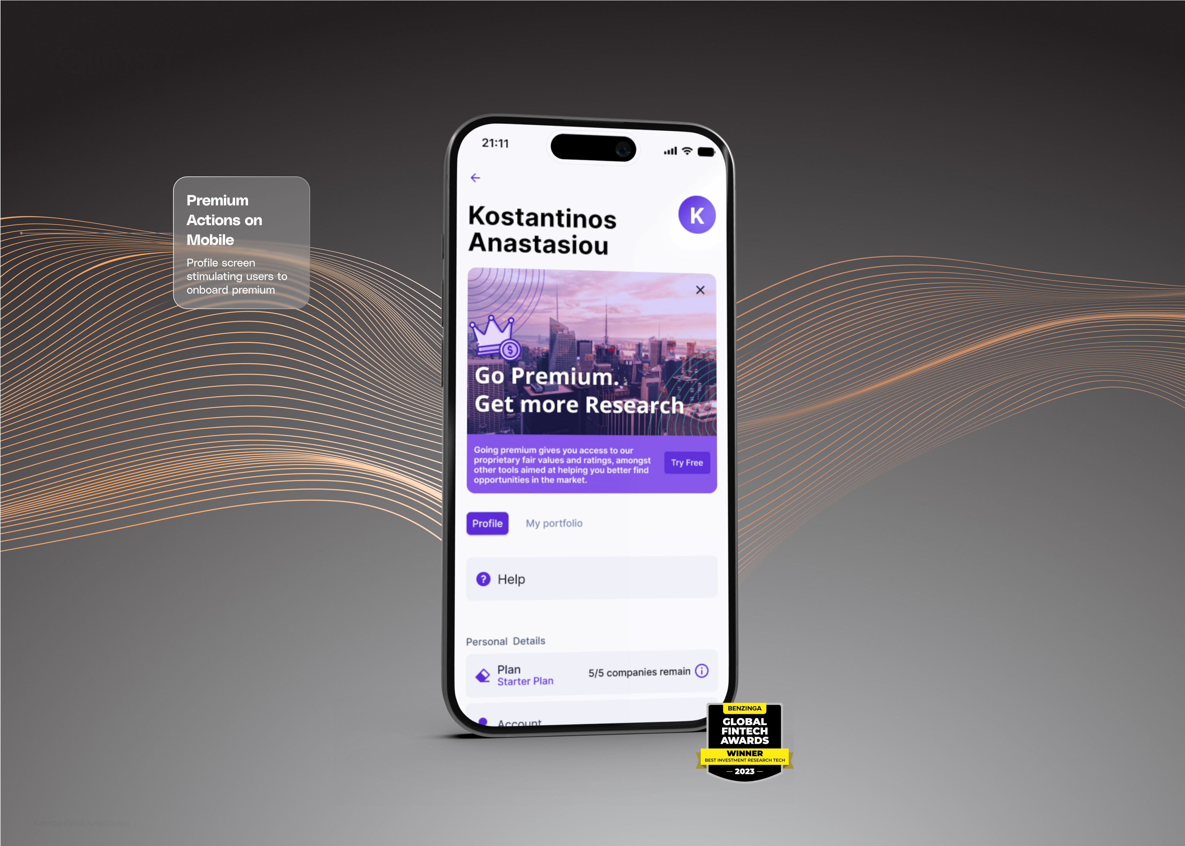
The redesigned EquitySet platform, launched as a minimum viable product (MVP), has achieved significant success. Collaborating with stakeholders to implement paywalls and SaaS strategies led to a remarkable 98% increase in revenues. Introducing a multi-tiered access system allowed users varying levels of information access, enhancing engagement and monetization. The addition of advanced triggers, filters, and notification strategies improved user experience and satisfaction.
EquitySet’s success was further recognized when it won the Benzinga Global Fintech Award in 2023, highlighting the platform’s excellence in meeting user needs and industry standards. The launch of the mobile app set EquitySet apart from competitors by providing researchers with on-the-go access to extensive company, stock, index, and industry data, increasing user engagement and expanding the platform’s reach.
Learnings and Future Directions
This project enabled me to apply my finance background to real-world challenges, resulting in innovative solutions for data visualization and complex data delivery. Moving forward, we aim to continuously learn from user interactions with the platform. These insights will guide further enhancements, making EquitySet even more intuitive and valuable for stock researchers.
Results and Impact
The redesigned EquitySet platform, launched as a minimum viable product (MVP), has achieved significant success. Collaborating with stakeholders to implement paywalls and SaaS strategies led to a remarkable 98% increase in revenues. Introducing a multi-tiered access system allowed users varying levels of information access, enhancing engagement and monetization. The addition of advanced triggers, filters, and notification strategies improved user experience and satisfaction.
EquitySet’s success was further recognized when it won the Benzinga Global Fintech Award in 2023, highlighting the platform’s excellence in meeting user needs and industry standards. The launch of the mobile app set EquitySet apart from competitors by providing researchers with on-the-go access to extensive company, stock, index, and industry data, increasing user engagement and expanding the platform’s reach.

Learnings and Future Directions
This project enabled me to apply my finance background to real-world challenges, resulting in innovative solutions for data visualization and complex data delivery. Moving forward, we aim to continuously learn from user interactions with the platform. These insights will guide further enhancements, making EquitySet even more intuitive and valuable for stock researchers.
Results and Impact
The redesigned EquitySet platform, launched as a minimum viable product (MVP), has achieved significant success. Collaborating with stakeholders to implement paywalls and SaaS strategies led to a remarkable 98% increase in revenues. Introducing a multi-tiered access system allowed users varying levels of information access, enhancing engagement and monetization. The addition of advanced triggers, filters, and notification strategies improved user experience and satisfaction.
EquitySet’s success was further recognized when it won the Benzinga Global Fintech Award in 2023, highlighting the platform’s excellence in meeting user needs and industry standards. The launch of the mobile app set EquitySet apart from competitors by providing researchers with on-the-go access to extensive company, stock, index, and industry data, increasing user engagement and expanding the platform’s reach.

Learnings and Future Directions
This project enabled me to apply my finance background to real-world challenges, resulting in innovative solutions for data visualization and complex data delivery. Moving forward, we aim to continuously learn from user interactions with the platform. These insights will guide further enhancements, making EquitySet even more intuitive and valuable for stock researchers.
Client Feedback
Konstantinos was absolutely a pleasure to work with. Not only was he an expert in UX / UI for financial applications, but he was an attentive listener that always looked to provide solutions fit to the ultimate vision. From web to graphic the quality of the work was always outstanding. Looking forward to working with him on new stuff in the future!
Anthony Zipparro ·COO @ LLT Group | Founder @ EquitySet
