Lockdown Privacy is a comprehensive privacy app offering firewall and VPN services to protect users’ digital privacy on iOS and Mac devices. Designed to block trackers and ads, it empowers users to take control of their online security with advanced features presented in an accessible and user-friendly manner.
Lockdown Privacy is a comprehensive privacy app offering firewall and VPN services to protect users’ digital privacy on iOS and Mac devices. Designed to block trackers and ads, it empowers users to take control of their online security with advanced features presented in an accessible and user-friendly manner.
Lockdown Privacy is a comprehensive privacy app offering firewall and VPN services to protect users’ digital privacy on iOS and Mac devices. Designed to block trackers and ads, it empowers users to take control of their online security with advanced features presented in an accessible and user-friendly manner.
Role
Product UX/UI Designer
Client
Appex
Year
2022
Services
Wireframes & UX Alignment
UI Design
Agency
Mentions
Development




The Problem
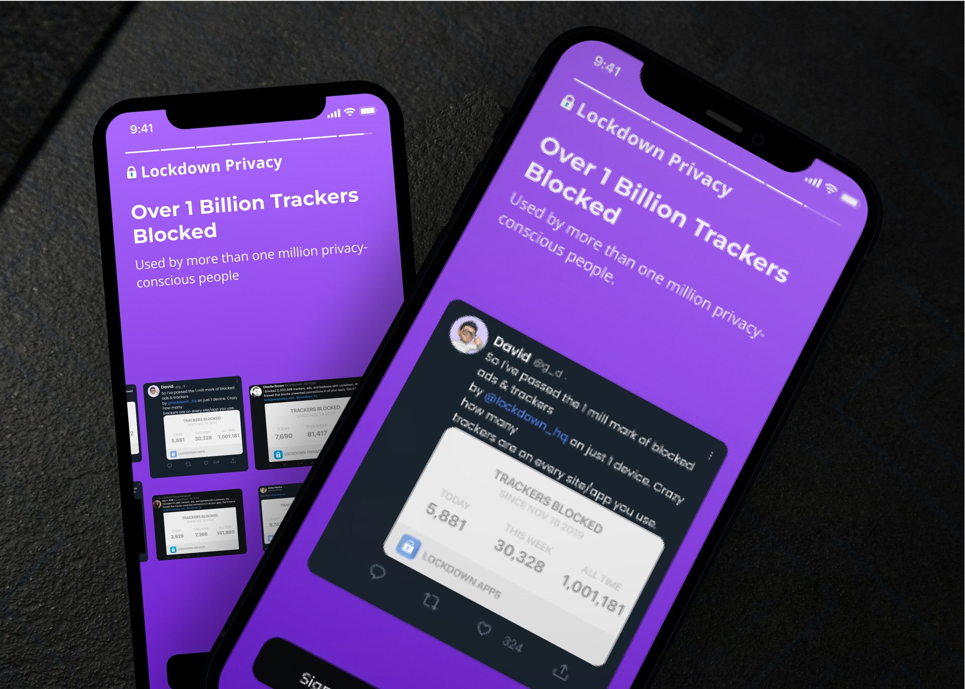
Many privacy-focused applications suffer from poor usability, making it challenging for non-technical users to protect their data effectively. Lockdown Privacy’s powerful firewall and VPN features were complex and difficult to navigate for casual users. Additionally, the existing user interface lacked visual clarity and failed to communicate the value of its advanced privacy tools.


The Sollution
To address these challenges, I reimagined Lockdown Privacy’s user experience with a focus on clarity and accessibility.
• Simplified User Interface: I redesigned the app with a clean, minimalistic aesthetic, utilizing easy-to-read typography and a consistent visual language to guide users effortlessly through the app.
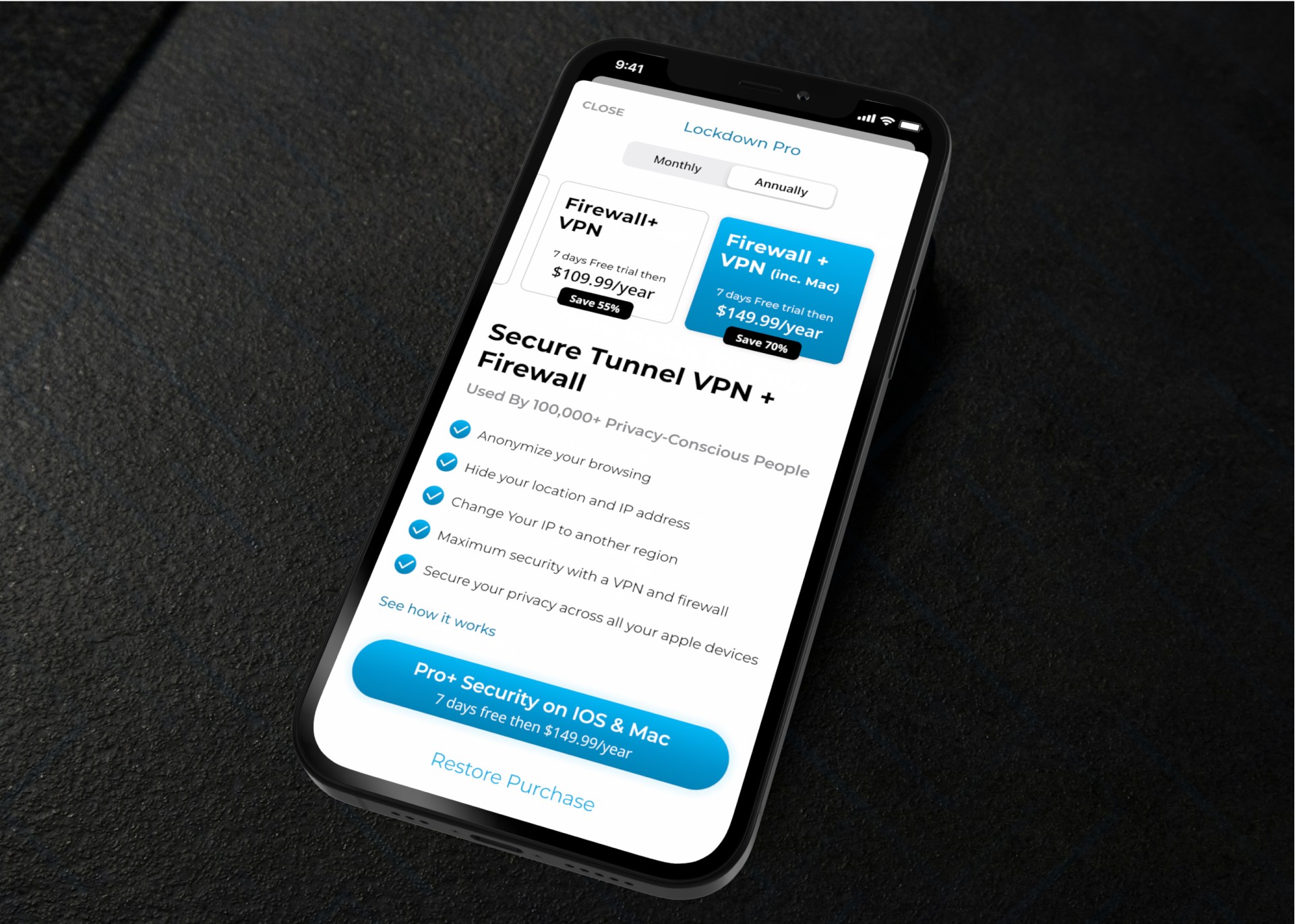
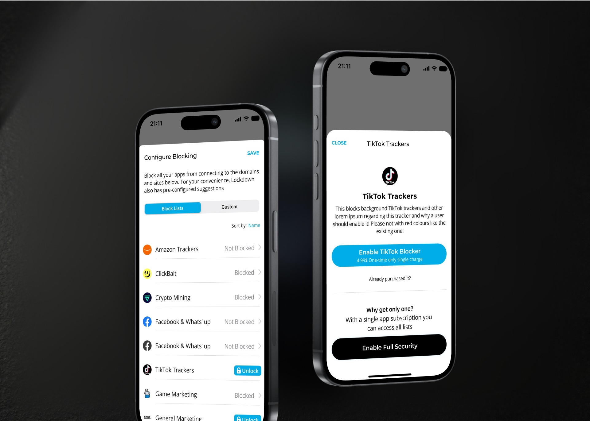
• Redesigned Paywall: Introduced a more flexible and transparent paywall, making subscription information clearer and encouraging increased adoption and subscriptions.
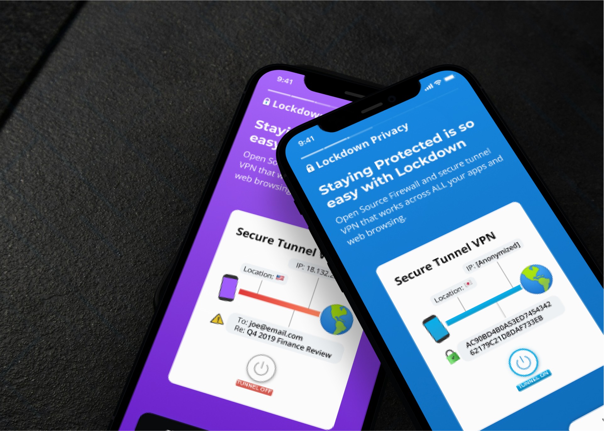
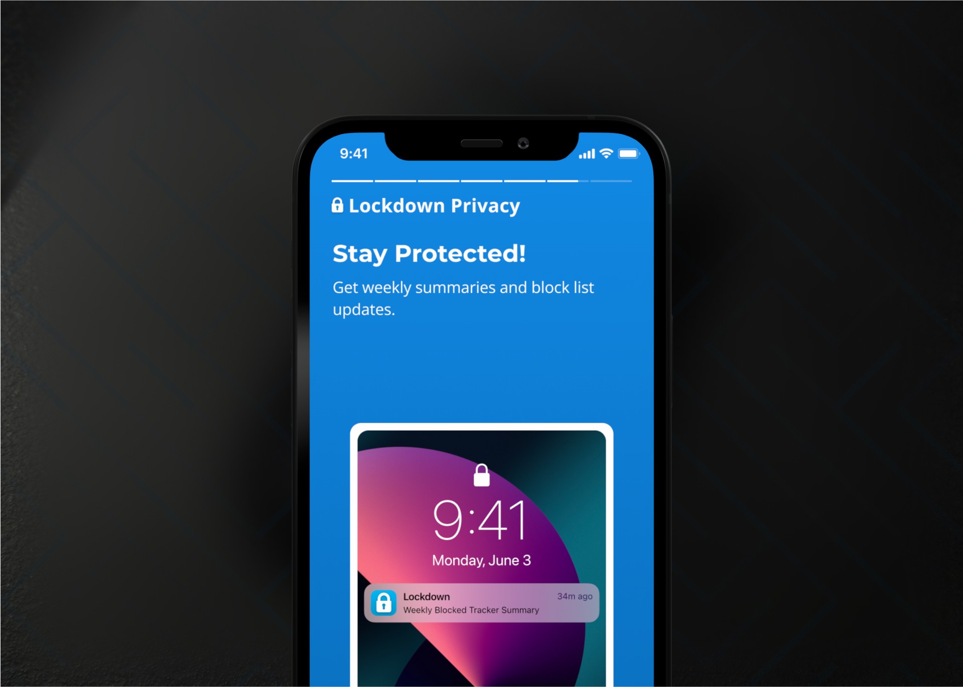
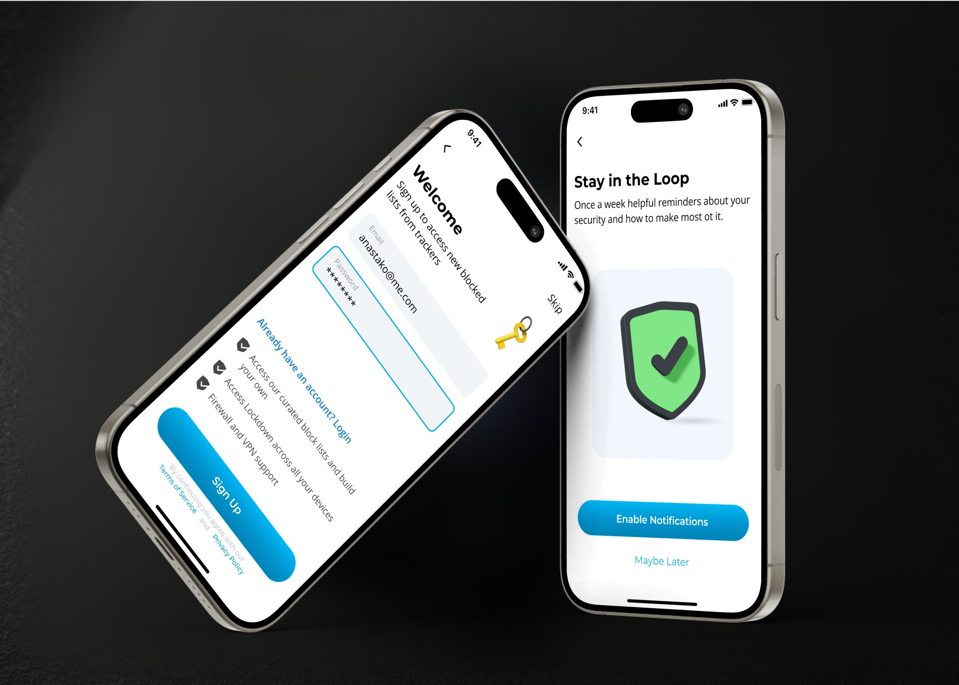
• Enhanced Onboarding Experience: Developed animated walkthroughs and instructional screens that guide users step-by-step through the app’s key features, simplifying setup and reducing user frustration.
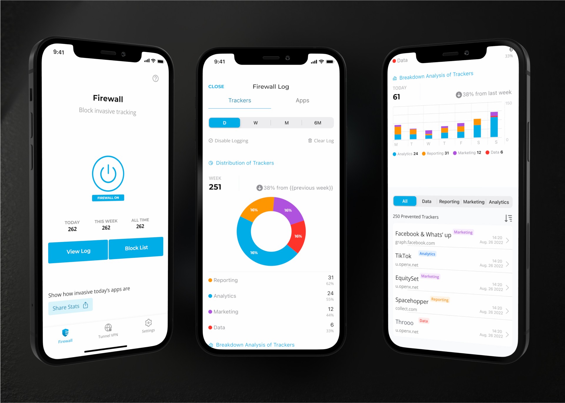
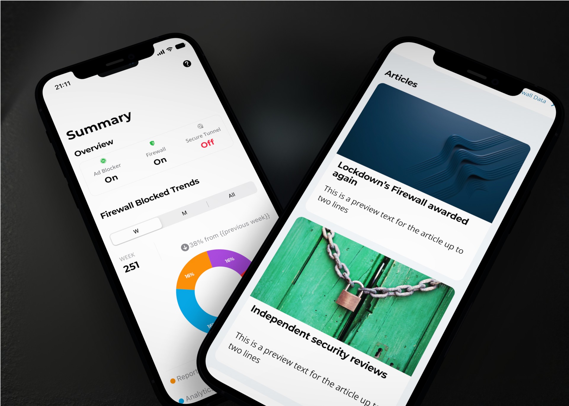
• Data Visualization: Created comprehensive data visualizations to display the number of trackers blocked, data saved, and overall privacy status, using engaging graphics to make complex data easily digestible.
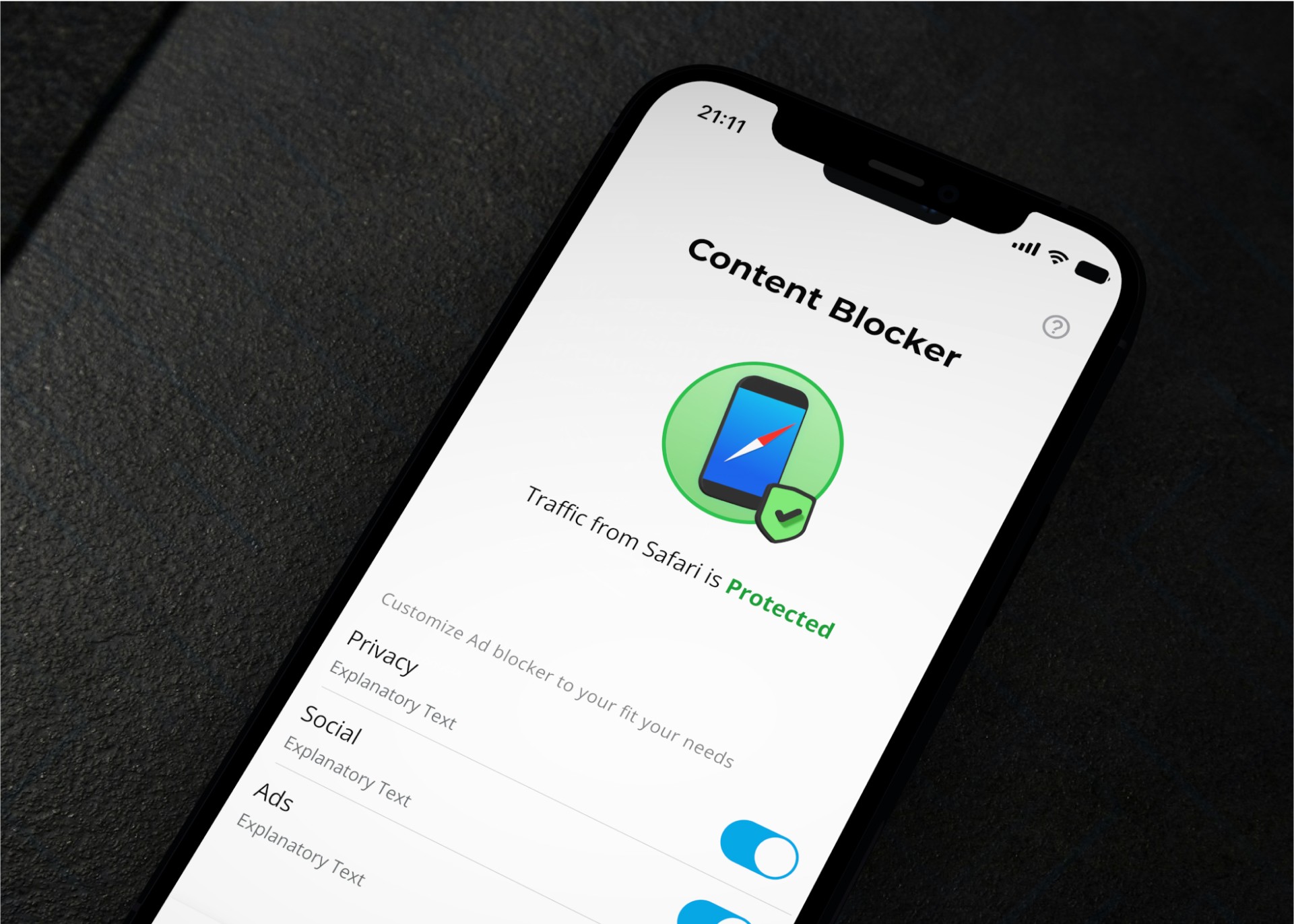
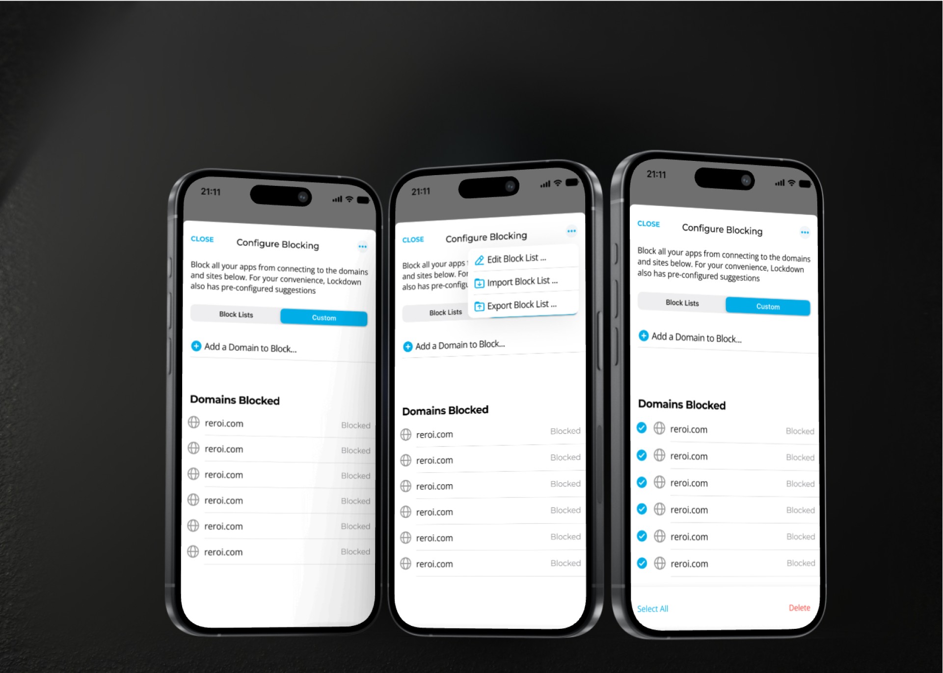
• Advanced Features for Power Users: Implemented detailed configuration options accessible through a dedicated menu, providing more control for advanced users without overwhelming the average user.
• Optimized Interaction Design: Streamlined key actions, such as enabling or disabling the VPN or firewall, into one-touch interactions and introduced real-time feedback to reinforce a sense of control.






The Design
The design approach centered on reducing complexity and enhancing user engagement. By adopting a minimalistic aesthetic, I delivered a visually appealing interface that prioritizes usability. Intuitive icons, consistent color schemes, and accessible typography ensure seamless navigation. Interactive elements and real-time feedback were integrated to make the user experience more engaging and responsive.
Special attention was given to the information architecture, organizing features logically to align with user expectations. Advanced settings were thoughtfully placed to be accessible yet unobtrusive, catering to both casual users and power users.






The Design
The redesign had a significant positive effect on user engagement and business outcomes:
• Increased User Engagement: The new intuitive UI and onboarding process resulted in a 25% increase in user engagement within the first three months after launch.
• Reduced Support Requests: The simplified design and clear instructional content led to a 30% reduction in user support requests related to setup and configuration.
• Higher Feature Adoption: By making advanced features more accessible, there was a 40% increase in the use of customizable filters and privacy settings, indicating users felt more confident navigating the app.
• Revenue Growth: The redesigned paywall and improved user experience contributed to a substantial increase in revenues and adoption rates.
